I guess there's a few redeeming qualities from the revisions here in my books from what we can see so far:

Positives

1) The huge podium will be broken up into 3 smaller podiums + the elimination of the larger scale retail size. If we've seen anything from Menkes (especially with Phase 1) is that they dont know how to create coherent and useful retail space, especially when in a larger footprint. This will essentially force them in a way to maximize the new retail footprint in an efficient manner (or at least one would rationally think so).

2) Related to 1 above, the retail use will be more flexible allowing for retail that will draw people to the area. Queens Quay East is pretty much a retail wasteland from an entertainment/crowd gathering perspective.

3) The school is separated from the residential/retail podium

Negatives

1) Towers shifted to the south will result in more pronounced shadowing in the park

2) School will be facing the vehicular cesspool that is the Gardiner and Lake Shore Blvd instead of a quieter Harbour St extension.
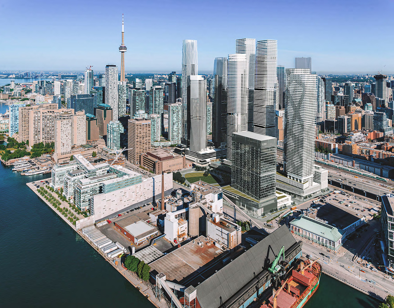
 

Toronto Model 09-12-24 Sugar Wharf.png
 
Some additional context for the new massing:


View attachment 595588View attachment 595589
YES! YES!! YES!!!!!

These buildings were absolute trash before! They would have become an incredibly boring and irreparable blight on the eastern skyline, lasting for untold generations. The new designs are far more interesting; for one they no longer looks like a five year old created them. And just as important is the new variation in heights, it's about time someone said NO to plateau skylines!

This is everything that I wanted, it's like they read my damn mind. Now I can rest in peace when I pass instead of rolling in my grave 🥹
Trapezoidal prisms are more interesting than a boxes. These appear slimmer point towers too. However, this could be three identical tall trapezoidal prisms with the 25 metre separation feeling a lot less based on their positioning. It could end up just as boring in the skyline with greater feeling of an uninterrupted wall of condos. The drawing two posts above puts it all into perspective.
 
YES! YES!! YES!!!!!

These buildings were absolute trash before! They would have become an incredibly boring and irreparable blight on the eastern skyline, lasting for untold generations. The new designs are far more interesting; for one they no longer looks like a five year old created them. And just as important is the new variation in heights, it's about time someone said NO to plateau skylines!

This is everything that I wanted, it's like they read my damn mind. Now I can rest in peace when I pass instead of rolling in my grave 🥹
It’s like we had the same damn minds 😄
I also love slight height decrease, it will eventually make Pinnacle OY truly stand out. It wouldn’t make that effect if the tallest tower would be surrounded by another tall towers.

P.S. I also wish 19 Bloor West gets lower to let The One stand out in Skyline
 
The database stats have been updated to reflect the Minor Variance application.
Renderings currently in the database reflect the previous design.
No CoA hearing date has been set at this time.
Minor variance? They’re radically altering the design and layout of the towers, goodness….
 
Minor variance? They’re radically altering the design and layout of the towers, goodness….
Agreed, this is a big change. All explained in the front page story.


42
 
Don't get too excited. Just because the 3 towers are no longer rectangular doesn't mean they're going to be interesting. The 2 existing towers are also trapezoidal, but they're as monolithic as other elongated boxes, mitigated by their balcony patterns (which only look good from afar IMO). I hope the new design won't be yet another variation of these patterns (see also Canada House), which are becoming a cliche on our skyline.
 
Agreed, this is a big change. All explained in the front page story.


42
The best reply to my UT ponderings is when Mr. 42 replies with an entire front page story! Sweet!! <3
 
Last edited:

Back
Top