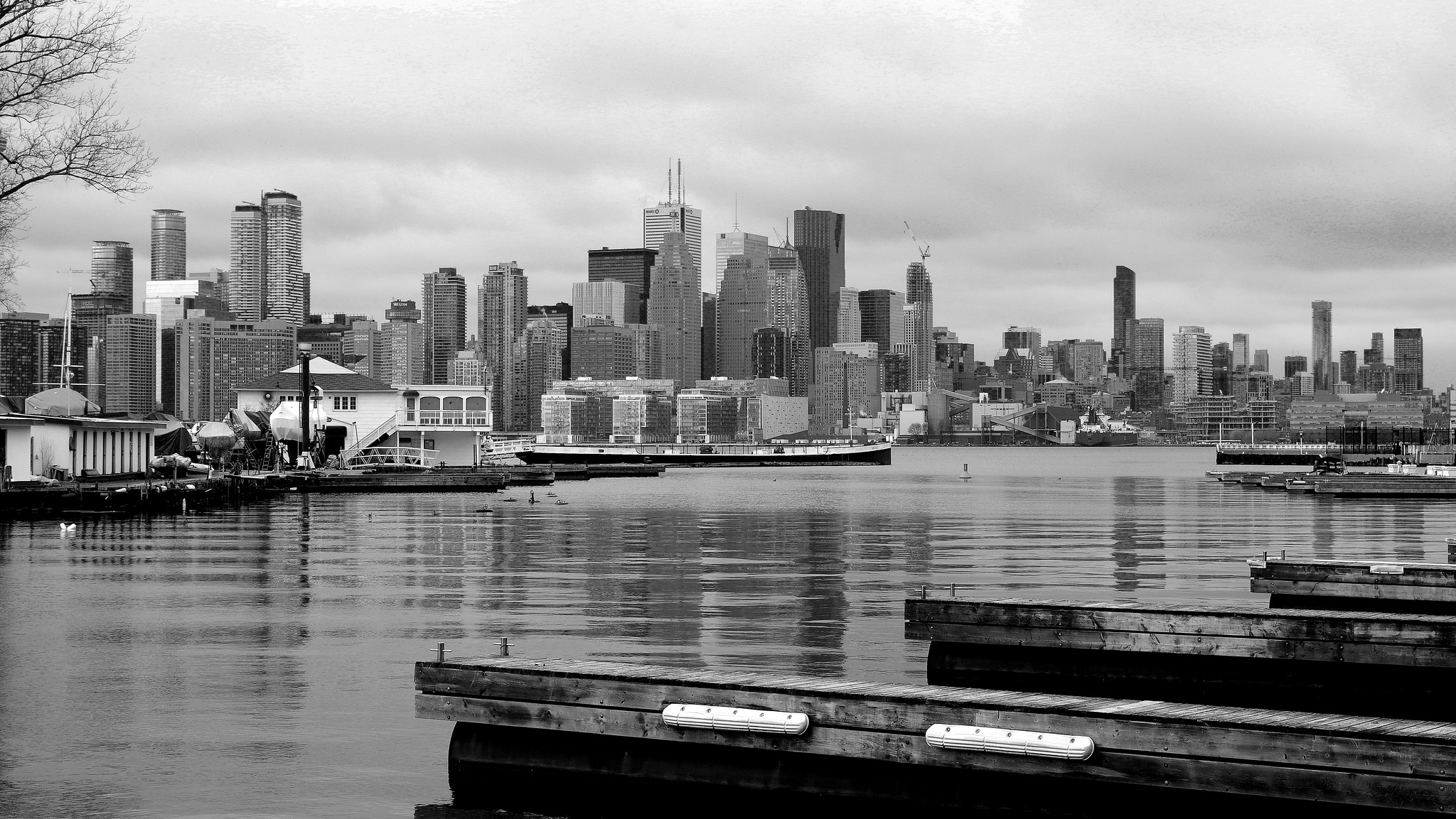
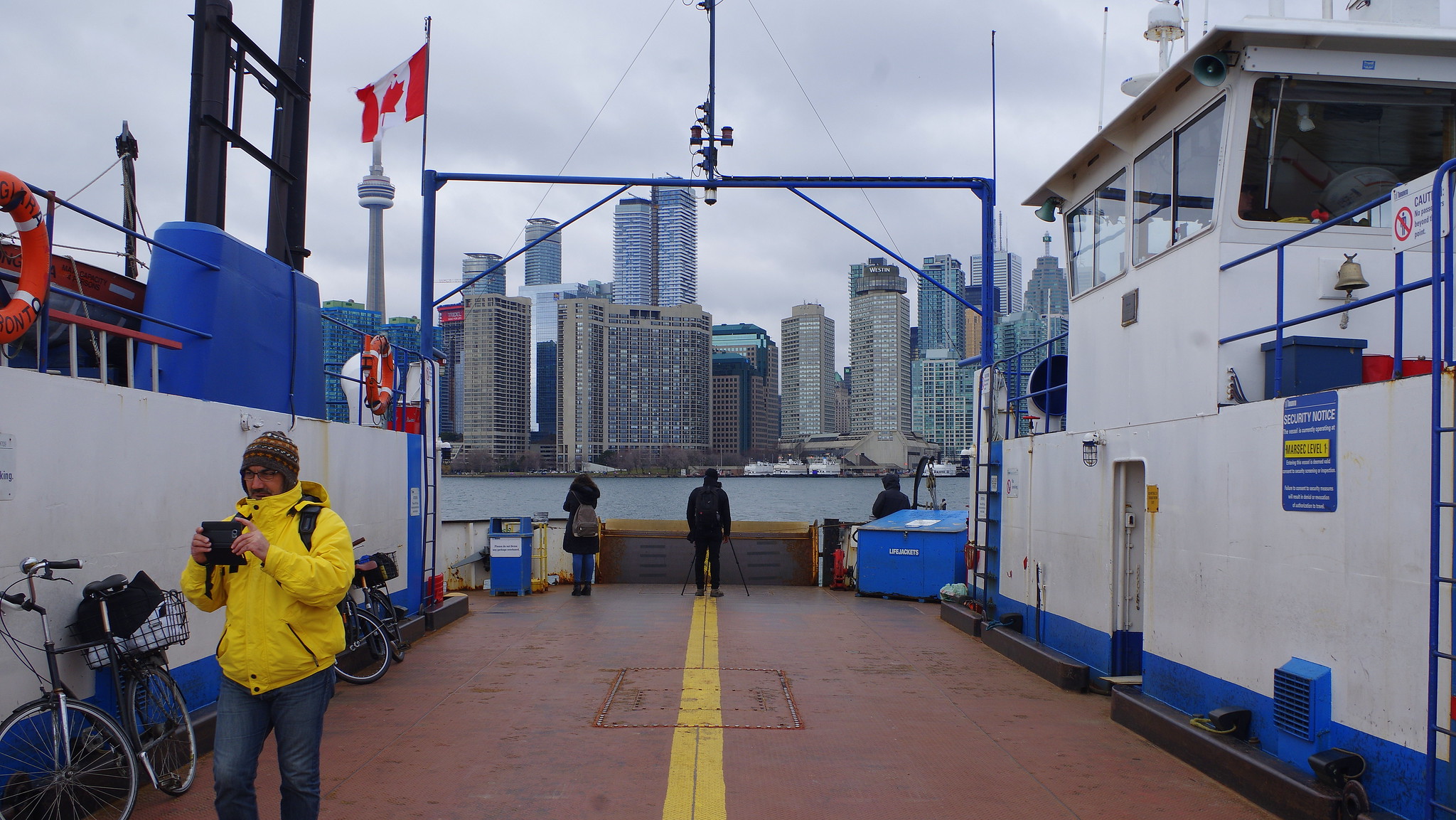
What's not to love about lighting? It not only animates the night sky but adds a level of dynamism to the skyline. I also really like all the little red blinking lights. I think Cityplace started the trend and I like how developers are upping the game in each new development. Ice was a fantastic addition.
Panoramic presentation of Toronto's skyline from Harbourfront by Roland Shainidze, on Flickr


Wow...so cool. Not over-the-top or garish. Just the right amount and classy.
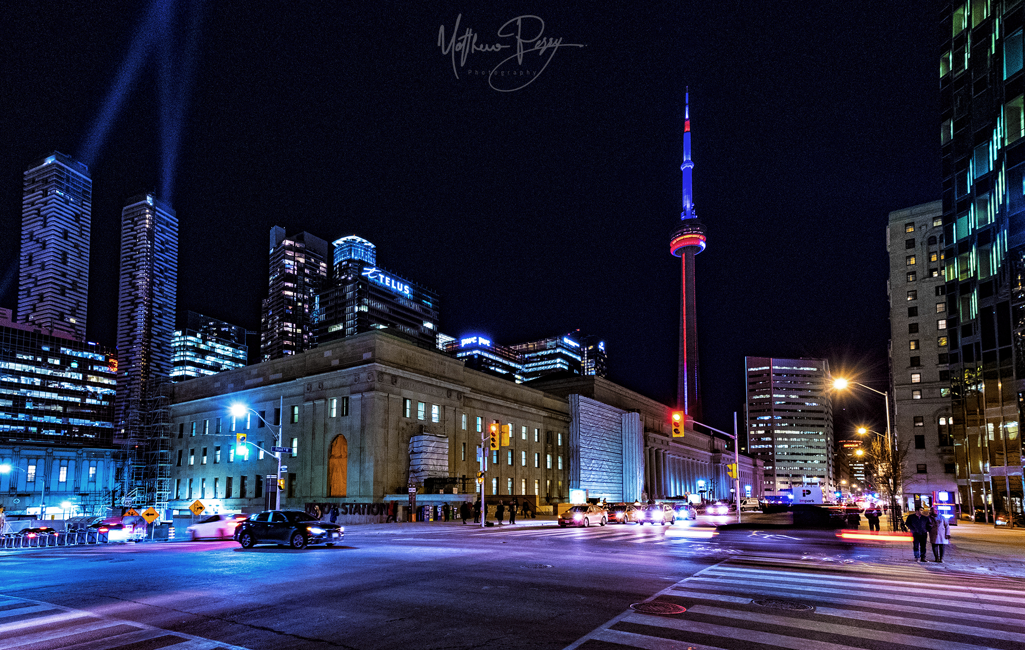
 
I think the new night lighting we have gotten so far is pretty good. Even those small dabs of colour make a difference in the skyline.
 
Graze lighting like what we have here is definitely more subtle and sophisticated than LED speedstripes- I think we're still missing out some major core office towers being illuminated (would love the setbacks on the top of Brookfield Place to get some lighting, maybe along with the top notch at Scotiabank Plaza and some illumination at the Royal York).
 
I love it. Lighting brings such a dynamic difference and may I say it...JOY!!!... to the city at night.
 
Stunning pic there kris...or should I say Matthew?

They were 'playing' around with the lights again last evening...including a subtle shift from light mauve to blue to green. But seemingly in one portion of one of the crowns. Looked nice though.

Here are a couple from today (on a gleaming, bright, mild, spring morn...)

One York-1.jpg


One York-2.jpg


From Polson....

One York-3.jpg
 

Attachments

  • One York-1.jpg
    One York-1.jpg
    1,014.4 KB · Views: 592
  • One York-2.jpg
    One York-2.jpg
    1.4 MB · Views: 537
  • One York-3.jpg
    One York-3.jpg
    955.9 KB · Views: 442
Last edited:
Great impact on the skyline if you ask me.

Yes, this and 88 Scott have been fantastic additions for 2016.

--

As much as I like the towers, I do dislike the final crown treatment. The visual break in colours combined with the setbacks lend itself to a much stumpier look, at least when compared to previous renderings. A tall crown, like Casa II's, would have been more fitting in relation to the slenderness of the towers.
 
I saw the top go from a deep purple, to light blue and then to white, so I assume this will be lit at night but the lighting is only on a small, north facing portion, as far as I could see. (from Front & Parliament)
 

Back
Top