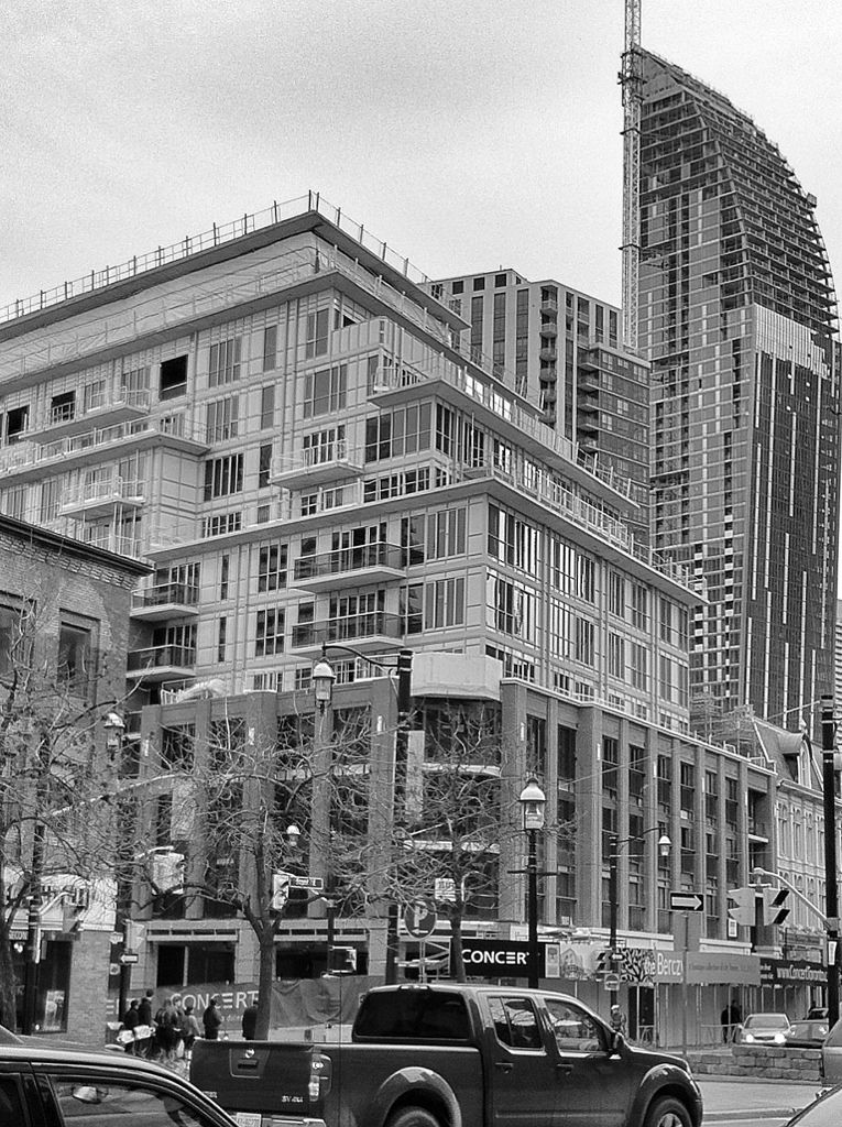
I get the impression that some would have been happy with something along these lines:

The small windows and mansard roofs of these buildings would have actually achieved the goal of fitting into the heritage streetscape better. Looking at the modern design of the upper part of The Berczy, it's so dull that the buildings in your photo might actually be architecturally superior.
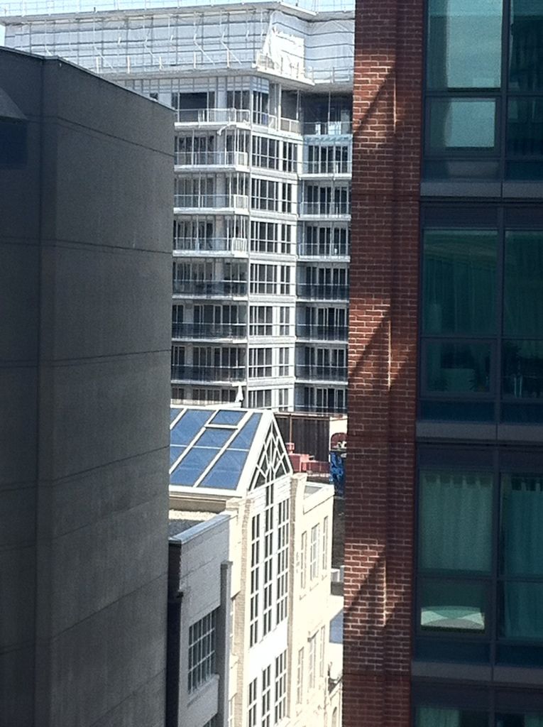
 
The small windows and mansard roofs of these buildings would have actually achieved the goal of fitting into the heritage streetscape better. Looking at the modern design of the upper part of The Berczy, it's so dull that the buildings in your photo might actually be architecturally superior.

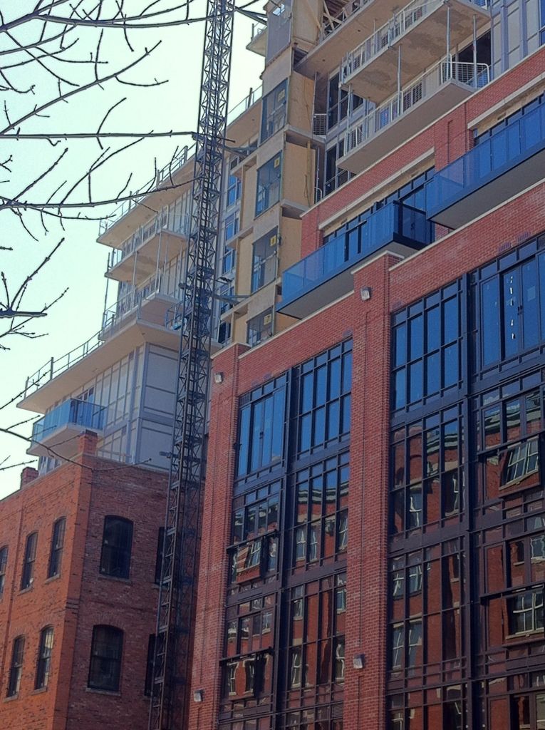
I just walked by... the grey aluminum was an absolutely terrible choice. Everything looks bland and washed out. So strange.
 
Would have preferred the upper portion to be similar to this concept here, with metallic framing and large clear windows.


Tinted balcony glass helping somewhat, but ouch, this one still hurts the eyes a bit. Really wanted to like this one. Can't recall ever being fooled by illustrations and the model as I have been by this one. Damnedest thing is, it actually does look like the pictures.
Go figure.
 

Black tinted glass balconies look amazing against that red brick...against that grey/white spandrel...not so much.
 

Clutter
 
Some interesting layering going on in the image above.

The only way Berzy can be saved through renovation is reducing the impact of the mullions and the difference between the spandrel and glass. I prescribe a smattering of darker spandrel panels to create a more random pattern and allow the glass and spandrel panels to blend together more.

At the moment, it really looks messy and unfinished, as if the facade was waiting to receive its final cladding.

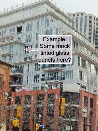
I agree in principle. I say whack out some of those panels and stick in some 'fake window' tinted glass panels. I've see it done and it might just work here. This thing could still be saved and still retain its Leeds qualification.
 

A prime spot to start putting in glass panels and give this upper portion a more solid coordinated appearance IMO.
 
I think people are disappointed because the rendering has the sky reflecting on the windows in a way that nearly matches the spandrel. In reality the windows look quite dark, and there is a lot of spandrel relative to window, and the lines of the panels look messy. The sky in the render also deemphasizes the upper portion because it is nearly the same colour.
 
That white cladding is just horrendous. Like jje1000 said it looks like it's waiting for something else to cover it or even be painted. Quite upsetting considering how good the brick and black windows look.
 
Concert should be ashamed by how this has turned out. If anyone from Concert is reading this, PLEASE don't let 88 Scott go the same way.
 

Back
Top