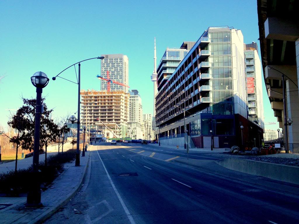
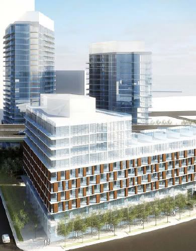
Now, that's quite a change. Very cool juxtaposition.

And those old sodium lamps on the Gardiner! I loved those.
 
Pic taken Dec 9, 2012

The back end of the project: Garage entrance and parking for many bikes.


IabZJ.jpg


lR6zK.jpg
 

Ever notice how when the renderings first come out, there is not even a hint of grey? Then when the actual building is finished, it's mainly grey. If the buyers love grey so much, why do the developers hide it from the renderings? I would think that if the buyers are demanding more grey, the developers would gladly splash grey over all their renderings. Something here just doesn't add up? lol


Why do renderings have to be so deceptive?
 
Last edited:
Rather disappointing comparing reality to fantasy:

1_2.jpg


source

When you compare the whiteish top portion in the rendering, to the drab, dark grey top they actually built, I can't believe anyone would prefer the grey. It just looks so gloomy and unattractive. Why would the developers choose that dark grey over white or any other attractive colour? Seriously, this just boggles my mind. Do Torontonians really love that dark, gloomy, grey spandrel so much or is it just the developers who do?

I have no doubt, that in 20 years time, people will be wondering, what the hell were those people thinking? (or smoking)
 
Last edited:
The grey does look great to some (including me), actually. It's a matter of opinion. Look at the photo by AlbertC just above your comment. It looks significantly better and more modern to me than the rendering you quoted.
 
I like me some grey, but I do think this one turned out quite monotonous (minus the brick).

I think once people have moved in and blinds and curtains are installed it will look quite different, though.
 

Back
Top