It's fine. It's nothing great but it's far from terrible. I'll wait till it's closer to completion before judging it, but it should look fine and won't be that visible anyway with all the height around it.
 
I walked by yesterday, and my first thought seeing only the tuna can cladding on the Bloor side was: "I can't wait to see all the hate this must be getting right now on UT"

Turns out you've all been playing nice... or completely given up! 🤣

We are still all over Aura and Design Haus. Don't worry, we will get to this one in due time - and we have close to eternity to do it.

AoD
 
We are still all over Aura and Design Haus. Don't worry, we will get to this one in due time - and we have close to eternity to do it.

AoD

And Alvin never forgets........or forgives..........so the Gupta Group.......may never live this down!
 
What's going up here is noticeably superior to Design Haus cladding, or Aura, or any number of recent buildings that are getting a strip torn off them, Strada for example. If you cannot see the difference then you're not particularly detail oriented: mullions do not run through the wall sections here • wall sections are not back-painted glass spandrel • mullions around windows have the same dark tint as the windows • and compared to Strada, specifically, windows aren't jumbled floor-to-floor but line up one above the other. (I'm actually normally fine with a window treatment that's syncopated from floor-to-floor, but only when the rest of the design is calm, and not when the syncopation only magnifies a mess.) In this case we have a far less busy design than any of the other buildings getting trashed these days: this one does not deserve the same degree of hositility.

42
 
From just now. Only a sliver of the topped-up 10-story building and rising main tower is visible here, but once the tower is done, it will dwarf the Selby and form a sort of nesting tables with it and James Cooper Mansion from my POV. I think the metallic cladding looks dated, but it will make an interesting contrast with the Selby's wine-coloured and JCM's beige & black claddings.

IMG_0759.JPG


IMG_0760.JPG
 
By looking at the photos up above and the previous pages . This building's cladding has that 80s-90s look. Adding more solid metal materials around the dark glazed windows. Which is going to look great when it's done for this area. Well needed!!
 
Loving the added density along this stretch and the sharp contrast to Rosedale Valley immediately north.
 
Any plans to cover them up with a glass lobby or put cladding on them?

Tbh, they don't look too bad to my eye.

edit: up close they do look pretty cheap.
 
  • Like
Reactions: xy3
Any plans to cover them up with a glass lobby or put cladding on them?

Tbh, they don't look too bad to my eye.

edit: up close they do look pretty cheap.
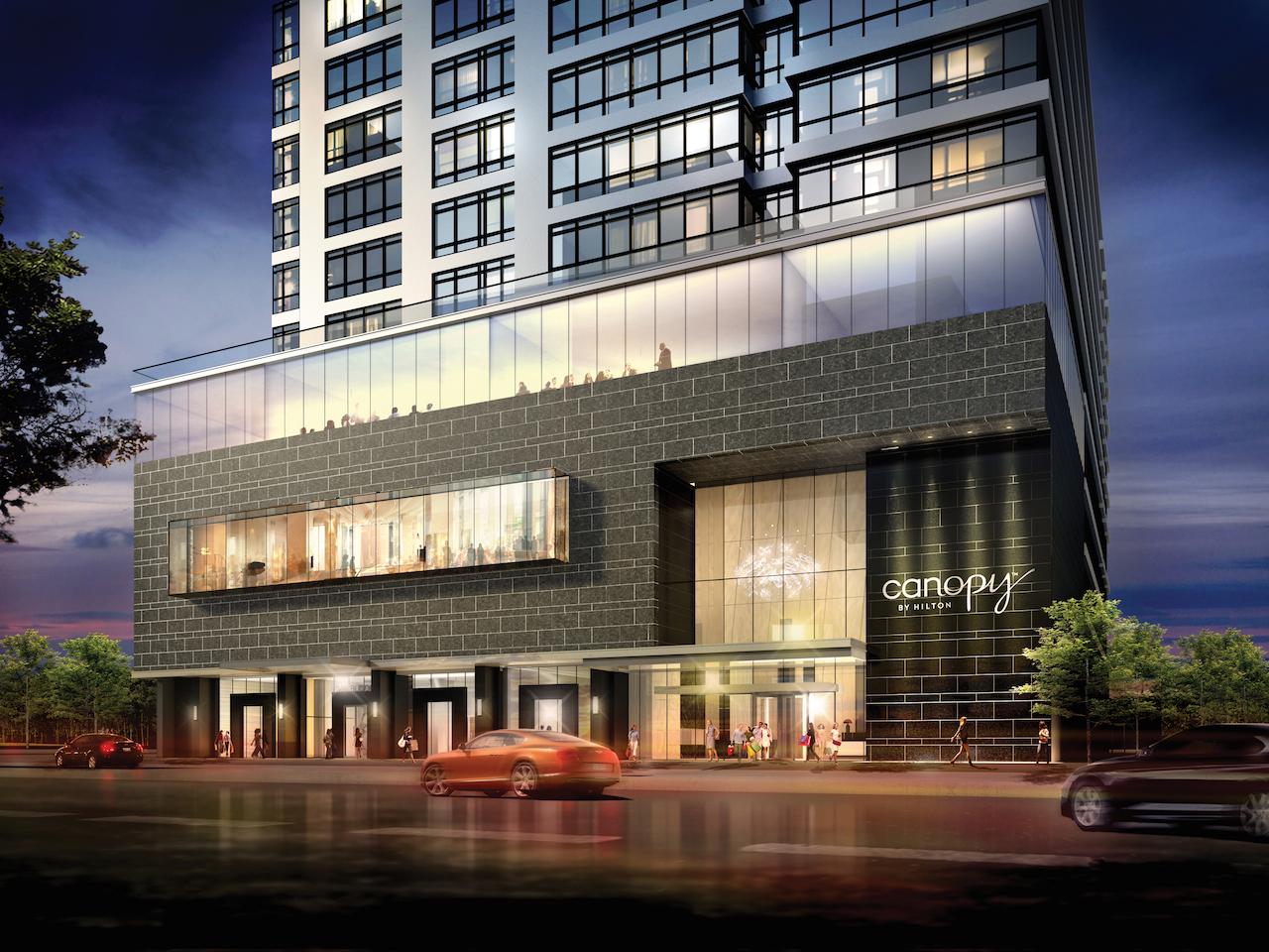
You can always check the renderings in the database file appended to the to top of every project page. Use the arrow on the second rendering to scroll through what we have. Clicking though those in this case will bring yo to this one:

17344-49013.jpeg


…so what the end result may not be exactly the same, it will be close enough to say you won't see those columns.

42
 

Back
Top