At one time, there was no deposit insurance. If a bank failed (which they did all the time), you were left with nothing.

Under those conditions, banks desperately needed to look safe. Hence all the Greek columns and solid stone facings -- they gave the potential client the illusion of permanence and stability.

Once full deposit insurance was introduced, that requirement disappeared, and banks could build the cheapest outlets they wanted.

That's an interesting theory, but it doesn't explain the fine modernist branches that were built across the city in the postwar period, particularly the Don Mills pavilion branches which made ample use of glazing.

Bank architecture has really declined and it's not just new construction that has been affected, but also their older branches which often have interiors stripped of any old trim and exterior facades with generic signage. Fortunately some new branches still see investment in architecture, but I think they're a rare minority.
 
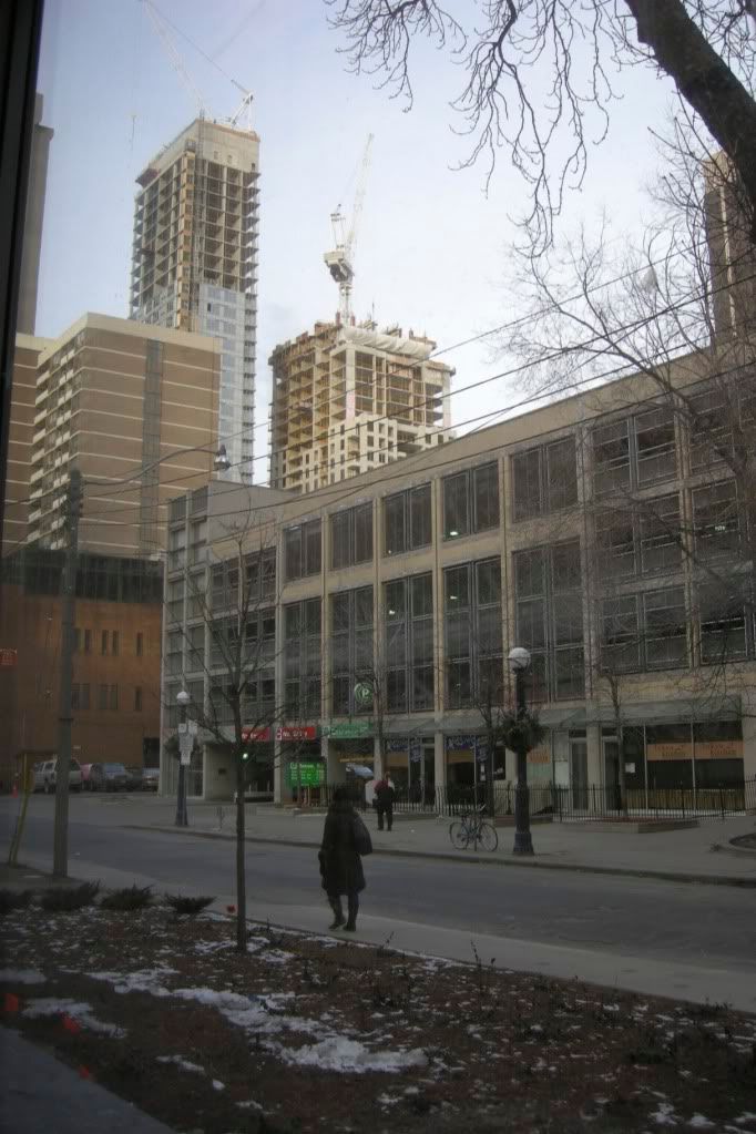
I still wouldn't knock this particular Scotiabank on the "uninspired design" count, relatively speaking--it's a good one for its 80s/90s day. (Another period fave of mine is the PoMo one at Yonge + Orchard View.)
 
The Scotiabank is actually a reclad of an older, brick building. You can see this by looking at its south elevation along that alleyway.

I wonder what it looked like before its extensive PoMo redo...
 
That's an interesting theory, but it doesn't explain the fine modernist branches that were built across the city in the postwar period, particularly the Don Mills pavilion branches which made ample use of glazing.

Well of course a bank could decide to spend more money than the bare minimum if they chose to do so. In the decades after the war, there was still an expectation that a bank branch be someplace where money was visibly spent on the architecture. As time has passed, that expectation has almost totally dwindled away.
 
To contribute to this bank discussion--- Banks were once designed to look prestigious and strike a bit of fear and consciousness into the citizens of a country using that bank-- it was supposed to make them realize the weight and seriousness of spending and so do smartly. However, the light, glass, modernist bank branches were part of the whole "spend all you want! overspend!" mindset, and the idea was to create a welcoming space for people to come and do stupid things with their money, essentially.

I think this is briefly covered in the Toronto book "Accidental City" by Robert Fulford.
 
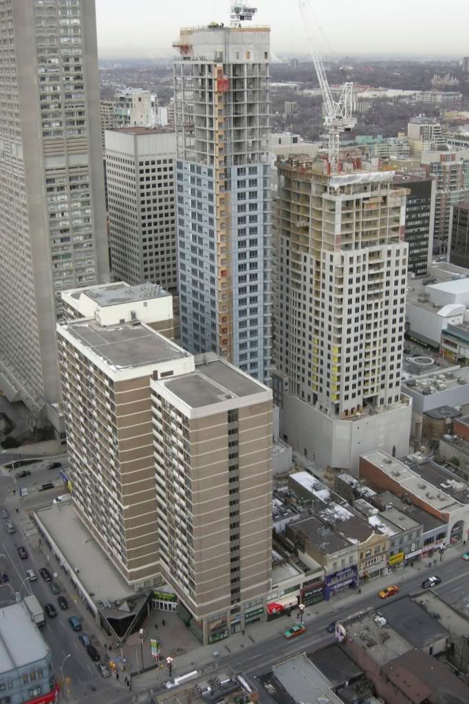
8 Feb 2010: Peek a boo I see you!

dsc00545nu.jpg
 
INCREDIBLE new perspective casaguy!

The 2 projects look fantastic from above! The whole area looks so different too!

Excellent work! :D
 
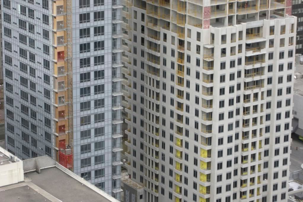
I have to say, Uptown looks surprisingly decent given the concerns we had on this forum. Looking forward to seeing the setbacks.
 
I have to say, Uptown looks surprisingly decent given the concerns we had on this forum. Looking forward to seeing the setbacks.

I agree. Despite its deco inspiration, it looks like they're keeping it simple, and a simple design is difficult to screw up.
 
I agree. Despite its deco inspiration, it looks like they're keeping it simple, and a simple design is difficult to screw up.

What's the aversion to art deco? Whether one gets a good result is usually about execution and details rather than architectural style.
 
What's the aversion to art deco? Whether one gets a good result is usually about execution and details rather than architectural style.

I have no problem with art deco at all. It's just that it's more difficult to execute well. See ROCP.
 
What is that windowless hulk Uptown is sitting on in the back?? Thank Odin that isn't visible from the streets...
 

Back
Top