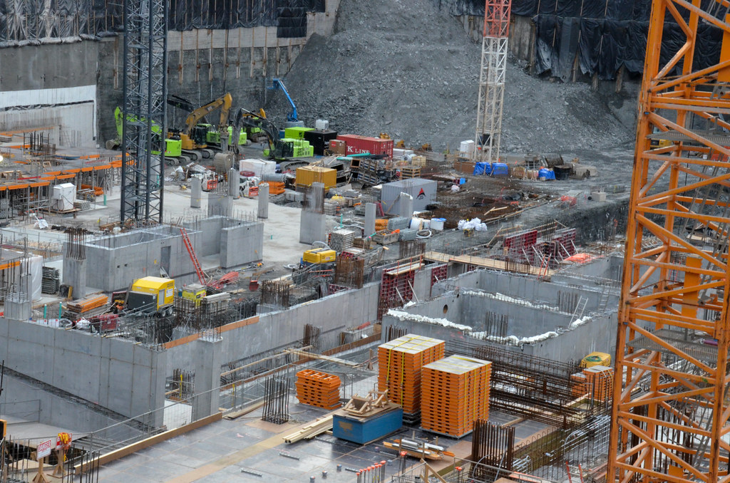
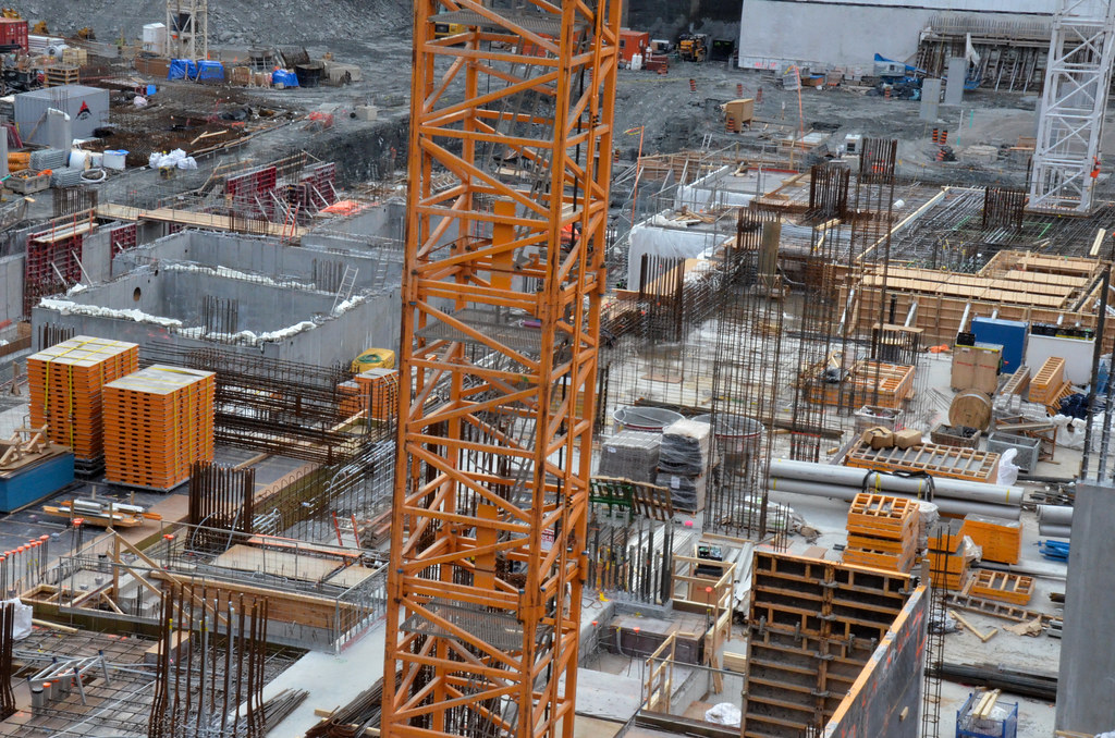
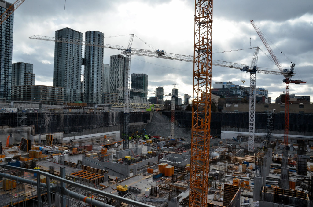
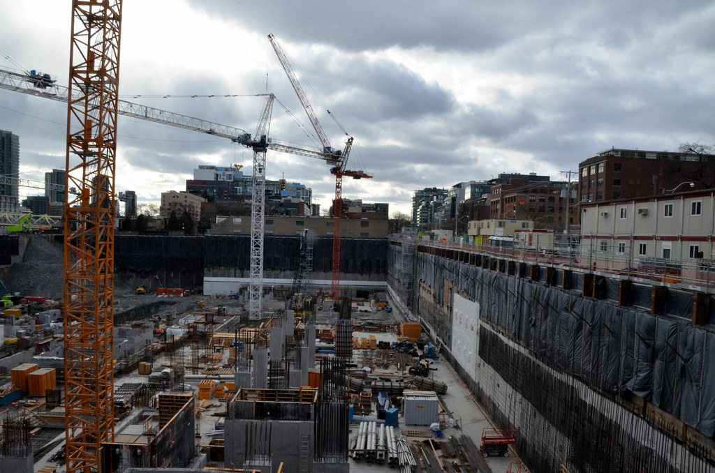
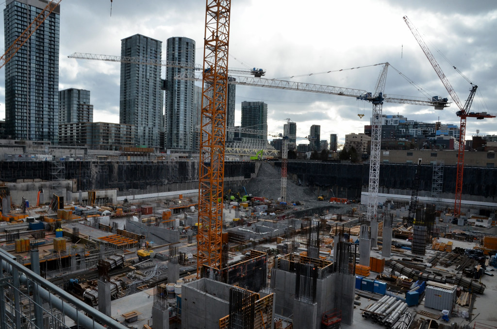
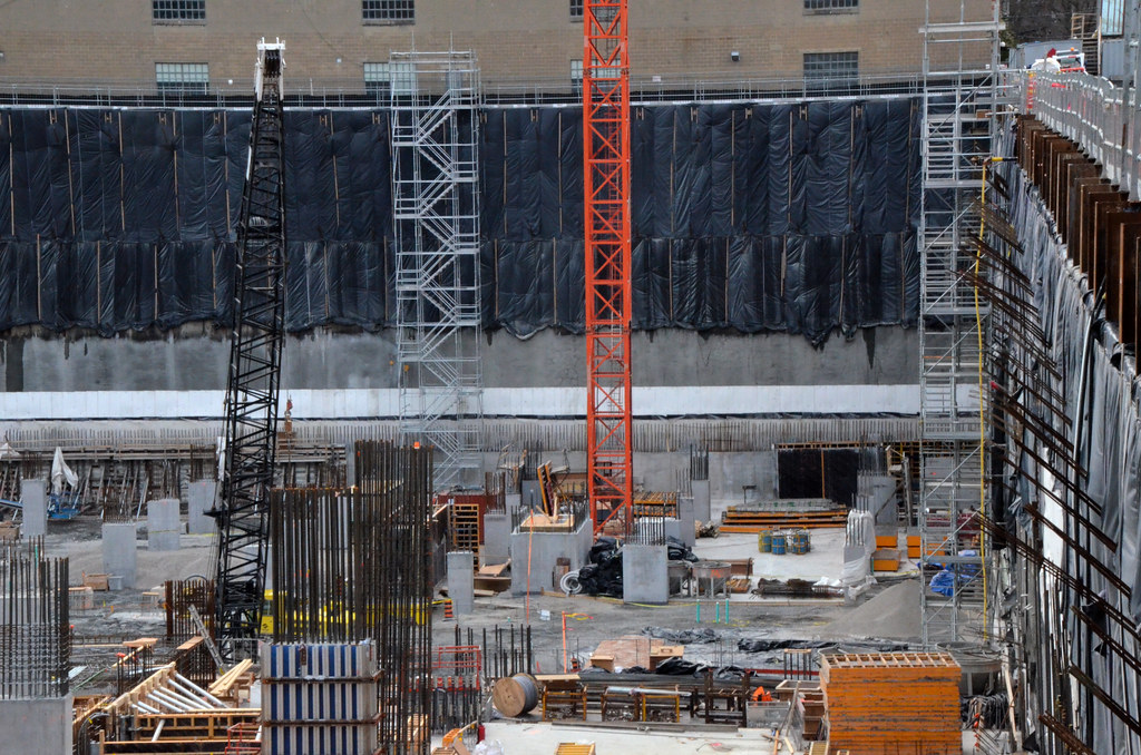
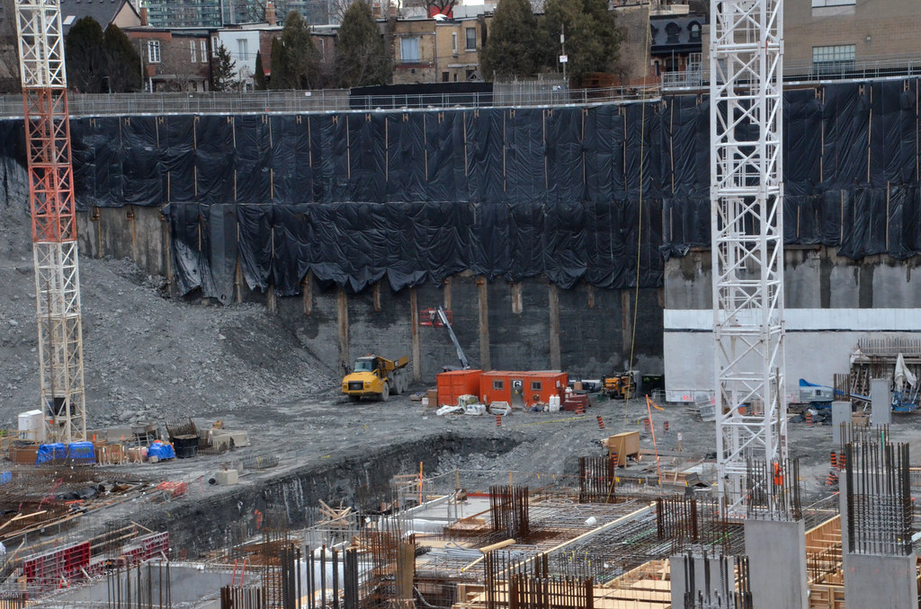
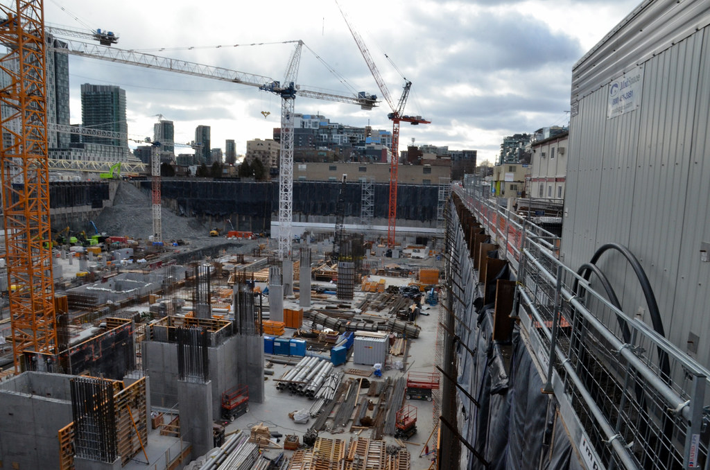
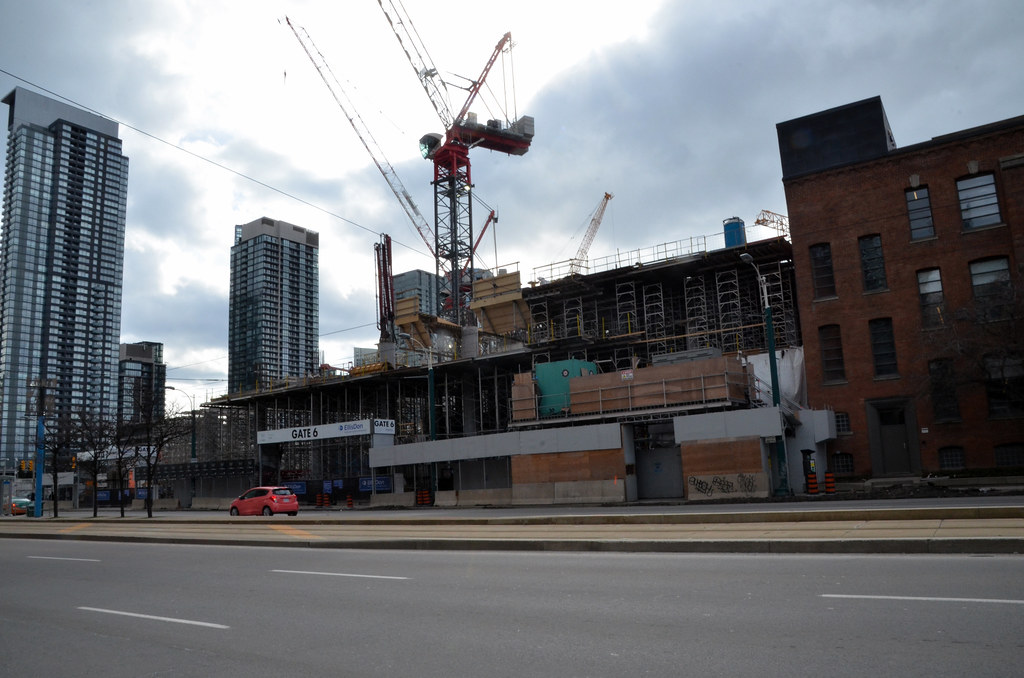
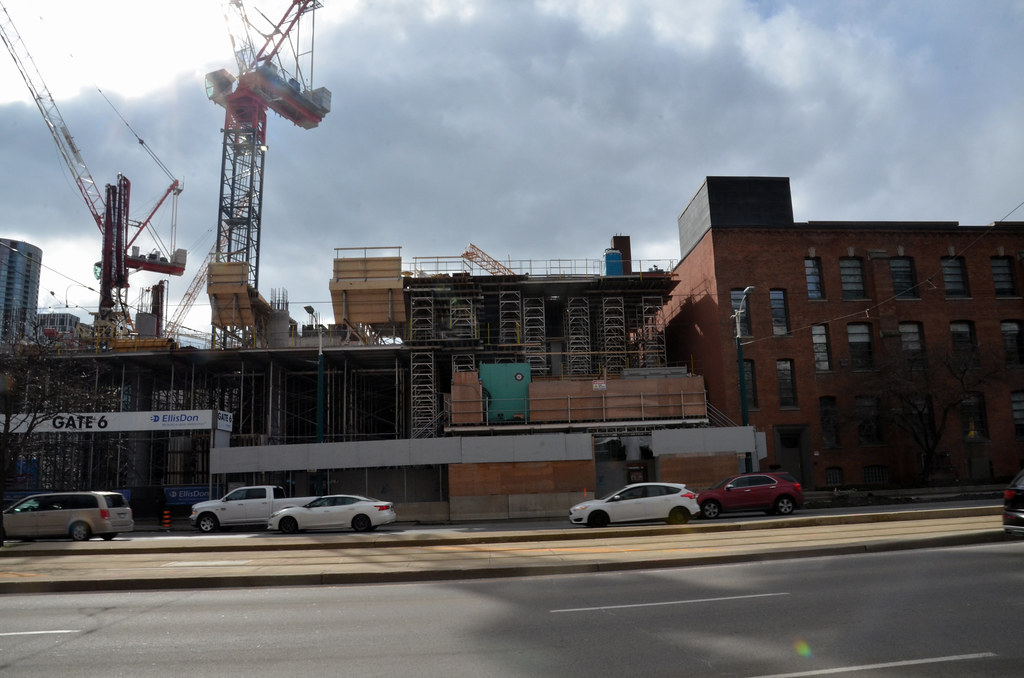
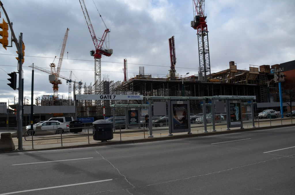
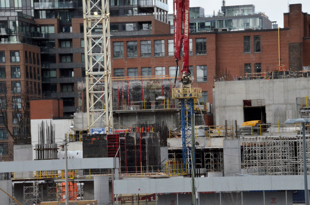
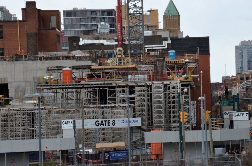
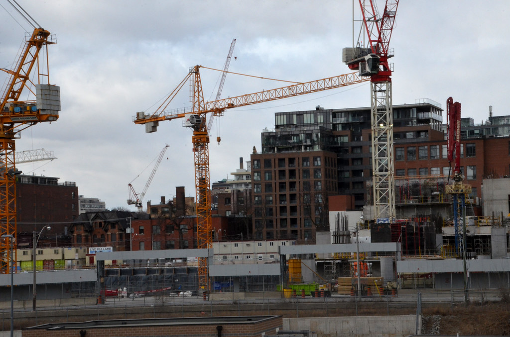
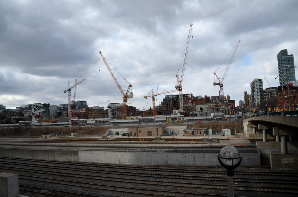
It's at least somewhat more intimate in terms of massing and block sizes for one thing, and isn't completely glass-n-steel in terms of materiality. It looks to integrate itself with its neighbors on Wellington, instead of standing apart from them.
It's not to say that Hudson Yards is a bad project- it revitalizes dead land and the quality of the towers is what we should aim for, but it feel monumental beyond the human scale.
Find local businesses, view maps and get driving directions in Google Maps.

goo.gl
Just look at the scale of that podium! If you overlaid the two projects, the main two towers & mall cover around 60% of the Well's site. Ironically it's the industrial High Line and the materiality of the surrounding buildings that helps humanize the scene.
Find local businesses, view maps and get driving directions in Google Maps.

goo.gl
Even the main public space as well, jumbo-scaled! The pedestrian nature of the square takes a back-seat to Heatherwick's sculpture.
But it's still beautiful and a skyline definer:
The supertall 30 Hudson Yards—New York’s third-tallest building—now offers the best view of the city out there, but its outdoor public spaces leave much to be desired.

www.wsj.com


