AHK
Senior Member
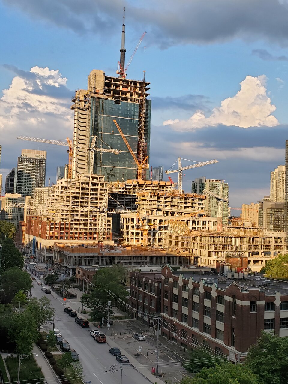
Sunday, June 13 - The Well in the evening sun.

It's a bit like people who don't want to get vaccinated but counting on others to get vaccinated to reach herd immunity (and back to normal)I was looking forward for the podium building with the arches from the get go and am so glad it's looking like a show stopper. The materials are top notch.
On an unrelated note, it makes me frustrated that just across the street we have projects doing the bare minimum (see the Taylor, Canada House or the future 400 Front Street) but are still capitalizing on the great neighbourhood forming projects such as the Well and King Toronto etc... Okay, rant over ///
OK this was very funny hahahahIt's a bit like people who don't want to get vaccinated but counting on others to get vaccinated to reach herd immunity (and back to normal)
To be fair, there's some cheaping out at the Well itself: the white precast concrete above the red brick and low quality window wall on the residential towers.I was looking forward for the podium building with the arches from the get go and am so glad it's looking like a show stopper. The materials are top notch.
On an unrelated note, it makes me frustrated that just across the street we have projects doing the bare minimum (see the Taylor, Canada House or the future 400 Front Street) but are still capitalizing on the great neighbourhood forming projects such as the Well and King Toronto etc... Okay, rant over ///
Looks like cladding has begun on the tallest residential!
View attachment 328101View attachment 328102
Why is it...black? The renderings show the same cladding colour across the 4 south facing towers!Looks like cladding has begun on the tallest residential!
View attachment 328101View attachment 328102