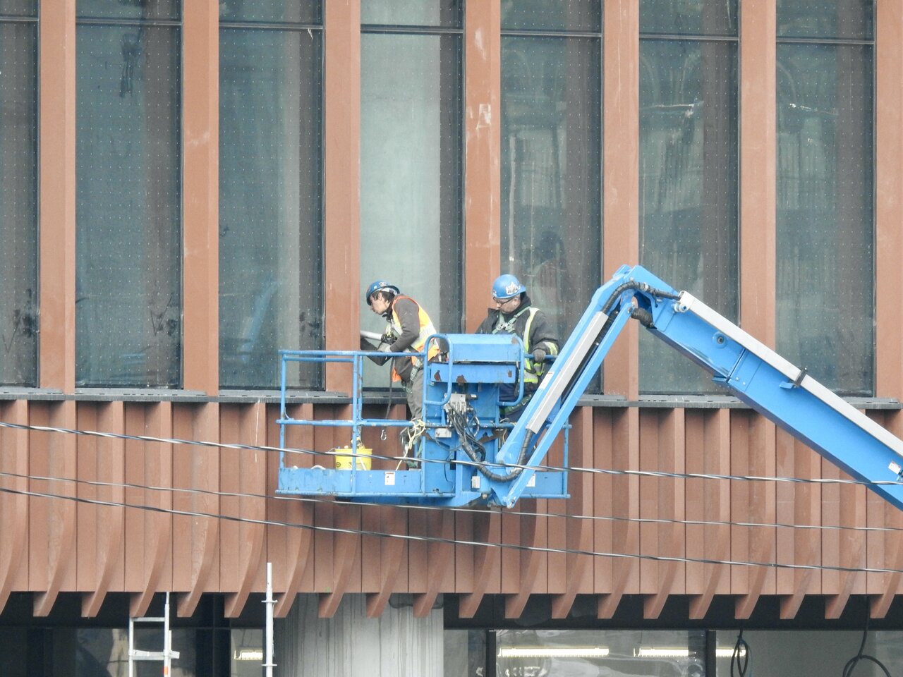
Nov 23, 2022

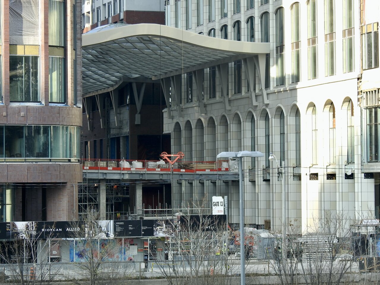
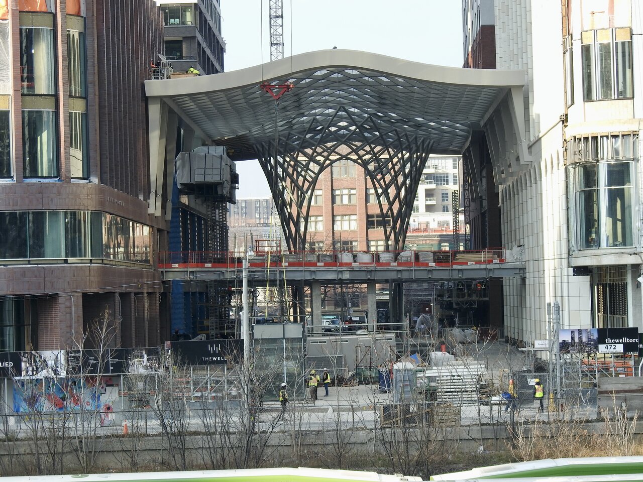
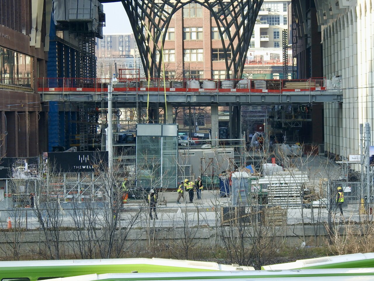
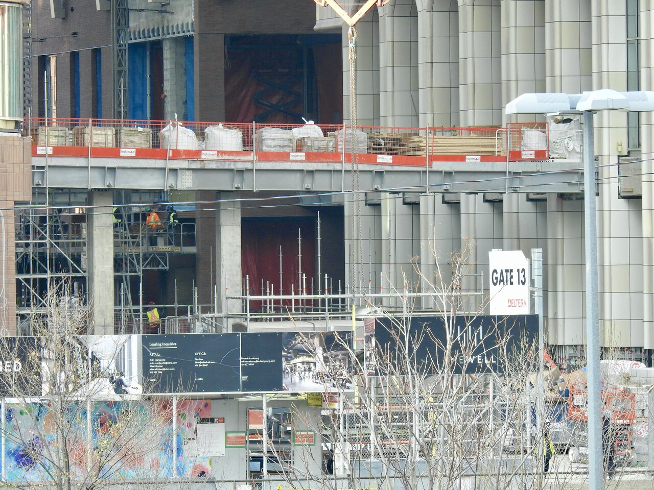
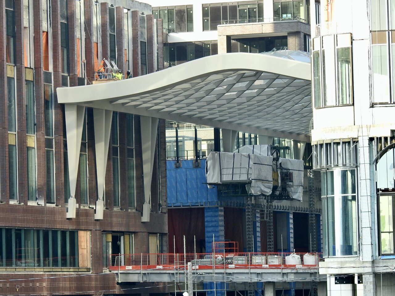
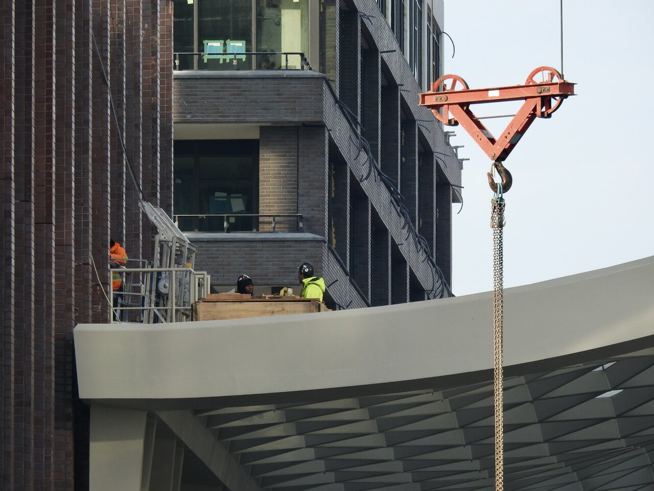
Now that the scaffolding has been removed from under the canopy, we can see the elevated walkway connecting the two buildings.

3CE8F10F-07BB-4FD3-BD9B-7F249E0267D5_1_201_a.jpeg


2AED9701-4FAD-4C09-AFB7-B695A48AB291_1_201_a.jpeg


992DB78A-2ED6-400E-9943-6C7E03A08CAF_1_201_a.jpeg


192950A6-990F-4FCB-AFE7-FC9D8152D332_1_201_a.jpeg


E57A5135-2493-4BA3-9B66-82E23F0CA597_1_201_a.jpeg


4B6D567E-36D5-4851-9406-5F127FDCCC36_1_201_a.jpeg


4535B859-07E1-4631-AC80-0C9370120C91_1_201_a.jpeg


5A700D2A-1581-4881-8D5F-CBB90B93C1F4_1_201_a.jpeg


D7AC9189-75A3-42C9-AF22-2083F9543330_1_201_a.jpeg


11B3713E-6BC9-4F51-A9ED-BB140E72FA21_1_201_a.jpeg
 
Feel like this project is almost done. But it looks like there's a lot more to go...
 
I don't believe these have been posted in thread yet, apologies if I missed it.

Adrian Price, principle at BDP recently shared some images from the 'The Well' with Dan Seljak who posted them on Twitter.

Here they are:

1669819329254.png


1669819356936.png


1669819378157.png


1669819397932.png


I don't believe these have been posted in thread yet, apologies if I missed it.

Adrian Price, principle at BDP recently shared some images from the 'The Well' with Dan Seljak who posted them on Twitter.
Here’s a couple more (they’re actually from Adrian Price’s LinkedIn)

1669829245425.png

1669829665632.png
 
Last edited:
Looks a little like what the Eaton Centre could have been rather than the BS suburban mall that was pitched to city council decades ago. Good to see we learned from our mistakes. Well done!
 
Looks a little like what the Eaton Centre could have been rather than the BS suburban mall that was pitched to city council decades ago. Good to see we learned from our mistakes. Well done!
That is...quite a claim...

The failure of the Eaton Centre was not so much its interior space which was reasonably original and urbane in its initial iteration.

The failure, admittedly, was its relationship to the surrounding streets, most acutely, Yonge Street.

No question that aspect of the development could, and should, have been handled better.

****

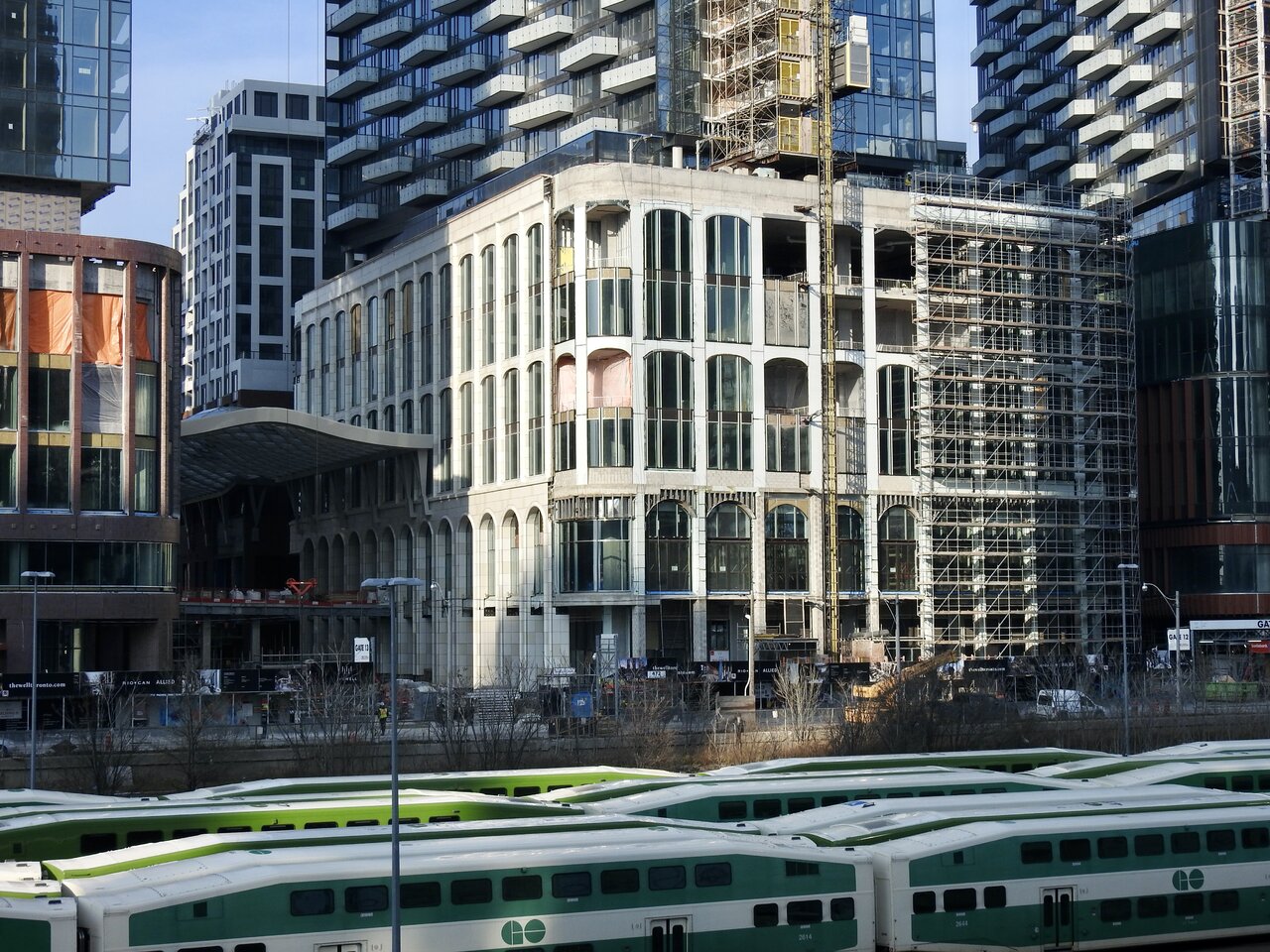
The Well equally has a nice interior (semi-exterior/open-to-the-air) space. Perhaps, when all said and done it will definitively surpass the original TEC interiors; I think it's fair to say the skylight is superior. But I think it may be premature to pass judgement on the balance just yet.

On the exterior, certainly, there are some warmer and more varied treatments than those on the original TEC. But will they actually serve to animate the streetscape with vibrance? Let's hope so; but again, I feel like we're getting a bit too far out front.

The one exterior space I think we can easily award extra points to is the public park/POPs/Streetscape on Wellington. The rest is a bit more TBD.

It's worth saying that TEC is so far from what was first delivered, as is the surrounding area, that it's very hard to draw fair comparisons.

Just try imagining 'The Well' across from several peeler bars, and open drug dealing etc etc. that would have been the case in the 70s.
 
Last edited:
This looks a like a real mall, which I find Canada really lacks. It's incredible, wide open, multi-layered, with absolutely fantastic aesthetic and design choices on top of it all.

This feels like actual architecture here, like the designers didn't want to create just a space but an experience that will be remembered. Cannot say how glad I am to see Toronto have a project like this.
 

Back
Top