Yesterday
7FFCC53B-E59A-4F86-86B6-903756F138FF.jpeg
94477700-1B5A-4521-96A4-A261DB52927E.jpeg
6FB7F805-76CD-4E2E-9CE3-FD85434059A6.jpeg
B206A552-F00E-4312-8E4A-5EEBD238DACA.jpeg
972B8E7A-9674-45FE-9173-80261EE7F870.jpeg
DF2B698E-E7EF-4266-ACE2-B3BCCE83D83F.jpeg
EACA425F-E53F-41F0-B14E-33B6FC83F666.jpeg
C78BB8BA-524D-4B1B-A2CF-5E8C9A55617C.jpeg
E6B9B08A-9F10-4322-8D8C-85A474BA79E2.jpeg
614788E8-3737-4D8A-86A5-05121F531B0B.jpeg
 
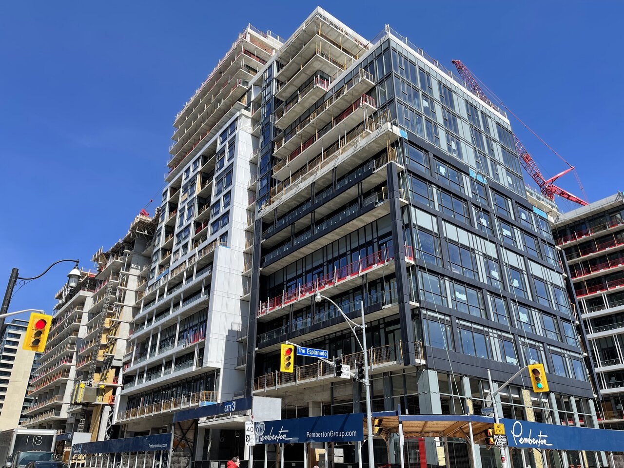
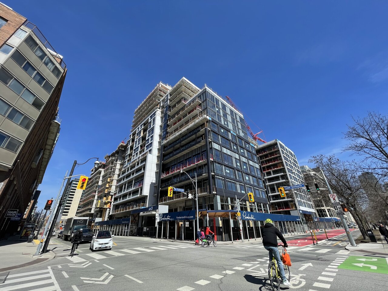
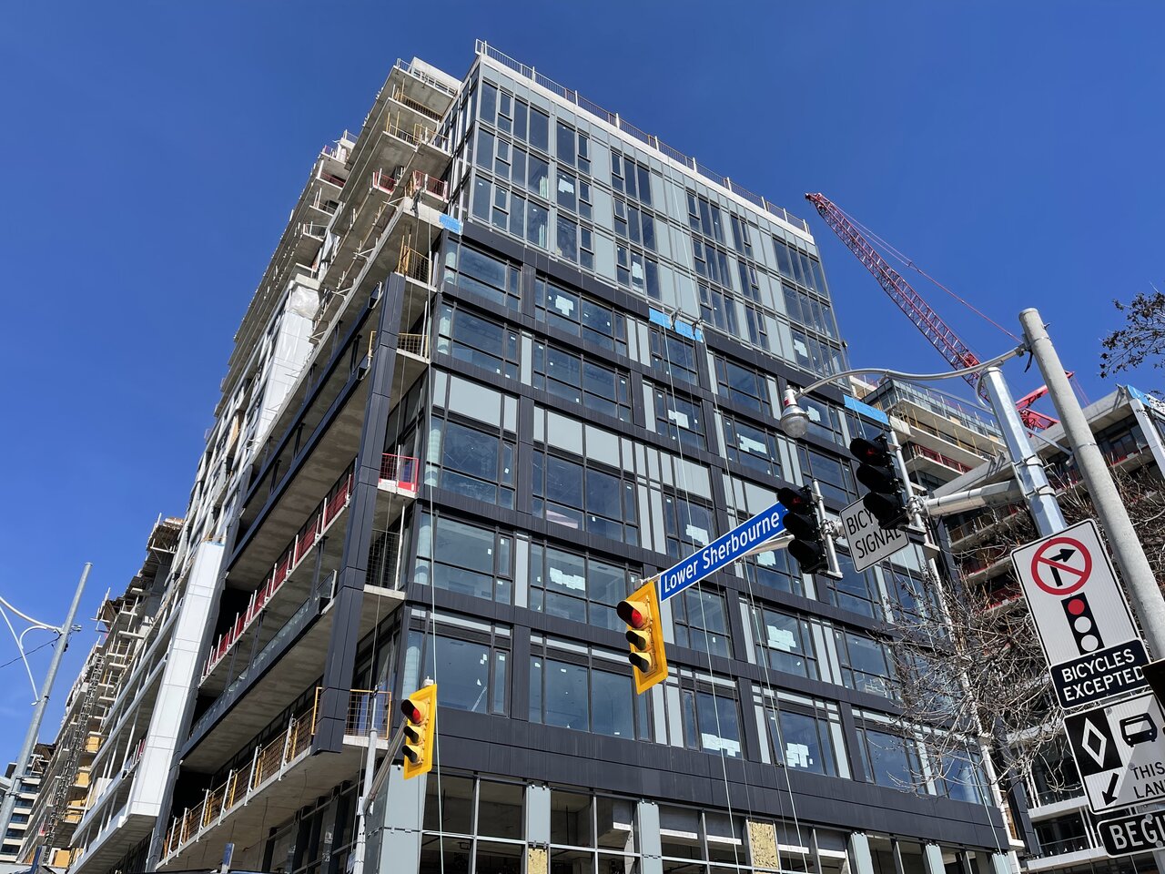
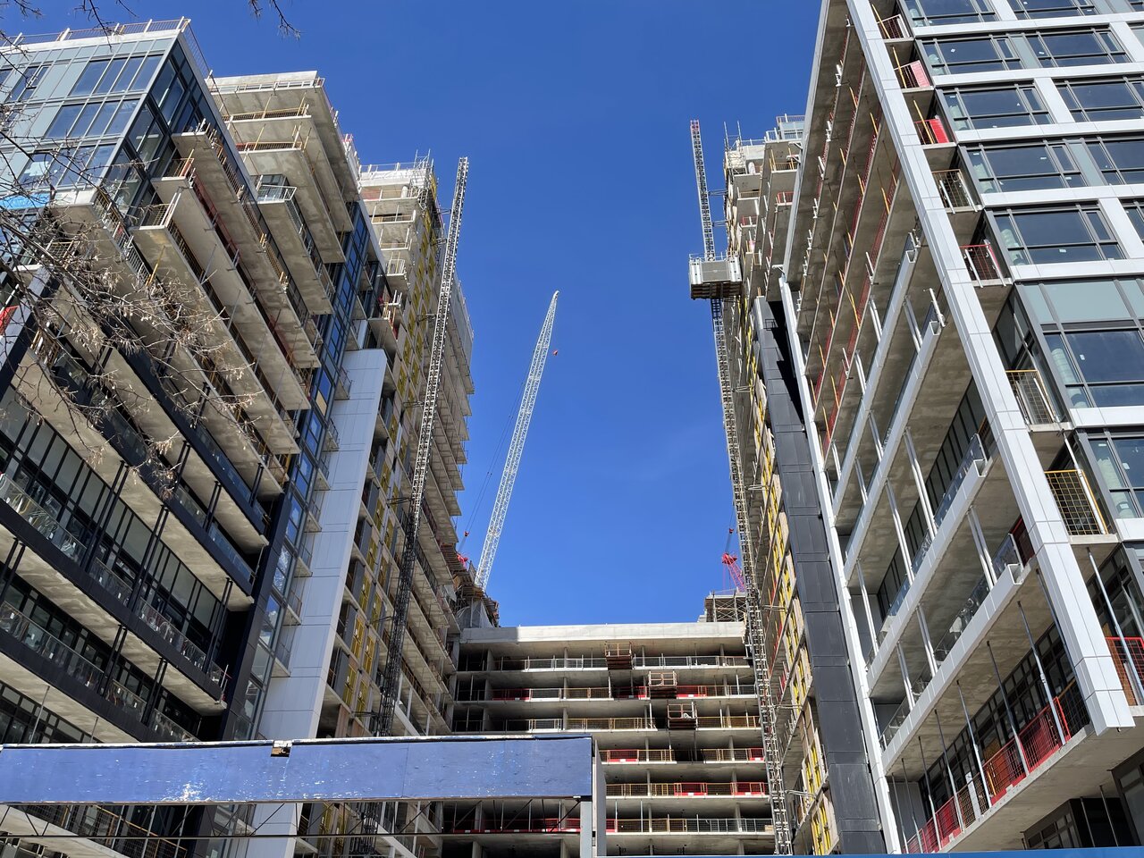
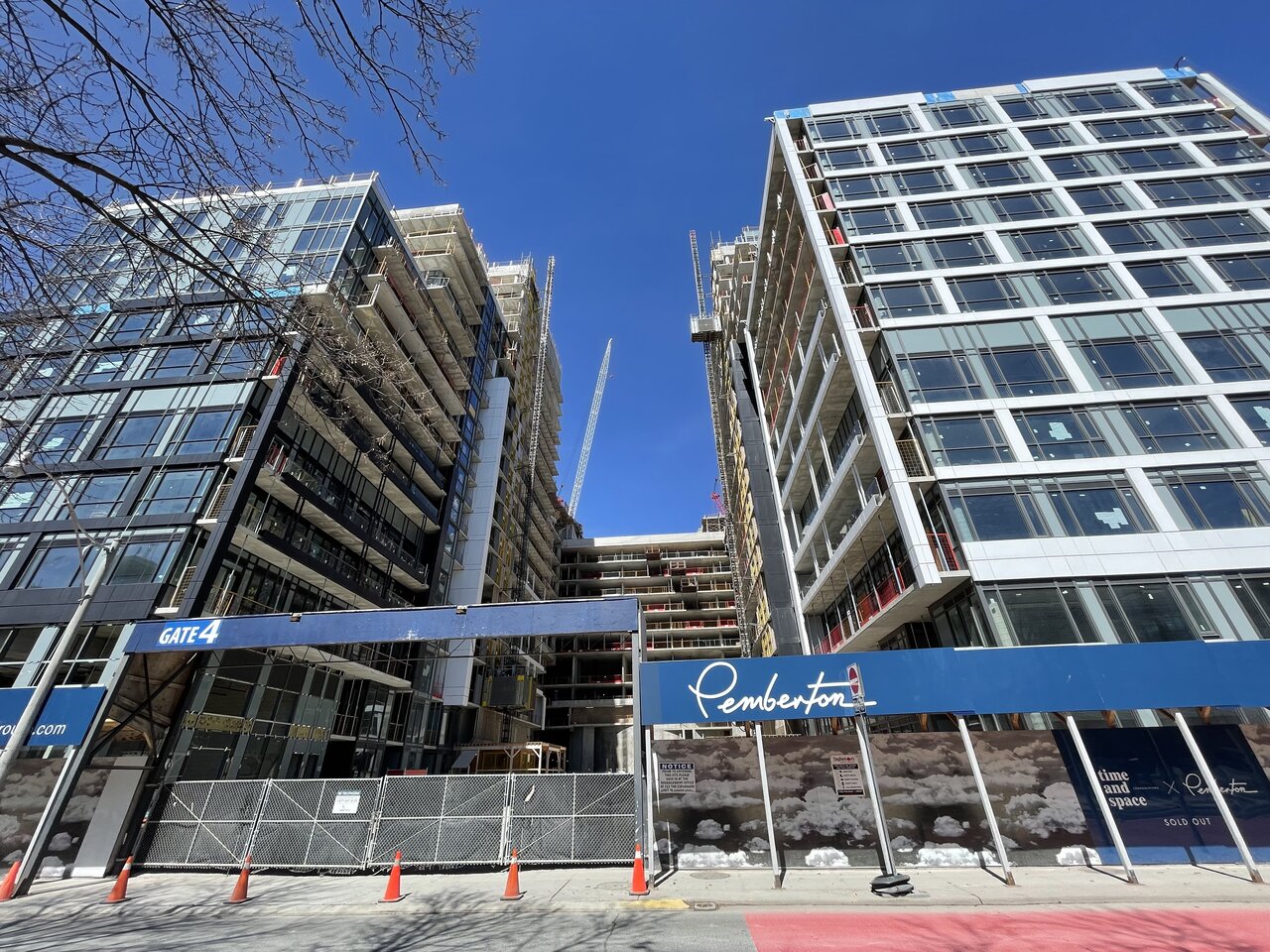
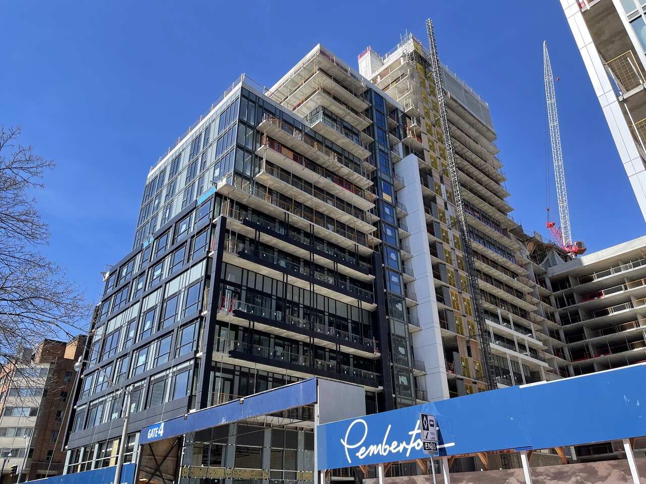
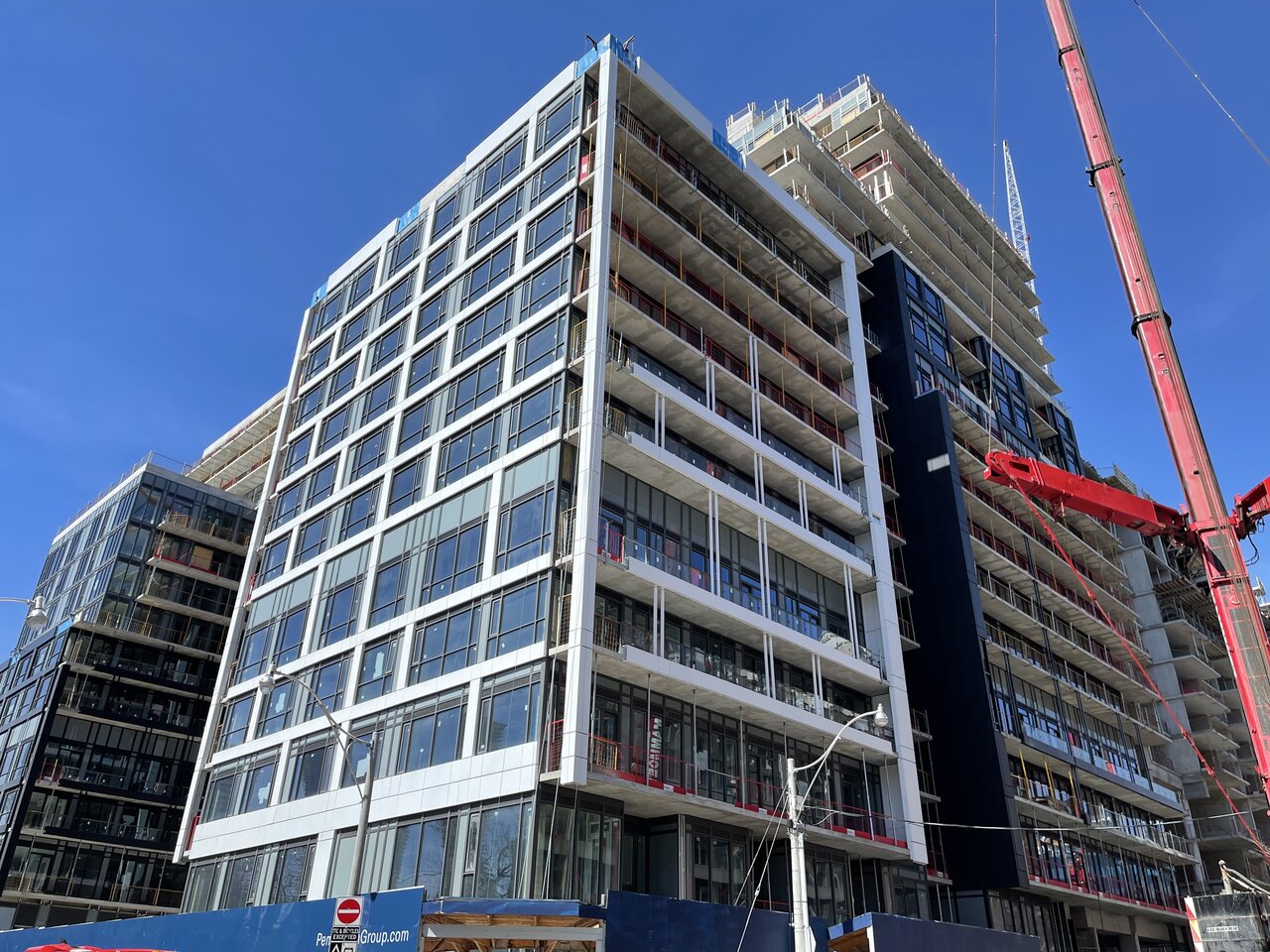
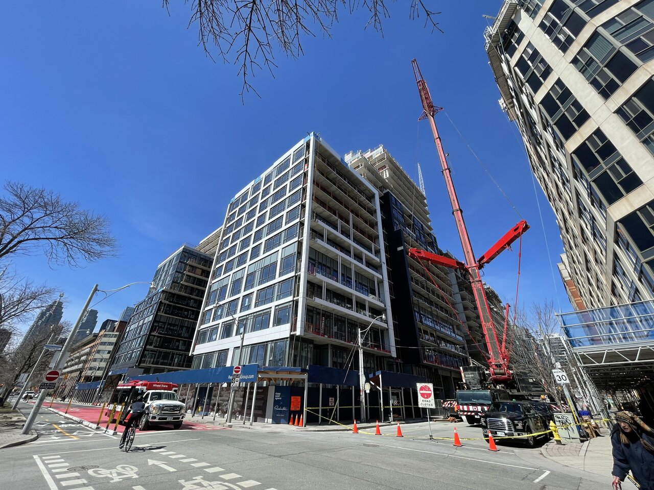
One saving grace (if anything can save Pemberton's signature budget cladding)... in Benito's shots the volumes are sort of starting to read as a handful of different buildings.

Sorta like Mirvish Village with no architects or $$ spent.
 
Last edited:
I was thinking the same. A wee bit of clever thinking to lessen the largess of this behemoth.
 
The lack of symmetry on the spandrel panel placements irks me. Just like what is going on here. The massing is something we'll have to live with. But the bare minimum should've been to at least make the cladding congruent.

Photo by @Benito

6FB7F805-76CD-4E2E-9CE3-FD85434059A6.jpeg
 
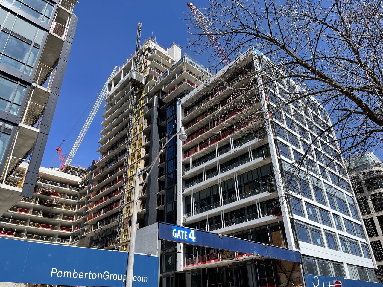
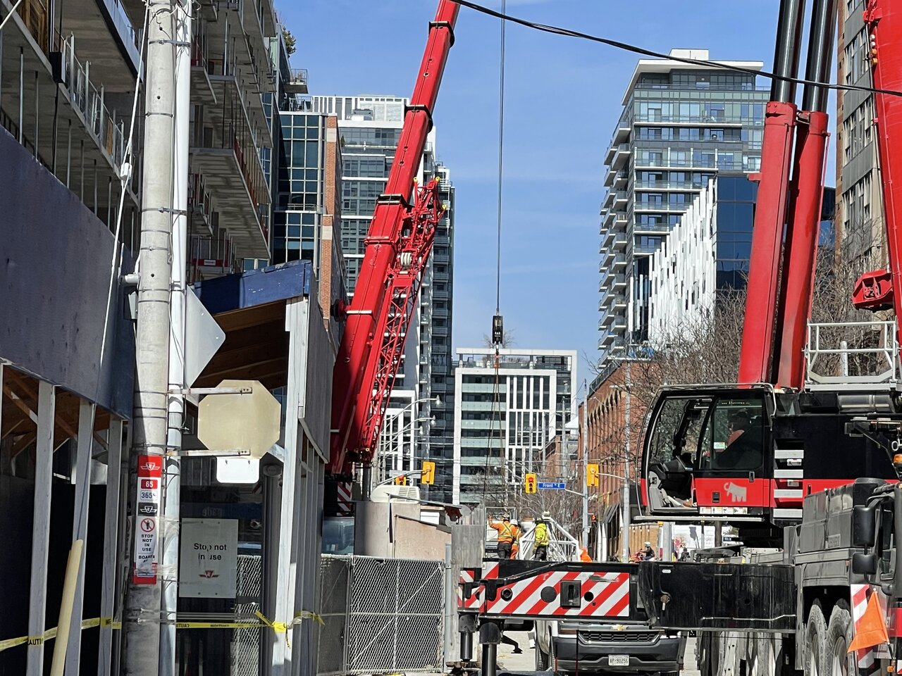
That north wall is gonna be something else when completed. A huge hulking mass of a wall blocking out light on that section of Front street.
 
That north wall is gonna be something else when completed. A huge hulking mass of a wall blocking out light on that section of Front street.
That's why I look forward to this project being completed. It'll be an innovative, efficient means of housing hundreds of families. /s


bah, I can't even find a way to be sarcastic about this project. It's such a poorly designed building through and through.
 

Back
Top