You are using an out of date browser. It may not display this or other websites correctly.
You should upgrade or use an alternative browser.
You should upgrade or use an alternative browser.
Benito
Senior Member
Updates from today. They are finally cladding the decorative bases of the "blades of grass" ornamentation that sprout from the ground and rise up through the balconies. The previously exposed steel beams are being covered in glass. It looks good.


Attachments
Benito
Senior Member
Attachments
Miscreant
Senior Member
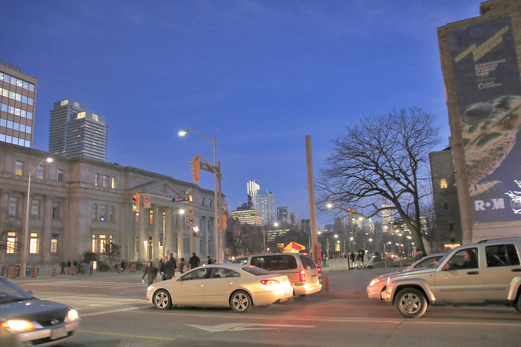
Great shots. Thanks for those. It looks pretty good fronting St. Mary there. I think the brass trim looks a bit off, but maybe it just needs to be weathered a bit to fit in more. It needs to be more subtle.
See they still have the crane up on the eastern building. Hopefully it comes down soon.
See they still have the crane up on the eastern building. Hopefully it comes down soon.
TheKingEast
Senior Member
Pretty boring but a nice addition to the area.
Great pair of posts Benito! That glass on the columns looks like it may just be the masterstroke of this design, and I'm liking the glow on the (brass?) (copper?) now. If it's been treated to keep it from oxidizing, I'll be fine with that, or happy enough to watch the patina develop.
U Condos aren't my favourite architectsAlliance design, but I'm not bored by them. They've turned out pretty nicely overall, better than I expected, and I'm happy to have the blades of grass design there. That's unique.
42
U Condos aren't my favourite architectsAlliance design, but I'm not bored by them. They've turned out pretty nicely overall, better than I expected, and I'm happy to have the blades of grass design there. That's unique.
42
Benito
Senior Member
The metal accents on the townhouses are copper and not brass. There doesn't appear to be any oxidizing so far so presumably they are treated/coated.
junctionist
Senior Member
That's clearly copper. Based on the fact that the podium is meant to blend in with St. Mike's next door, the copper will probably be allowed to oxidize. I hope that if that's the case, some provision has been made for run off, so that the patina doesn't stain the rest of the facade. I remember seeing aA's wonderful Woodsworth College Residence every day when it was new as a U of T student. I always wondered how no one figured out how to deal with precipitation runoff atop the brick podium. The top of the podium was noticeably stained when the building just a few years old. The facade was otherwise flawless.
Benito
Senior Member
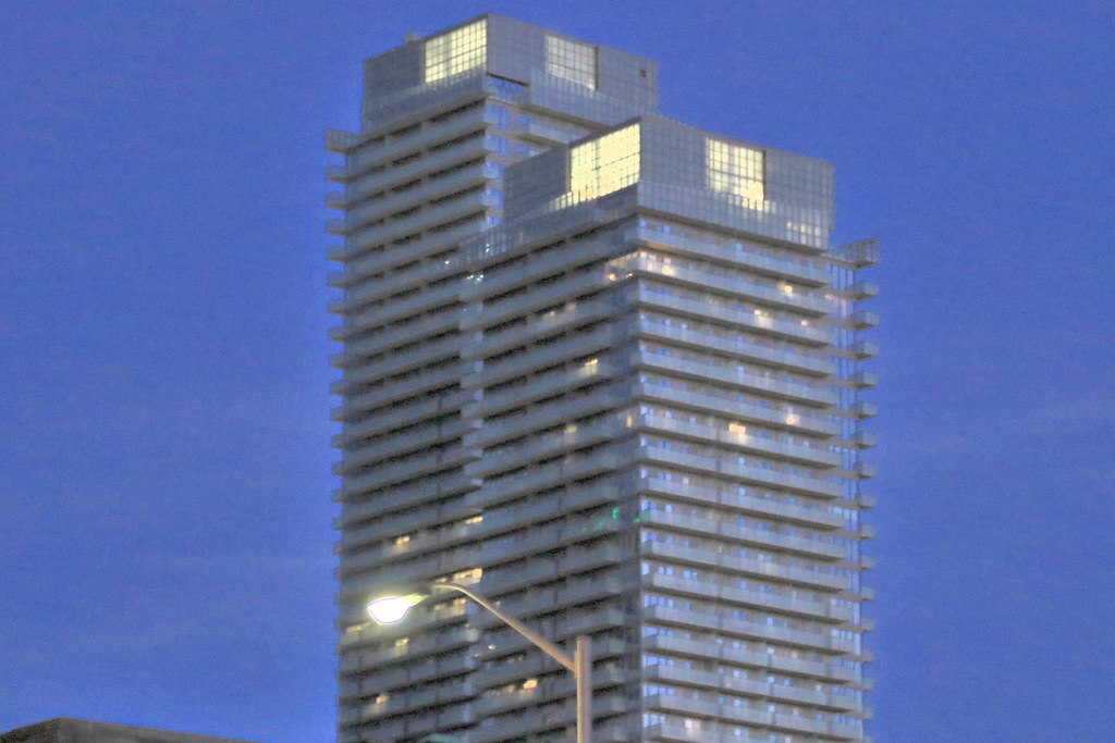
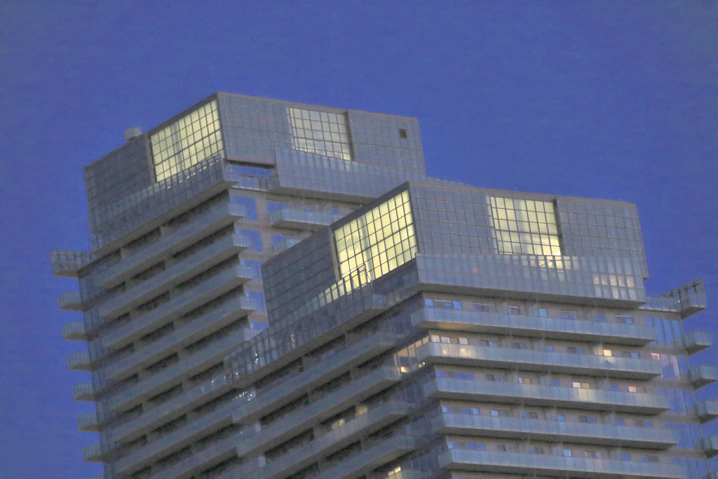
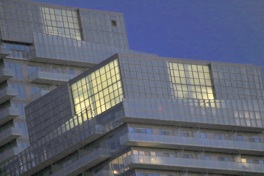
Interesting. It seems that they weren't happy with the cladding on the blades of grass. They have removed what I had taken photos of in the fall and now are recladding them in a darker fritter glass.


Attachments
-
 image.jpeg1.3 MB · Views: 1,256
 -
 image.jpeg1.1 MB · Views: 1,257
 -
 image.jpeg1.2 MB · Views: 1,229
 -
 image.jpeg1.1 MB · Views: 1,254
 -
 image.jpeg1.1 MB · Views: 1,239
 -
 image.jpeg1.1 MB · Views: 1,225
 -
 image.jpeg1 MB · Views: 1,250
 -
 image.jpeg1.4 MB · Views: 1,284
 -
 image.jpeg1.2 MB · Views: 1,246
 -
 image.jpeg1.3 MB · Views: 1,279
 -
 image.jpeg1.2 MB · Views: 1,247
 -
 image.jpeg1.5 MB · Views: 1,265
Miscreant
Senior Member
That darker glass looks fantastic there. Nice.
enrigue8
Active Member
Pretty nice addition to Toronto skyline.
If only all building here were nice like that.
If only all building here were nice like that.
NBGtect
Active Member
That darker glass looks fantastic there. Nice.
I think I like it much better this way. Although the exposed metal columns look good with blank spaces, too. Maybe the condo board (or just vocal residents) had some final say here with this change.
TheKingEast
Senior Member
A lot of nice finishing touches
Vlad353
New Member
There's no condo board yet.... And - as far as I know - nobody cares about residents' say 
drum118
Superstar
Feb 1
