Awesome look from above, courtesy of Norm Li's Flickr photostream:

upload_2017-10-23_11-56-31.png
 

Attachments

  • upload_2017-10-23_11-56-31.png
    upload_2017-10-23_11-56-31.png
    1.4 MB · Views: 2,723
That is a great pic from above - there is actually a lot of cool shapes captured in that photo.
 
Some shots from today's official opening…

The new sign is temporary. Next year, it'll disappear since they'll start building a new front "porch" - the Paul Oberman Belvedere - which will provide both a spot from which people can look down Spadina towards the lake from a slightly elevated position, and a place to hold outdoor receptions. No indication quite yet as to how large it will be, or how close it will approach Spadina Avenue to the south.

DSC05753.jpg


The Paul Oberman Belvedere is funded, fundraising is going on for three more expansions to the project. One would be a new entryway to the lower-level One Spadina Gallery in the building, approximately where the two cars are parked below.

DSC05763.jpg


Two other expansions are possible out the "back", under the hilly landscaping at the north end of the building. The expansions would create dedicated space for the Global Cities Institute and the Model Cities Theatre and Lab. I'm not sure if one of the expansions would include a way to hide the utilities currently hidden behind a rater unsightly fence at the northwest corner… or not. Quite possibly not: we may be stuck with that.
DSC05759.jpg


Inside, the Prinicpal Hall in the heart of the building was the site for the opening ceremony.

DSC05713.jpg


Above, that's Dean Richard Sommer welcoming everyone, and expressing his thanks to a lengthy list of those who made the new building possible. Below, Mitchell Cohen, President of The Daniels Corporation, talked about company founder and faculty alumnus John H. Daniels' values, and his philanthropy which made the new facility possible, having given the school about $24 million and triggering the generosity of many other donors.

DSC05720.jpg


Below, fourth year undergrad student Farrah Michel spoke on behalf of the students, telling the crowd that what they were seeing is essentially just the start, and intimating that there was some more growing into the building to be done. It put in mind for me @modernizt's comments regarding the lack of storage space and issues with circulation that require more thought.

DSC05725.jpg


Following the speeches and ribbon cutting, U of T Music Faculty students performed Talking Heads' This Must Be The Place to end the formal part of the ceremony.

DSC05733.jpg


Here's the new of the Principal Hall from the graduate students' lab overlook…

DSC05734.jpg


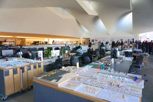
…and here's the lab, with pretty much every square inch used already.

DSC05738.jpg

DSC05742.jpg


A townscape maquette that caught my eye:

DSC05740.jpg


Beyond the lab where things are in-progress, there are displays of completed student work throughout the hallways:

DSC05746.jpg

DSC05747.jpg


The library has some lovely spaces, both in the heritage building and new construction immediately adjacent:

DSC05748.jpg

DSC05749.jpg


And that's it for this post, all 15 photos that our software will allow per post. More on today's events can be found on our front page.

42
 

Attachments

  • DSC05713.jpg
    DSC05713.jpg
    223.6 KB · Views: 960
  • DSC05720.jpg
    DSC05720.jpg
    188.5 KB · Views: 967
  • DSC05725.jpg
    DSC05725.jpg
    183.9 KB · Views: 993
  • DSC05733.jpg
    DSC05733.jpg
    228 KB · Views: 962
  • DSC05734.jpg
    DSC05734.jpg
    369 KB · Views: 959
  • DSC05738.jpg
    DSC05738.jpg
    189.7 KB · Views: 1,082
  • DSC05740.jpg
    DSC05740.jpg
    231.4 KB · Views: 934
  • DSC05742.jpg
    DSC05742.jpg
    247.4 KB · Views: 1,034
  • DSC05746.jpg
    DSC05746.jpg
    192 KB · Views: 909
  • DSC05747.jpg
    DSC05747.jpg
    183.9 KB · Views: 924
  • DSC05748.jpg
    DSC05748.jpg
    251.8 KB · Views: 995
  • DSC05749.jpg
    DSC05749.jpg
    228.4 KB · Views: 986
  • DSC05753.jpg
    DSC05753.jpg
    456.1 KB · Views: 1,126
  • DSC05759.jpg
    DSC05759.jpg
    498 KB · Views: 934
  • DSC05763.jpg
    DSC05763.jpg
    249.8 KB · Views: 1,025
It's strange that a faculty of landscaping would fill so much of the landscape with generic poured concrete. Every aspect of this project should have been an example of best practices, but the landscaping and heritage restoration is underwhelming. Some of the complaints regarding the new building from students have been quite pointed as well.
 
Which signage is temporary? The "Daniels Building" affixed to the building above the front doors, or the signage in front of the front doors? Hopefully both... they're unsightly. The big one moreso.

Very concerned about this belvedere thing. Anyone have more details or a rendering of it? Is it a separate structure to go on the front lawn, or is it something they're going to affix to the building's front entrance?

IMO the front looks grand as it is right now, all cleaned up. They need to be very careful how/what they do, because there is high potential to uglify it.


In agreement with comments about landscaping being underwhelming. Not enough large vegetation around the front... how about a tall columnar tree or two, or a hedge, or something
 
This whole project is mouth-wateringly beautiful. AFAICT every element from cutting edge new design, heritage restoration, handsome landscaping, and re-emergence of an important view corridor has elevated this dusty forgotten old afterthought into one of Toronto's most striking and, hell, even postcard-worthy visages (esp. when those flashy new streetcars whiz by--giving the whole sweeping expanse a veritable European alpha city on the move look to it.

Kudos to everyone involved! This is the rarest of achievements in Hogtown--a noble, well intentioned plan with a promising design which got better and even more dazzling with each stage, until it finally emerged--Steve Nash like-- from relative obscurity into a total WOW! for the ages.

What surprises me the most is that this iconic project--a new downtown architecture school no less-- has only inspired 14 pages of comments thus far in a forum dominated by architects and those who worship architects. Less, feedback, I'm sure, than some of the most mediocre condos ever raised in this city.
 
Last edited:
It's strange that a faculty of landscaping would fill so much of the landscape with generic poured concrete. Every aspect of this project should have been an example of best practices, but the landscaping and heritage restoration is underwhelming. Some of the complaints regarding the new building from students have been quite pointed as well.

What were some of the complaints? I'd like to consider them the next chance I get to observe the building.
 
What were some of the complaints? I'd like to consider them the next chance I get to observe the building.

Master's studio specifically (as these are the types of issues raised in recent student surveys which were presented to the faculty):

Work Space:
Smaller desks than in the previous building, certainly too small to model at or do anything other than use a laptop (without drawings out). No drawer. Poor ergonomics; the height of the desks and chairs are incompatible. Anyone who has been through architecture school knows how important your workspace in studio is; you practically live there.

Storage:

Nowhere to put personal belongings, no flat storage, no model storage, not enough lockers so the ones on the main level are for undergrads only, no space to post drawings at your desk or in your section. Between this and the space issues listed above, it is a crime that an architecture firm could come up with something so lacking in the most basic needs of the student body. It's a head-scratcher for all of us.

Circulation:
The circulation is awkward to begin with (huge non-rectangular open space with islands of desks) but particularly the fact that perimeter walls are used for pin-ups/presentations which means the circulation spaces are crowded with people on presentation days. This makes for frustrating circulation on those days especially (when you need to go to a bathroom or the printing station, you are tripping over other sections or disrupting them). If a fire broke out it could be problematic.

Acoustics:
The studio is one contiguous space that features a shapely ceiling perfectly sculpted to cause sound to bounce off in every direction. The parabolic forms pick up certain sounds from one part of the studio and direct it to elsewhere. This means that in a presentation, you generally cannot hear the person presenting 5' in front of you, but can hear conversations from students working elsewhere in the studio surprisingly well. Without any divisions or break-off spaces for presentations, the studio becomes one big echo-chamber most days. It's nicest to work there in the evening when it's quieter. Given that the acoustics will be almost impossible to dramatically fix (that ceiling treatment isn't changing anytime soon), the idea of the collaborative studio space is likely to be abandoned in order to hold crits in other rooms, mostly in the heritage block at the south end of the site. This seems to work much better for presentations, but undermines the whole point of a studio space designed for collaboration and multiplicity of functions.

Plumbing & Amenities:
The building seems to have used some creative methods for calculating its occupancy, because its plumbing provisions are underserving the student body. It would also be nice to have more than one water fountain per floor. There also seems to be no dedicated lounge space outside of the studio, or a proper kitchenette. On the second level there is a proper kitchenette for undergrads; for Masters students there are currently a couple mini-fridges and microwaves on carts scattered around studio. Again, we essentially live in the building so it would be nice to have some level of student amenity other than the rumoured lounge on the main level.
 
The building is gorgeous, but obviously that is not enough. I don't mean this to sound trite; there's no school in all of the U of T which is better suited to tapping its own faculty and students to fix the issues here. No doubt it's going to take more than just better use of existing space, so I am curious about what physical changes will be made in upcoming months and years to tackle the problems. @modernizt, hopefully you'll be able to let us know about any solutions that improve the situation.

42
 
Awesome look from above, courtesy of Norm Li's Flickr photostream:

View attachment 124972
What an amazing urban space this development has given back to the city! From above, it looks like something you'd see in London or Berlin. Aside from the older homes in the northwest segment of the ring(which are charming and hopefully will never be lost), the only disappointment is the utter mediocrity of the buildings around the circle. It's a shame that they were constructed at a time when little consideration or sympathy was given for the curves of the circle. Hopefully as downtown expands ever westward, someday we'll see new complimentary architecture that follows the contours of the circle and only enhances this "new" public realm!
 
Last edited:

Back
Top