U of T's Business Board gets periodic updates on Major Capital Projects.

This is the newest one for this project. Note some key dates in the graphic:

1643404937735.png
 
They have re-opened the pathway through the medical science building from king's college circle to queen's park. However it looks like they might now be closing the other end of it very soon
 
They have re-opened the pathway through the medical science building from king's college circle to queen's park. However it looks like they might now be closing the other end of it very soon

I think they would need to retain a connection to the building at that end...... but we shall see.

Doesn't surprise me that the stairs on that end will come down, they are in rough shape and over due for some work.
 
Pics, Taken March 9th, 2022:

Just one from the Hoskin end of the project, some modest progress here on the stands:

DSC06910.JPG


Moving on the heart of the project and campus:

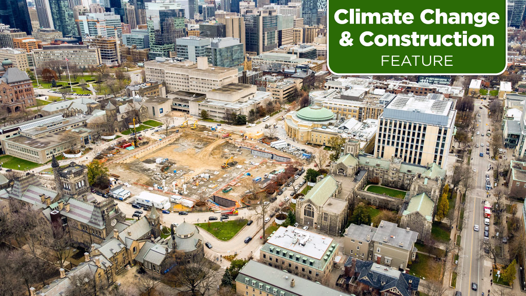
I now see why that diversion road was put in place, this is where the ramp to the parking is going in:

DSC06911.JPG


DSC06912.JPG


Looking at the this part of the project from other angles:

DSC06917.JPG


DSC06918.JPG


DSC06919.JPG


Now about those steps from King's College Circle to Med. Sci, @Student99 was not kidding, demo 'in progress. And, I guessed wrong, they're not keeping any access to the building from this side, you now have to come in via Queen's Park Cresc.

DSC06914.JPG


DSC06915.JPG


Which brings us to those stairs that took an infernal amount of time over on the Queen's Park Crescent side.............. Well......they didn't exactly replace them........they re-graded them out of existence:

DSC06924.JPG


New drainage swale, I'll be curious to see how they landscape this:

DSC06925.JPG


DSC06926.JPG


Lastly, we need to talk about the new lighting:

DSC06928.JPG


There are many things I like about this project; this is not one of them.

I find the design inelegant; ahistorical, a bit tall frankly, and too promoting of light pollution. Too bad.
 
Lastly, we need to talk about the new lighting:

DSC06928.JPG


There are many things I like about this project; this is not one of them.

I find the design inelegant; ahistorical, a bit tall frankly, and too promoting of light pollution. Too bad.
I agree, U of T St. George is mostly historical and therefore should reinforce that feel. There are some paths where there will be historical lighting, but most of it will be contemporary.
Unfortunately, this isn't even a good contemporary design.
I also think that even though the campus is gonna look nicer, the overall landscaping design could've used some detailed refinement.
 
I am pretty sure the lighting is designed with safety and accessibility in mind. There will be excess lighting, and this is fine in my opinion.
 
I am pretty sure the lighting is designed with safety and accessibility in mind. There will be excess lighting, and this is fine in my opinion.
On the contrary, it spreads lighting where it isn't needed. Instead of focusing on the pathways, it spreads it into areas that don't need it, not to mention how that light pollution is bad for the environment and takes away our ability to see the night sky. I also believe that lighting should be attractive, either by improving the nighttime aesthetic of a landscape/building or by expressing a beautiful form.
On the other hand, the campus' historical lights have the same issue of not being dark-sky compliant and spreading excessive glare.
 
I think this is a case of safety of women is more important than seeing the night sky on campus.

This is a false trade.

No one is suggesting dim lights or no lights.

There are two issues, one is the style of the fixture. If one was indifferent to light pollution, you can still make a historical looking fixture that broadcasts light widely, the city has an ample supply of these in fact, and so does the university.

The second issue is the excess spread of light, not so much over horizontal area, as vertical.

No one is hiding in the night sky to jump on someone from 8 storeys up. Not happening. The light does not need to go there, it does not add any safety factor.

Even at grade level, this is a very open section of landscape with very clear sightlines, along a busy road with streetlights, meaning it is more than possible to light areas brightly that are on the path, close to the path, or adjacent to buildings without spreading it where it adds no value.

I hasten to add, while there is some risk of danger in public places, by far the greatest risk of assault, sexual or otherwise comes from the person/people someone lives with or otherwise knows.

Stranger assault is, fortunately, exceedingly rare. Which, again, is not to argue against sensible precautions including proper lighting. But blinding, wasteful lighting is not shown to add any safety factor.
 
I find the lighting choice strange as well. I liked the more historical-looking light fixtures U of T had up before this. Most of the campus had them. It seems like they are diversifying fixtures again after a period of more uniformity. The new Robarts area has yet another type of lighting fixture.

Also that new ramp pathway looks too narrow. The plaza that used to be there was quite expansive and handled the foot traffic well.
 

Back
Top