I'd probably choose the 2nd proposal, if it were up to me. Bringing back the Hart House pond is a must.

Can someone provide some context to this comment? The only Hart House pond I've ever heard of before now is the one at Hart House farms (a property owned by UofT http://harthouse.ca/wp-content/gallery/farm/farm_sm_2007_13.jpg)

The skating halo in the Janet Rosenberg proposal is an interesting idea, although I'm skeptical that it's a realistic idea. I like the DTAH + MVVH proposal the most, although I do really like the pond of the Public Work proposal.
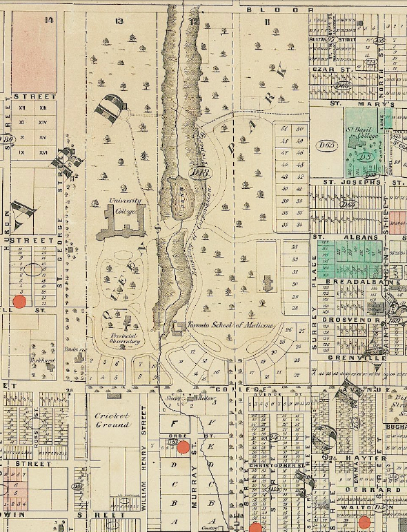
 
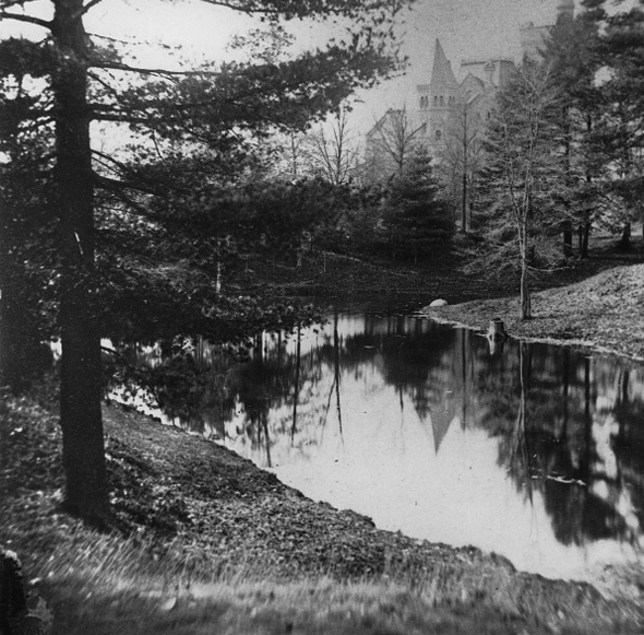
Can someone provide some context to this comment? The only Hart House pond I've ever heard of before now is the one at Hart House farms (a property owned by UofT http://harthouse.ca/wp-content/gallery/farm/farm_sm_2007_13.jpg)

It's the Taddle McCaul Pond:

20120329-Taddle-Map.jpg


20120329-Taddle-University-College.jpg


http://www.blogto.com/city/2012/03/a_brief_history_of_taddle_creek_torontos_lost_treasure/

AoD
 
4. The Public Work proposal is a non-starter in my onion because the space in front of the Pritchard Alumni House and Convocation Hall are well used by public events and they offer nothing here. The Plaza would have been better suited in the opposite corner. Their use of the bridge and pond is the best use of that space of all the proposals though.

3. KPMB Proposal is very pretty in renderings, but the grass along all the walkways around Kings College Circle would look extraordinarily shabby over time.

2. Janet Rosenberg Proposal is pretty decent in the KCC section. The Hart House lawn section is a disaster with all the winding walkways that force pedestrians to use routes they'd rather not use. And the reflecting pool. The reflecting pool is a nice idea in trying to make a sense of place, but...

1. ...the DTAH proposal has much better multiple place-making sights that could reinvigorate this section of campus. The coziness of the pond and design around it reflects the small places for reflection on the rest of campus. This space still maintains pedestrian desire lines without giving up anything. The spaces in front of Convocation Hall and Pritchard Alumni House will be well used and this proposal designs those spaces the best in terms of meeting day to day and large event space. The arrival gates look like a fun way to enter and exit.
 
When competitions like these occur, are aspects from the different proposals ever combined (is that even allowed?)? I like the DTAH + MVVH proposal the best, but I would prefer to see a larger pond and with a more organic shape. The pond, as proposed, looks similar to the one at Corktown Common; which is nice, but the water is barely visible because of all the vegetation on its banks and in the water. I wouldn't want to see something similar here.
 
Pretty awfully written - and funny they don't seem to be complaining that they are going to a university with plenty of spanking new buildings, which by world expectations is a pretty privileged thing to begin with...

AoD
 
Well, they picked the least interesting proposal IMO --

http://news.utoronto.ca/winning-team-picked-transform-downtown-university-toronto-campus

It seems like such a conservative choice, almost too deferential to the past. Thoughtful tree canopy and higher quality paving are nice, but it doesn't take any chances at all. No big design gestures. I thought the DTAH proposal was the best -- great for improving the area with interesting design elements that made sense and it didn't trample heritage/history of the area. Oh well!
 
Last edited:
Wonderful, the pond-less one, my third choice. Bah.

42
 
Yeah I'm disappointed that DTAH didn't get it. I wouldn't be surprised if they chose the KPMB one because it had a cheaper price tag
 
No POND?!? This week sucks (like last week and the week before that) for depressing news about choosing second and third rate plans. Are we ever going to pick the best choice or always the cheapest?
 
Of course they pick the shittiest one. This city's capacity to disappoint never fails.
 

Back
Top