Willybru21
Active Member
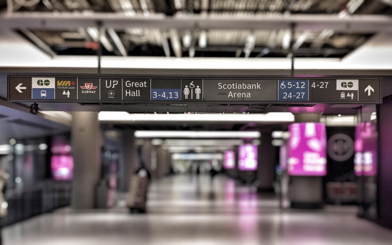
Same sign, 3 different eras of wayfinding. Interesting to see what information is prioritised in each standard, I already see an issue with the TTC not being shown on the newest version:


Not on that particular one, no^ So they didn't include the TTC on the latest version?
No one’s going to agree but I miss the run down non gentrified parts of Toronto. I miss the union station with the Harvey’s and reasonable prices with the arcade underneath. It seems there’s absolutely nothing made for normal people anymore. We replaced the dingy dodgy arcades with Dave and busters and the Harvey’s for five guys. Great. I’m now officially a homebody because going out is outrageous. The street meat sausage is now $8. Wth.
They want people to get lost so they shop more?
This is my take as a former high-performance HMI designer.View attachment 606673
(just now, outside Union Chicken)
Honestly, these new signs are a huge improvement. I can’t find much to criticize here.
At this Harvey’s where two SRs used to sit every night when tmz broke the news on the crappy crt that Michael Jackson died. Went downstairs and hit up the arcade. Make the most of a bad day. Cheap food and entertainment.A Harvey's breakfast on a Sunday morning when heading down to work a Jays game was a vibe.
This is my take as a former high-performance HMI designer.
Overall: A-
- (+) Strict design patterns are followed in each repeated contextual block, every block reads the same in content and style
- (+) In particular the high contrast arrow element provides a fast visual cue when scanning any sign
- (+) All blocks on one sign are sorted by direction so I can easily scan this sign as either “where is x?” or “what is in x direction?”
- (–) Every icon on a white background takes away from the bold visual distinction of the arrows. Adjusting the background on them would draw more attention to the arrows – though I’m not sure which of these logos have an appropriate alternative
Yesterday, had to point out the elevators next to the TD bank to VIA passengers with heavy luggage trying to go to TTC. They balk at the escalator and looking around for elevator. It was right next to the escalator going down but the big pillar was blocking it. The lack of clear signage really affects passengers’ experience here.Much improved but the signage for accessible path from TTC to VIA is incredibly bad. You can hardly see the signage to the elevator from the retail level up to lower level. And even worse after that to the street level.
Ys, that elevator is remarkably poorly signed!Yesterday, had to point out the elevators next to the TD bank to VIA passengers with heavy luggage trying to go to TTC. They balk at the escalator and looking around for elevator. It was right next to the escalator going down but the big pillar was blocking it. The lack of clear signage really affects passengers’ experience here.
Shake Shack's coming...