You know, when you look at the renders it looks like it is to be pretty colourful and impressive:
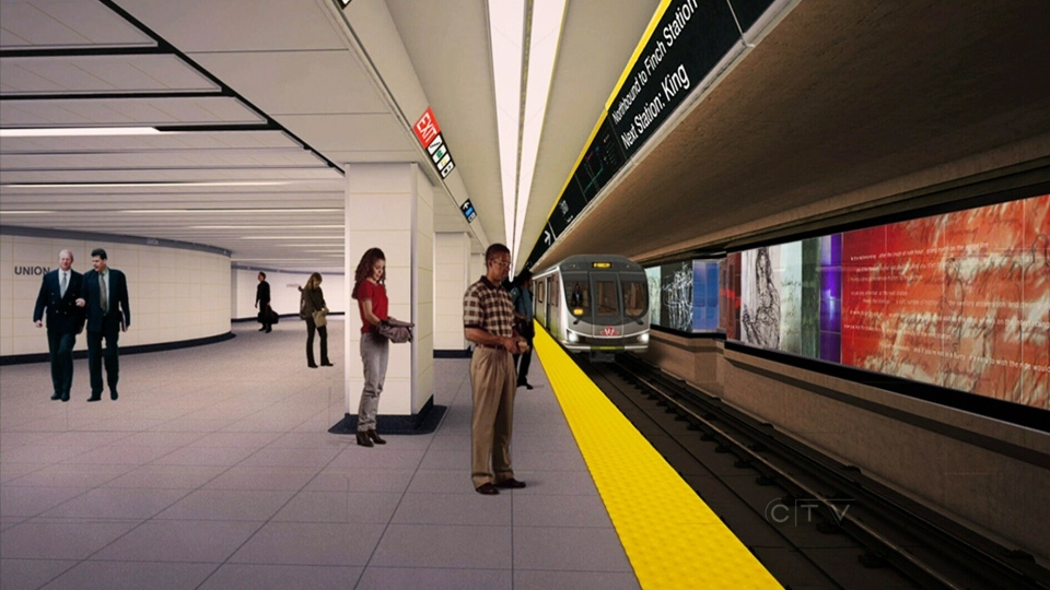
image.jpg


Perhaps when it is lit up it will look better?
 
Some of the sketches literally look like they are crying.
 
Some of the sketches literally look like they are crying.
Good grief, really?

It might well be art, but that hardly sounds like the inspiration I want to see when arriving at the office for another 10-hour day.

I wonder what it would trigger in the mind of someone thinking about jumping.
 
I've been on the platform and heard people comment that the figures look sad and depressed. Something a little lighter and more cheerful would be a good way to brighten people's day when they're about to pack into a crowded subway train. The installation itself is great, excellent concept.

I thought the same thing when I saw the pics posted here.
 
I thought the same thing when I saw the pics posted here.
I they really that bad? I haven't seen them back lit yet, haven't really made much of them.

Could they possibly trigger someone who is already suicidal and on the edge, to go one further step than they would otherwise?
 
I'm kind of hesitant to admit it, but I really like the installation... I like the colours and I like the style that the figures were drawn in. I find it thoughtful and introspective. It's unlike anything else on the network and I don't think that's a bad thing.
 
You know, when you look at the renders it looks like it is to be pretty colourful and impressive:

image.jpg


Perhaps when it is lit up it will look better?

Good lord, the platform is also like double or triple the width by the looks too.
 
I'm kind of hesitant to admit it, but I really like the installation... I like the colours and I like the style that the figures were drawn in. I find it thoughtful and introspective. It's unlike anything else on the network and I don't think that's a bad thing.
Is it lit up yet? When I was on the new platform the other day, it was hard to really see it clearly. Or is best viewed from the old platform?

Good lord, the platform is also like double or triple the width by the looks too.
That's near the centre. Just to the right is the entrance to the streetcar platform (it's cool that you can stand and see both streetcars and subway trains at the same time - I don't think that happens anywhere else on the system). It does get wide there.
 
I'll admit to liking the art panels, too. I think they're going to look really sharp when the old platform finally reopens and you get the light coming through. It's something different for the system.
 
It's definitely a sombre piece, but I see that as thoughtful more than I do depressing.

42
 
It's also set in an alternate universe where humans are two dimensional. #dontTrustRenders

Not to mention where the TTC wasn't totally incompetent and chose an all-caps bold sans-serif font for the destination signs on the new subways, rather than an illegible serif mix of caps and lower-case. But I digress.

I have to agree that the new art installation is sort of creepy. I know that it's the most Toronto thing in the world to finally get some public subway art and then immediately complain about it, but $160,000 is an enormous sum to spend on some "ghoulish gangs" of sketches that do nothing to brighten up the day of a subway rider.

And I too shudder to think of what sort of thoughts the installation might provoke in the mind of a potential jumper.
 
The last time I had a look at the new Artwork, no light fixtures were in place on the existing old platform to display the artwork clearly.

Both platforms are still going to be an issues to keep riders behind the yellow edge as the area is too narrow in the first place.

Still too dark down there where there is good lighting as well still leaking on the new platform.
 
Had a look at a section that was lit up today. It didn't look too bad, actually almost like the renders.
Some sections are lit with a spot light and some with a strip light (front and back). I think the spotlights are where the stairwells are located on the University platform. The strip light sections looked better in my opinion.
 

Back
Top