Electrify
Senior Member
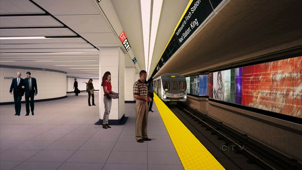
You know, when you look at the renders it looks like it is to be pretty colourful and impressive:
Perhaps when it is lit up it will look better?
Perhaps when it is lit up it will look better?