ryanbruins17

Active Member
Member Bio
Joined
Aug 29, 2020
Messages
122
Reaction score
784
Apologies if this thread already exists (I did look for one, but I am no Scooby Doo)

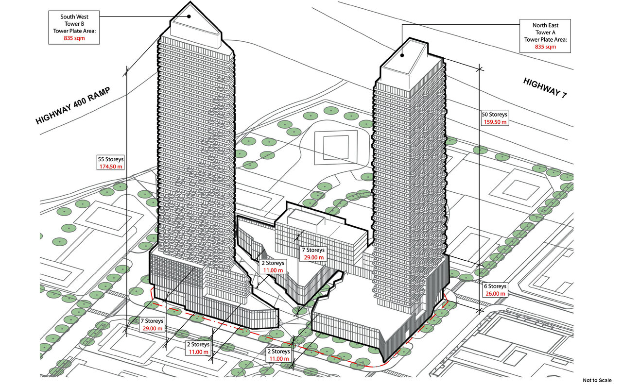
This was in Vaughan council meeting docs from earlier this week. It's 2 towers, and 1 two storey podium (connected to another tower by a five storey podium), for block 4S in VMC, which is directly south-west of the currently under-construction Festival condos.

Pictures are attached below. Let the discussions begin! (I personally really like these, as a Vaughan resident anyways).
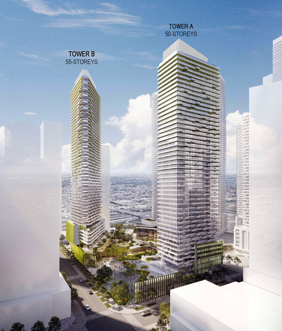
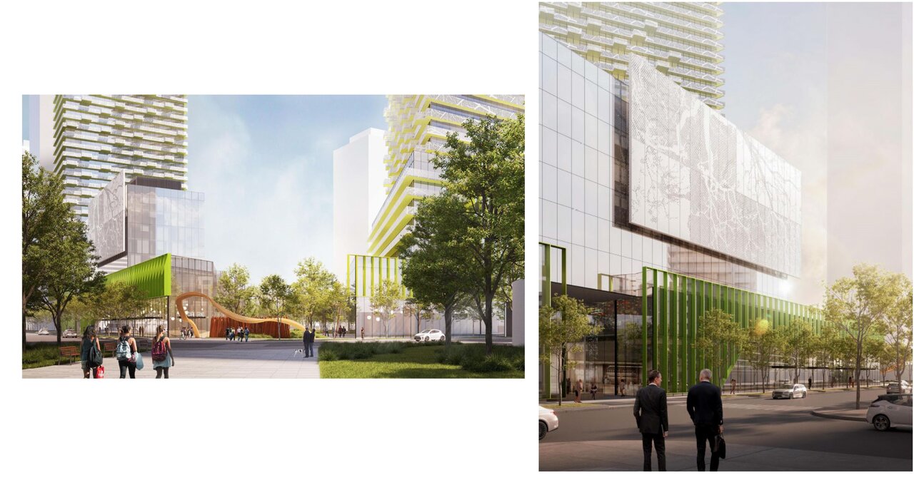
Attachment 6 - OP.22.010, Z.22.019, DA.22.031 - Perspective Rendering.jpg
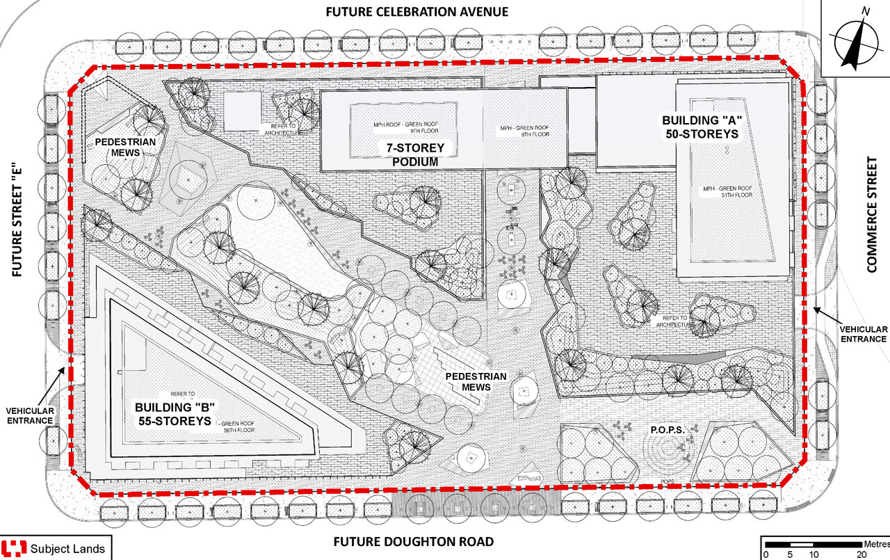
Attachment 4 - OP.22.010, Z.22.019, DA.22.031 - Landscape Plan.jpg
Attachment 5 - OP.22.010, Z.22.019, DA.22.031 - Context Model.jpg
Communication_C18_PM_0919_22_Page_09.jpg


PS: I find it really funny that with every 'fancy' VMC master plan that gets put out, with the parks and streetscapes and everything, there is still a massive Ikea with a massive parking lot there. Just really weird planning.
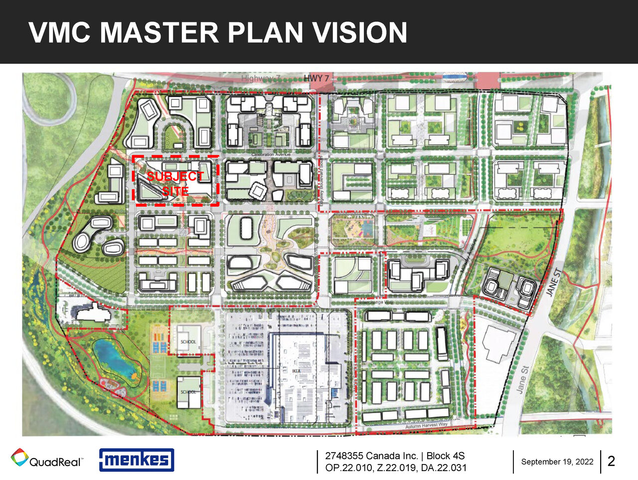
Communication_C18_PM_0919_22_Page_02.jpg
 
@ryanbruins17 I don't believe we have any existing thread for this one.

@interchange42 is there any way we can maybe put the VMC Masterplan Image in the front of each of the applicable threads to help people clarify which thread, is about which block?

One challenge, if searching is that the Blocks are all defined by a single number, then, often a designators like north/south which may be read as N or S; plus we all tend to use VMC, even in thread titles, and the search function doesn't work for that (too short).

A further complication is that as projects become branded with names, we tend to use the name in the thread title in lieu of and without the block designation.

Perhaps we could also standardize the thread titles to Project Name | VMC Block XX | etc.

I'm not stuck on any of that, but I must admit its a pain to keep straight which block is which a the moment, especially when the future street grid is as yet largely incomplete.
 
Apologies if this thread already exists (I did look for one, but I am no Scooby Doo)

This was in Vaughan council meeting docs from earlier this week. It's 2 towers, and 1 two storey podium (connected to another tower by a five storey podium), for block 4S in VMC, which is directly south-west of the currently under-construction Festival condos.

Pictures are attached below. Let the discussions begin! (I personally really like these, as a Vaughan resident anyways).View attachment 429976View attachment 429974View attachment 429975View attachment 429978


PS: I find it really funny that with every 'fancy' VMC master plan that gets put out, with the parks and streetscapes and everything, there is still a massive Ikea with a massive parking lot there. Just really weird planning.

View attachment 429977

Unfortunately the reason the IKEA is like that is it isn't owned by Quadreal etc. So it can't be included. I'm sure they will redevelop their site at a later date.
 
Apologies if this thread already exists (I did look for one, but I am no Scooby Doo)

This was in Vaughan council meeting docs from earlier this week. It's 2 towers, and 1 two storey podium (connected to another tower by a five storey podium), for block 4S in VMC, which is directly south-west of the currently under-construction Festival condos.

Pictures are attached below. Let the discussions begin! (I personally really like these, as a Vaughan resident anyways).View attachment 429976View attachment 429974View attachment 429975View attachment 429978


PS: I find it really funny that with every 'fancy' VMC master plan that gets put out, with the parks and streetscapes and everything, there is still a massive Ikea with a massive parking lot there. Just really weird planning.

View attachment 429977
Amazing looks like the future of Vaughan Downtown is here it's going to look amazing
 
Resubmission here with the following changes:
  • Max height decreased slightly from 184 → 180.35m
  • The towers are still 55 & 50-storeys, but the 7-storey building grew to 18-storeys (68.95m)
  • Total residential units increased from 1441 → 1556
  • Total vehicular parking decreased from 621 → 289
  • Total bicycle parking increased from 882 → 951
New renderings:

SUB2_Feb-15-2024_Architectural Drawing Set.pdf-0.jpg

SUB2_Feb-15-2024_Architectural Drawing Set.pdf-65.jpg

SUB2_Feb-15-2024_Architectural Drawing Set.pdf-64.jpg

SUB2_Feb-15-2024_Architectural Drawing Set.pdf-63.jpg

SUB2_Feb-15-2024_Architectural Drawing Set.pdf-05.jpg
 
Ugh!

I like Ralph.............but this is not his firm's best work.

Or even an average effort.

Aside from poor aesthetics and a misuse of the colour green that should be considered criminal, the scale at street level is terrible. There's an alternation between too short, and an 18-storey streetwall. Yikes! Send it back for a complete, total and utter rethink.
 
i like the color as well. very ballsy of a Toronto firm to design something that bold. LOL!
 
Yea I've gotta say I (potentially) love that green glass brick at grade, reminds me of the stuff they used over at 50 Ossington (Formula Fig). The rest of the tower? It's vivid bordering on garish, but it'll certainly stand out. VMC is terminally depressing and could use something bold.

And yes, I'm aware the CG Tower is a standout red brick tower but it's a drop in the bucket.
 
Really? Honestly, I love it. The green glass brick at grade is a lot of fun and VMC desperately needs some colour.

Agree on the bolded bit completely.......... but

It's vivid bordering on garish

I agree with this too.

Also the scale issues at-grade just drive me nuts.

***

Could I work with the green at-grade? If the scale issues were addressed, maybe, but I think it really needs something to ground it a bit.
 
Agree on the bolded bit completely.......... but


I agree with this too.

Also the scale issues at-grade just drive me nuts.

***

Could I work with the green at-grade? If the scale issues were addressed, maybe, but I think it really needs something to ground it a bit.
Agreed, massing could use work. I just hope some colour makes the cut when it comes time for changes.
 
A large project without massive podiums gets points in my book. Enjoy the colour play. Yes towers particularly the rectangular one a bit blocky.
 
Everyone hated the pale green on 88 Queen at first and now it is a fun, subtle feature of the building.
 
I can't decide on the towers. There's not enough total spaces for 1551 units.
 

Back
Top