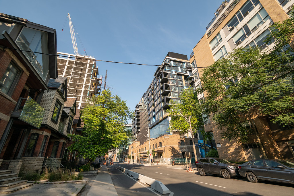
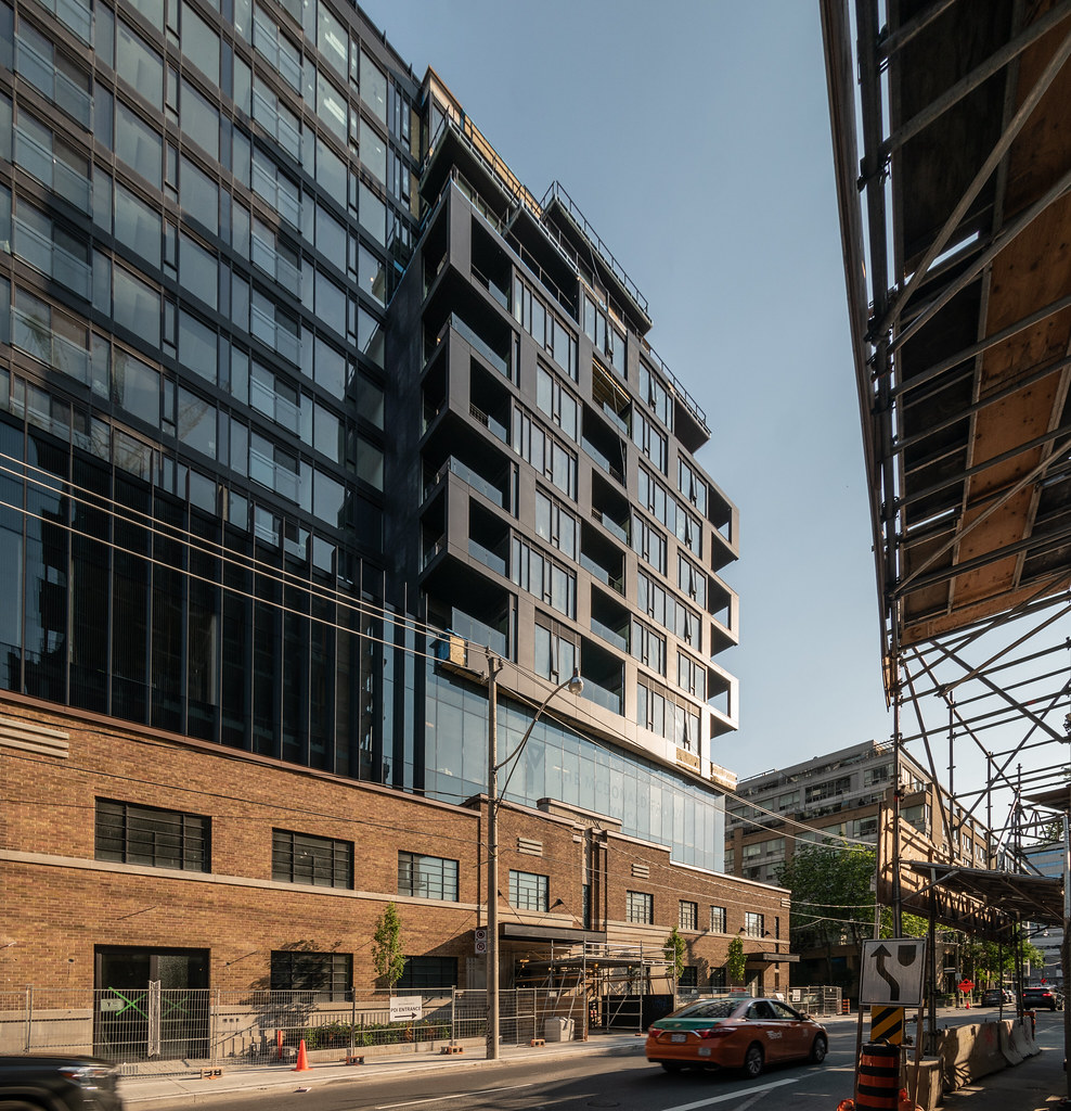
I wish I didn't feel this way, since I really wanted this one to be good, but I don't find the way this integrates into the original building to be harmonious at all in terms of aesthetic but most primarily in terms of geometry and how the shapes relate to each other. Looking from the north from the Queen/Augusta view south onto it or on Richmond looking west, the big wall of new addition looks completely incongruous to me and out of alignment with the shape, proportions, and centre of gravity of the old building — and is very imposing. And it doesn't seem to me that the massing of the two wings on the south end really responds at all to the waterworks building below either with its tall window shapes and its angular skylight windows (which are very nice).
And even disregarding how it matches with the old building the the new upper section kind of just seems like a jumble of elements all of the same colour without any cohesive articulation. There's some nice crispness to the execution, but it still seems mostly just like jumbly snap-together condocore, this time the grim and too serious Darth Vader version.
I'm happy that the original building has been preserved and adapted so thoughtfully and I imagine the food hall is going to be great, but I have to admit I'm pretty disappointed with the execution of the upper part. It feels heavy and imposing in a way it really shouldn't and doesn't feel like it works well with the original building or for the area. Hopefully it'll start to come together a bit more as the detailing continues to be finished.
 Waterworks Building by Marcanadian, on Flickr
 Waterworks Building by Marcanadian, on Flickr
 Waterworks Building by Marcanadian, on Flickr
 Waterworks Building by Marcanadian, on Flickr
 Waterworks Building by Marcanadian, on Flickr