Yes Concord! Please keep acquiring land and air rights across the Gardiner, the people of Toronto are fascinated and want more of your products. CityPlace, LakePlace, ExhibitionPlace, HighparkPlace, QEWPlace; please keep the developments coming!

Maybe after their gone with the Gardiner stretch, they can even acquire air rights above the entire rail corridor so they can develop RailPlace.
 
I thought you guys might be interested in seeing more than the three pics of the event today that were included in today's front page story, and when I started going through them, I thought that along with seeing some pics that fill in some of the atmosphere, that it would also be fun for you to see some of the rejected speech pics, with an explanation of why. Some of these aren't particularly flattering of John Tory in particular, but know though that everything below is presented with sympathy for him and others who are constantly being photographed, and I'll admit that I'm rather self conscious myself, like many of us are, about how I am caught on camera.

So, to start off, these pics are from the time that everyone was meeting each other in advance.

DSC04452.jpg


Below; Peter Clewes of aA, Gabriel Leung of Concord Adex, Galen Weston of Loblaw, and a couple of other guys I don't know talk. Terry Hui of Concord Adex is in another conversation to the right.
DSC04453.jpg


Those are the backs of W. Galen Weston and Galen Weston to the camera, with l-r behind them Tony Grossi of Wittington Properties, Mayor Tory, Councillor Cressy, and John Morrison of Choice Properties REIT.
DSC04459.jpg


Tony Grossi, President of Wittington Properties acted as MC. Wittington is Loblaw's development arm.
DSC04467.jpg


John Morrison, President of Choice Properties REIT, speaking. Choice owns Loblaw lands.
DSC04463.jpg


So it's really tough to get a shot of Tory speaking without him looking angry, which of course is not what he sounds like at all. He doesn't naturally smile when he talks, so as any photographer trying to capture people when they're speaking onstage, you shoot and you shoot and you shoot. I took, as it turned out, exactly 40 shots of Tory, and could only find two where he looks more like he's making a point than actually being angry, and in one case, he was finished speaking.

So here Tory is looking angry, (so we can't use this on the front page), but he isn't angry at all of course, he's actually starting a joke:
DSC04468.jpg


Thirteen seconds later, Tory's looking more relaxed, but the joke is landing and Cressy is hiding his face, either hiding a smile or fixing his hair (so we can't use this).
DSC04469.jpg


And seven seconds later, Tory is looking angry again, but the others are cracking up a bit. Can't use this one.
DSC04470.jpg


Finally, one that, even though it's a bit squinty, we can use (and we did). Thankfully, everyone else is paying rapt attention:
DSC04484.jpg


So here's one of Tory looking pensive after thanking the Westons for their philanthropy in the city, so not bad of him, but the others are a mish-mash.
DSC04507.jpg


Post Tory, Joe Cressy spoke, and he on the other hand always has a bit of a smile on his face all the way through his speaking. Like here…
DSC04511.jpg


and here…
DSC04527.jpg


and in fact I took about 20 pics of Cressy and could have used any of them. We didn't include those in the story though, neither the pics of Terry Hui. The Westons, father and son, did not speak.

Here's a bigger version of the 'First Brick' shot that we used in the story.
DSC04541.jpg


Here's the group getting ready to unveil the banner…
DSC04546.jpg


And here it is unveiled:
DSC04548.jpg


…and that's the 15 pics that the current version of our software will allow you to load into one post.

42
 

Attachments

  • DSC04452.jpg
    DSC04452.jpg
    346.4 KB · Views: 1,453
  • DSC04453.jpg
    DSC04453.jpg
    289.1 KB · Views: 1,911
  • DSC04459.jpg
    DSC04459.jpg
    332.2 KB · Views: 1,699
  • DSC04463.jpg
    DSC04463.jpg
    233.4 KB · Views: 1,424
  • DSC04467.jpg
    DSC04467.jpg
    244.8 KB · Views: 2,005
  • DSC04468.jpg
    DSC04468.jpg
    230.8 KB · Views: 1,395
  • DSC04469.jpg
    DSC04469.jpg
    250.1 KB · Views: 1,271
  • DSC04470.jpg
    DSC04470.jpg
    257.5 KB · Views: 1,257
  • DSC04484.jpg
    DSC04484.jpg
    240.7 KB · Views: 1,288
  • DSC04507.jpg
    DSC04507.jpg
    243.6 KB · Views: 1,262
  • DSC04511.jpg
    DSC04511.jpg
    202.8 KB · Views: 1,374
  • DSC04541.jpg
    DSC04541.jpg
    267.8 KB · Views: 1,265
  • DSC04546.jpg
    DSC04546.jpg
    319.5 KB · Views: 1,259
  • DSC04527.jpg
    DSC04527.jpg
    270.6 KB · Views: 1,340
  • DSC04548.jpg
    DSC04548.jpg
    830.7 KB · Views: 1,286
Last edited:
Suddenly? They've been around for decades and been producing crap on a regular basis for quite some time.. I wonder what the teams over at P+S and Kirkor do whenever they finish designing a project. I can't imagine they could genuinely look each other in the eye, smile and nod as if to say: Job well done, boys. With firms like HP, aA, Teeple giving us excellent work over and over, how can those firms above -- among others -- be honestly proud of the work they do? They're a repulsive joke in the architectural community and they must know it; or are they delusional and actually think they offer a quality product? Do they not observe the great work being done by other local firms and abroad? Are they only in the business for the money and not for artistic integrity? I can't fathom how a firm could design such utter garbage and be proud of it. No one holds P+S in high regard. Don't they care at all about having a positive reputation? I don't know how UT's news writers can publish stories for firms such as this without shooting snot across their monitors from hysterical laughter. It's sad to thnk that something as obscure and utilitarian as an electrical shed used to be designed with excellent attention to detail, and now massive buildings are often designed by people that probably studied architecture under Stevie Wonder. I guess it is true: Money corrupts and beauty takes a back seat to ego. Sad times we live in, but there is some hope that things are gradually improving. P+S, however, will stick to their formula of pinching hefties, followed by beef barley butt broth.
 
Last edited:
I thought that along with seeing some pics that fill in some of the atmosphere, that it would also be fun for you to see some of the rejected speech pics, with an explanation of why. Some of these aren't particularly flattering of John Tory in particular, but know though that everything below is presented with sympathy for him and others who are constantly being photographed, and I'll admit that I'm rather self conscious myself, like many of us are, about how I am caught on camera.

At the Queens Quay ribbon cutting I managed to get a selfie with Mr Tory :). However his facial expression is awkward and looks as if I was annoying him (which was not the case), so I haven't posted this pic until now. Oh well.

Screen shot 2015-08-06 at 1.35.46 AM.png
 

Attachments

  • Screen shot 2015-08-06 at 1.35.46 AM.png
    Screen shot 2015-08-06 at 1.35.46 AM.png
    618.4 KB · Views: 1,276
Does John Tory really 'look' angry or awkward? I don't see that at all. He looks like a normal (and older) human being without some stupid grin on his face all the time (like the selfie generation who is always camera ready with the exact same smile in every pic). Thankfully we have someone real in office who doesn't care about such stupid things and is who he is...not like say a certain spouse of Kayne West...or the millions of other IG users who present an imaginary life to make others jealous.
 
Yes, in two of those that I posted he looks angry, along with 35 others that I didn't post. This is just a little behind-the-scenes glimpse to give you a feel for what an editor goes through to try to find photos that best express the content and mood of the day. I'm not calling him out for looking that way, it's simply that he does. Tory looks absolutely fine when speaking if you're viewing him on video, where you have the benefit of hearing his coherent, polished, and affable delivery, but the way the still camera captures the frozen moment of just a split second… well, as an editor you're looking for the frozen moment that still conveys the mood, and it's not the angry face.

It's definitely not a question of looking for 'a stupid grin' to publish, as if a smile indicates vacuity necessarily, but if you really want to go there, I'll say that I actually sympathize with Rob Ford (whom I have no other sympathy for) for many of the goofy grins or wild faces that he was caught with during his time in the Mayor's seat. Lots of pics of him got out and went viral when he looked particularly crazy, but they 'worked' and often went viral because that's how people saw Ford in the first place. The angry Tory faces won't go viral because that's not his demeanour.

So, there were piles of cameras there yesterday, and every photographer was snapping again and again as one does, with everyone trying to get the best set of faces to publish. It's just a bit harder to get a good one of Tory, despite him being a handsome man. It's just what happens.

42
 
Still don't see him looking 'angry' in the pics. But my comments were more directed at the selfie generation. Like why would John Tory go out of his way to take a selfie with someone only to end up on UT with a comment that he looks 'awkward' (simply because he doesn't have a stupid selfie grin on his face but looks more like an everyday person)? The post should have been left with just the first line and a happy face showing appreciation that he took the pic in the first place. But then the next lines feed right into the previous post about 40 shots of John Tory looking 'angry'.

The thread is supposed to be about Loblaws redevelopment not unnecessary critical analysis of John Tory's facial expressions in photographs. Sorry that I don't understand the relevance here -- but there will be 3 more pages of discussion about this, I'm sure...
 
We need to rid our city of architects like Kirkor and P+S if our city is to improve. They are putting up too much dreck in this city and are constantly being rewarded with new projects.
 
Cheap developers are going to build cheaply. They always have and always will. There's more than enough "commie-blocks" in the city to provide evidence of that, and if you make it illegal to build cheap ugly buildings or whatever then enjoy your stagnant city.
 
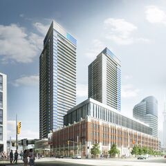
The towers are meh. They are no worse than anything else though and atleast this means that the heritage building will get some love and some new life injected into that area. So I think over all this is a positive.

IC42 I can definitely appreciate your efforts in documentation. Things that look easy never are, and it's interesting to see some of the stuff from behind the scenes.

Tory looks fine, and not to attack salsa... I don't know him personally so that's not fair. But I must say that between the two Tory is not the one who looks the most awkward. But hey I typically have resting b*tch face myself so I feel for him.

I assume that these towers like most concord builds will have lighting features. That I'm ok with. I'm a sucker for shiny things.
 
Suddenly? They've been around for decades and been producing crap on a regular basis for quite some time.. I wonder what the teams over at P+S and Kirkor do whenever they finish designing a project. I can't imagine they could genuinely look each other in the eye, smile and nod as if to say: Job well done, boys. With firms like HP, aA, Teeple giving us excellent work over and over, how can those firms above -- among others -- be honestly proud of the work they do? They're a repulsive joke in the architectural community and they must know it; or are they delusional and actually think they offer a quality product? Do they not observe the great work being done by other local firms and abroad? Are they only in the business for the money and not for artistic integrity? I can't fathom how a firm could design such utter garbage and be proud of it. No one holds P+S in high regard. Don't they care at all about having a positive reputation? I don't know how UT's news writers can publish stories for firms such as this without shooting snot across their monitors from hysterical laughter. It's sad to thnk that something as obscure and utilitarian as an electrical shed used to be designed with excellent attention to detail, and now massive buildings are often designed by people that probably studied architecture under Stevie Wonder. I guess it is true: Money corrupts and beauty takes a back seat to ego. Sad times we live in, but there is some hope that things are gradually improving. P+S, however, will stick to their formula of pinching hefties, followed by beef barley butt broth.
I am assuming they have a different design philosophy, one that plays into maximizing utility to the developer and future condo-dweller.

Makes me think of Lanterra's developments. Not often praised for their architecture and exterior finishes, but often praised for their interior finishes and the amenities they provide to their residents.
 
Devil is always in the details but I like what I see.

The 2 tall buildings have some interesting design components and it looks like they are going to ensure the integrity of the older building.
 

Back
Top