You are using an out of date browser. It may not display this or other websites correctly.
You should upgrade or use an alternative browser.
You should upgrade or use an alternative browser.
- Thread starter ten_eighteen
- Start date
.dwg
Active Member
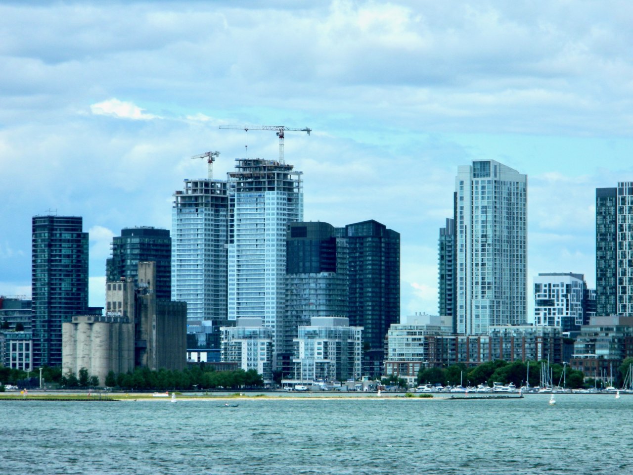
from far that white spandrel looks like marble.
No.
Rascacielo
Senior Member
The spandrels are actually mint green, but they look white from certain angles on sunny days.
Tuscani01
Senior Member
It's not that you made them look good in those shots @G.L.17, but somehow you made them not look terrible! Impressive!
42
Just had to scroll up to re-look at the pics, and you are right. They do look decent there. The green tint seems to be gone in full daylight.
It's too bad the balcony glass wasn't white instead of clear. It's going to look even messier once people start outfitting their spaces.
agoraflaneur
Active Member
Honestly, these turned out better than I expected. The mint green panels look white to me from most angles I've seen them from (typically King/Bathurst area) and they provide a pallet contrast to all the grey in the area.
Edit - just reading back now, looks like I have some agreement from other members
Edit - just reading back now, looks like I have some agreement from other members
.dwg
Active Member
If these turned out "better than you expected", I am going to go right ahead and say your expectations are terribly, terribly low. As long as people sustain this level of commentary and have standards this low, we definitely can't expect any better from purchasers and ultimately will continue getting more of this crap. And don't kid yourself, that's what these two towers are: crap.
TheKingEast
Senior Member
If these turned out "better than you expected", I am going to go right ahead and say your expectations are terribly, terribly low. As long as people sustain this level of commentary and have standards this low, we definitely can't expect any better from purchasers and ultimately will continue getting more of this crap. And don't kid yourself, that's what these two towers are: crap.
I agree. This is absolute crap.
steveve
Senior Member
Today:

kyuen
New Member
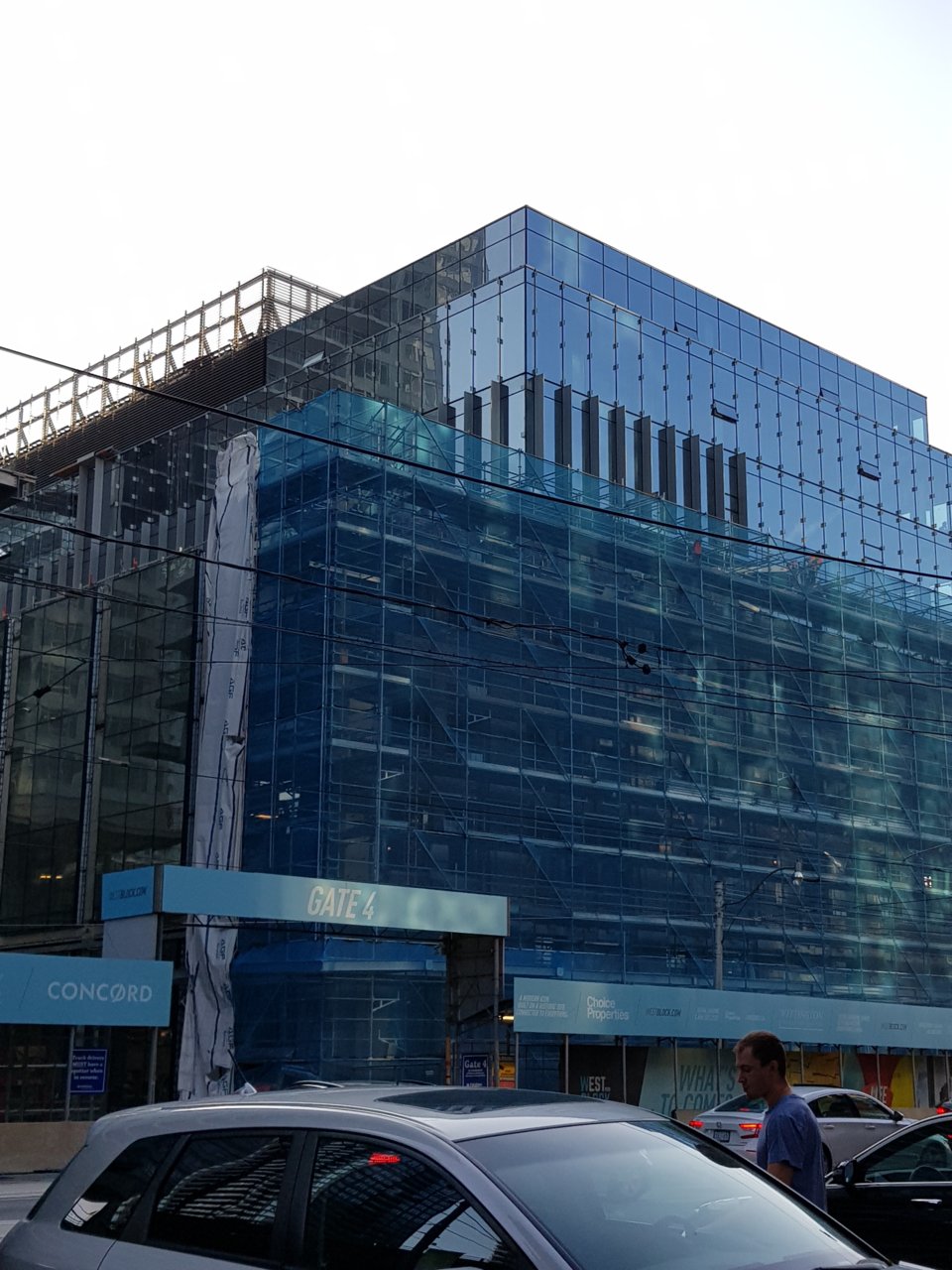
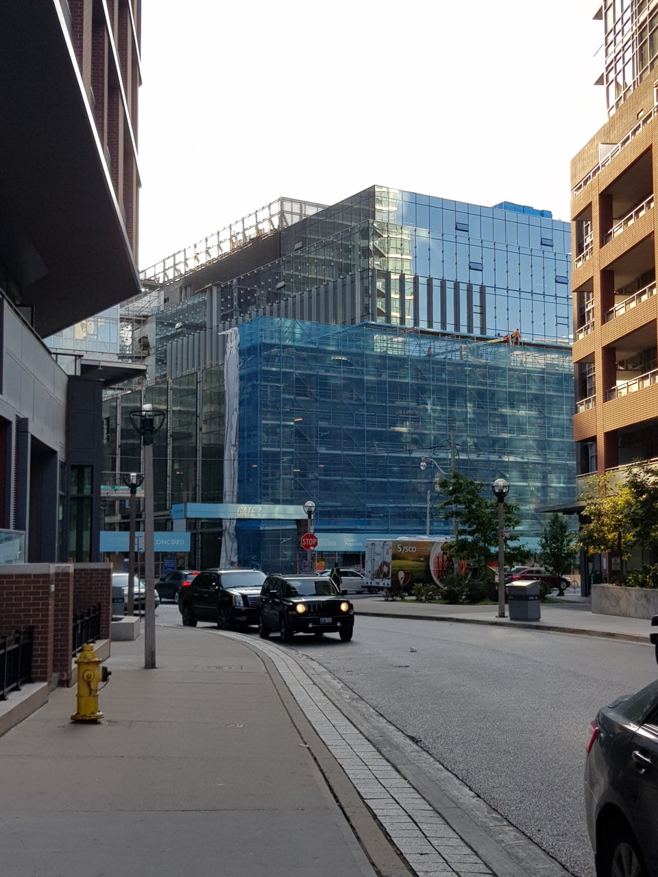
First of the fins getting installed.


DSC
Superstar
My god, those last two photos make this POS look even worse than it looks in person. Ahhhhhhhh
The commercial building should be perfectly fine when finished.My god, those last two photos make this POS look even worse than it looks in person. Ahhhhhhhh
42
DSC
Superstar
They are certainly better than the towers but I reserve judgement until they are fully 'unveiled". My POS comment was really addressed to the towers!The commercial building should be perfectly fine when finished.
42
Red Mars
Senior Member
christiesplits
Senior Member
Such a missed opportunity.
Amare
Senior Member
Concord's new slogan should be: Concord, destroying neighbourhoods in Canada one at a time est. 1987