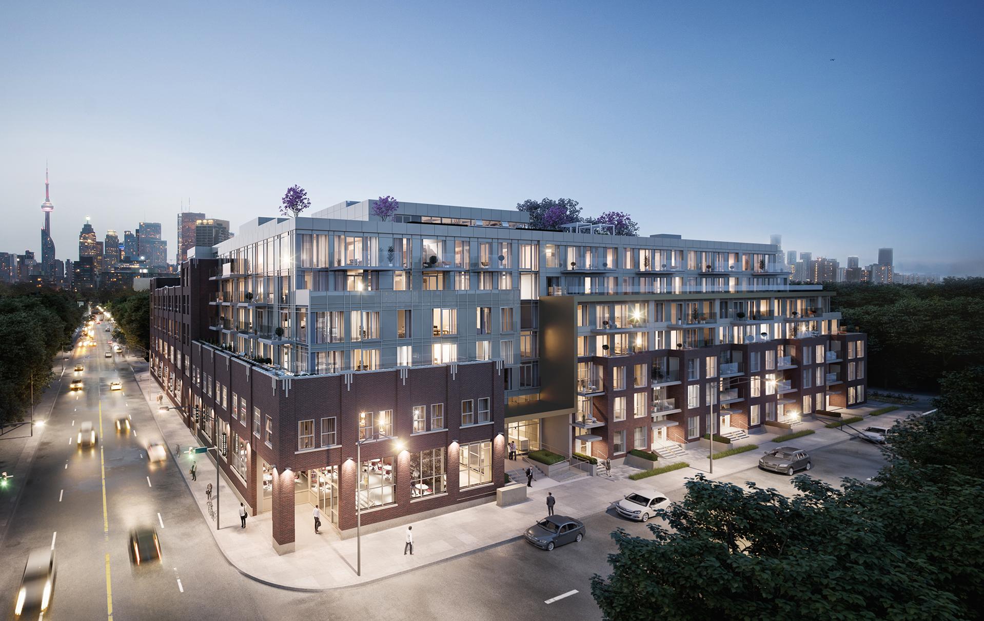
I marked up one of @AlbertC's recent pics just to show one area that had me shaking my head as I viewed the set (and that is far worse than anything on the Berczy):

View attachment 430751
Shameful. If you're going to go balls out on mullions, at least make the mullions and the spandrel the same color to camouflage all that mess, but seems like they are trying to highlight it. There was so much promise for this project. This got Sanctuary Lofts'd!
 
^^^ or go the opposite route and have the mullions (and spandrels) in multiple colours and create a plaid or tartan pattern — maybe not so appropriate here.
This development is such a shame because the original building is such a small portion of the overall development and the new ugly building portion seems to dominate and engulf it. Too bad the residents in the houses along Booth and Empire Avenues have to see this hot mess all the time. At least the loft building portion fronts Eastern where it is seen the most (just don’t look up). The windows on even the loft portion doesn’t look appropriate in terms of its design — should be more warehouse- or period-styled. Very little thought and and sympathy here.
 
Last edited:
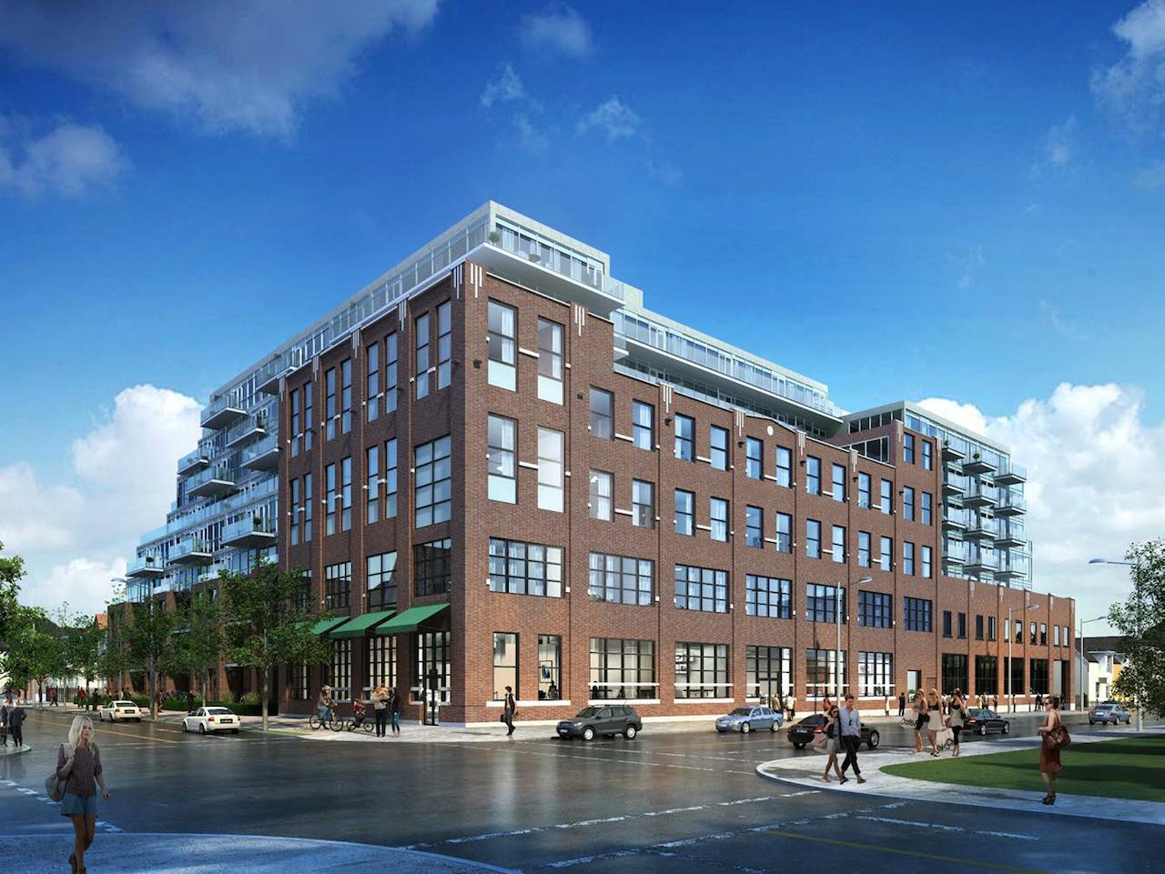
For reference
28525-92167.jpeg


28525-102850.jpeg
 
Alterra has been disappointing. Has anyone seen the crap they built on Sherbourne and Wellesley? Passed by this weekend. My goodness. This thing is just as hideous.
 
Lovely restoration of the original building, but a horrendous modern addition. The cladding makes it look like it will topple over in a slight breeze.
 

Back
Top