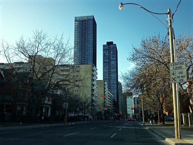
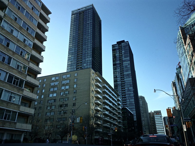
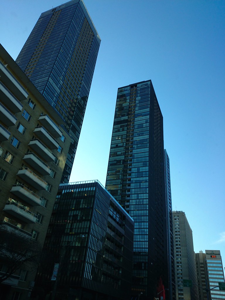
It does not always look disjointed, and at night it is lit up (partially)
My apartment looks out towards this cluster, which I didnt love when it was just x and couture. looked like a wall, but now with x2 I think it looks great.
X is my least favourite of the 3, its colour is good the mech is not so great imo. I'm sure no one will agree with me but at night couture looks the best.

In general though I think they look good because they are so much darker than a lot of other projects and with the inset balconies they look like office buildings not residential.
 
I do applaud the fact that they really tried to make the mechanical disappear and be coherent with the rest of the building, which they did to a certain extend, but this is an instant where you would have wanted to put some spandrel behind those panels to make it look dark, instead of making it transparent so that light can shine through it. Which is why it sticks out so much to the naked eye.
 
I wouldn't have wanted to put spandrel panels behind it to make it look dark because I am fine with it "sticking out". It tells me that the roof mechanicals are open to the air, and I'm fine with that. Nothing wrong with telling people that the top of the building is different from the rest of the building.

To each their own!

42
 
Compare the windows in X with the blinds down to the crown on X2. I think that once blinds are installed in the units of X2 the appearance of the glass on the crown of X2 will make more sense.

image.jpg
 

Attachments

  • image.jpg
    image.jpg
    1.3 MB · Views: 2,066
That's a decent list for this site.

Meanwhile, here are too many photos of it, all from yesterday, starting with a close-up of the best* crown for a new condo in Toronto.

*An objective fact, not an opinion. If you don't like this better than any other top for a new flat-topped building in Toronto, you're simply wrong. Stamped it, locked it, no erasies!

01P1450016.jpg


02P1450015.jpg


03P1450020.jpg


04P1450035.jpg


05P1450034.jpg


06IMG_7226.jpg


07P1450023.jpg


08P1450024.jpg


09P1450025.jpg


10P1450026.jpg


11P1450028.jpg


42
 

Attachments

  • 01P1450016.jpg
    01P1450016.jpg
    221.9 KB · Views: 1,290
  • 02P1450015.jpg
    02P1450015.jpg
    189.8 KB · Views: 1,287
  • 03P1450020.jpg
    03P1450020.jpg
    516.6 KB · Views: 1,279
  • 04P1450035.jpg
    04P1450035.jpg
    406.8 KB · Views: 1,280
  • 05P1450034.jpg
    05P1450034.jpg
    416.5 KB · Views: 1,310
  • 06IMG_7226.jpg
    06IMG_7226.jpg
    477.1 KB · Views: 1,264
  • 07P1450023.jpg
    07P1450023.jpg
    280.2 KB · Views: 1,264
  • 08P1450024.jpg
    08P1450024.jpg
    215.6 KB · Views: 1,276
  • 09P1450025.jpg
    09P1450025.jpg
    211.8 KB · Views: 1,264
  • 10P1450026.jpg
    10P1450026.jpg
    216.8 KB · Views: 1,281
  • 11P1450028.jpg
    11P1450028.jpg
    213.4 KB · Views: 1,269
From yesterday:

DSC00271.jpg


42
 

Attachments

  • DSC00271.jpg
    DSC00271.jpg
    143.5 KB · Views: 1,107
It's a really good looking building. Too bad that the landscaping design at street level is just bad IMO. That strip of grass/flowers is going to be a muddy receptacle of litter in few months like the X condo's one. Grass on a main sidewalk.. sigh. They don't really learn from their mistakes, uh (re: Liberty Village)?
 

Back
Top