GenerationLee
Senior Member
I mostly care about the podium in this case....which is a disaster. The tower is a bit tall for the location, but it is what it is.
Podium units have Juliette balconiesI take back previous comments about this project. It has turned out a lot better with more materials. And that pattern on the one tower came together. Not bad. Still don’t understand though as to why they left balconies missing at the bottom.above podium. It looks ..ODD
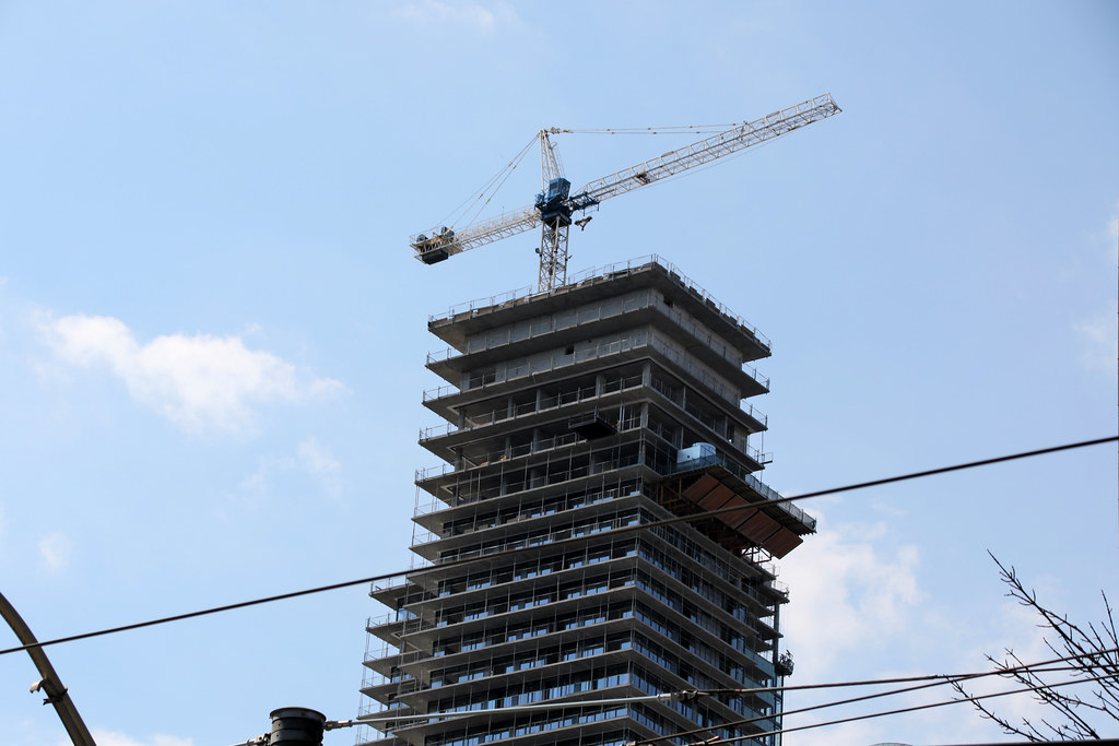


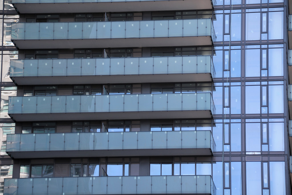

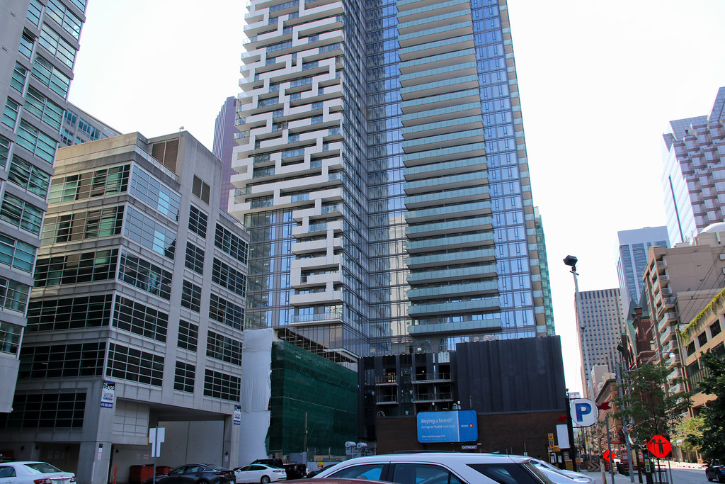
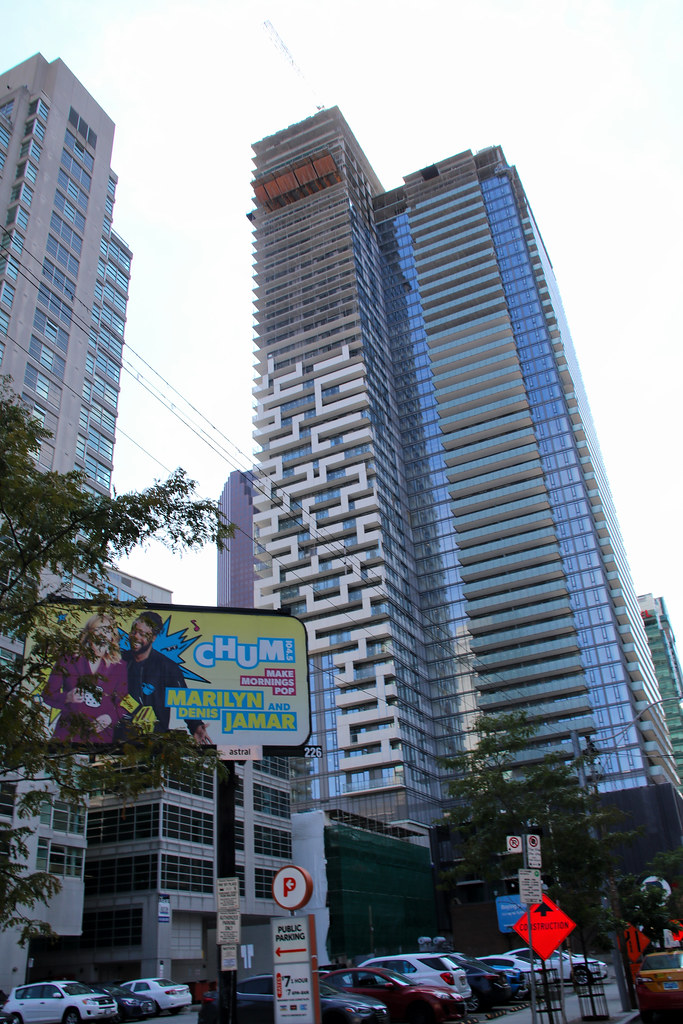


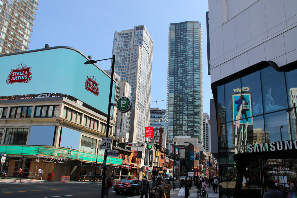
That, and the horror show of a podium. The building looks awkward to me...it's not two towers, so the different treatments is confusing design wise.I feel like they really messed up with that green tint balcony glass.
That, and the horror show of a podium. The building looks awkward to me...it's not two towers, so the different treatments is confusing design wise.
The two treatments are meant to set the two volumes apart so that the larger-than-normal tower does not look monolithic.The building looks awkward to me...it's not two towers, so the different treatments is confusing design wise.