Northern Light
Superstar
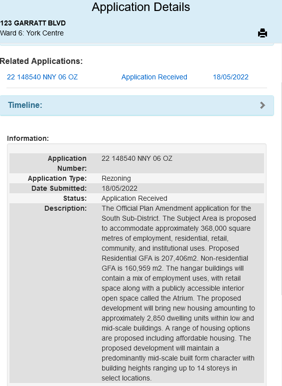
A new App into the AIC for a portion of the Downsview site:

In what sense?Bit of a Corktown vibe being proposed here.
Canary District?In what sense?
Is this not "European style density" being proposed?I guess I’ll wait to see more than just these 3 photos but it seems like this is the typical inhuman recent Canadian/Toronto urbanism. It’s like a weird, modern, faux happy go lucky equivalent of old Soviet architecture and planning. They should develop this more like the humber area development, or the newly proposed part of regent park by those British architects. Or just develop a new building code for the area because it’s so big, and go for European style density.
A little disappointing in the density. This is nextdoor to a subway station and a go line, would expect something taller.
I guess I’ll wait to see more than just these 3 photos but it seems like this is the typical inhuman recent Canadian/Toronto urbanism. It’s like a weird, modern, faux happy go lucky equivalent of old Soviet architecture and planning. They should develop this more like the humber area development, or the newly proposed part of regent park by those British architects. Or just develop a new building code for the area because it’s so big, and go for European style density.
I guess I’ll wait to see more than just these 3 photos but it seems like this is the typical inhuman recent Canadian/Toronto urbanism. It’s like a weird, modern, faux happy go lucky equivalent of old Soviet architecture and planning. They should develop this more like the humber area development, or the newly proposed part of regent park by those British architects. Or just develop a new building code for the area because it’s so big, and go for European style density.