You are using an out of date browser. It may not display this or other websites correctly.
You should upgrade or use an alternative browser.
You should upgrade or use an alternative browser.
- Thread starter SRC Admin
- Start date
Froggy
Active Member
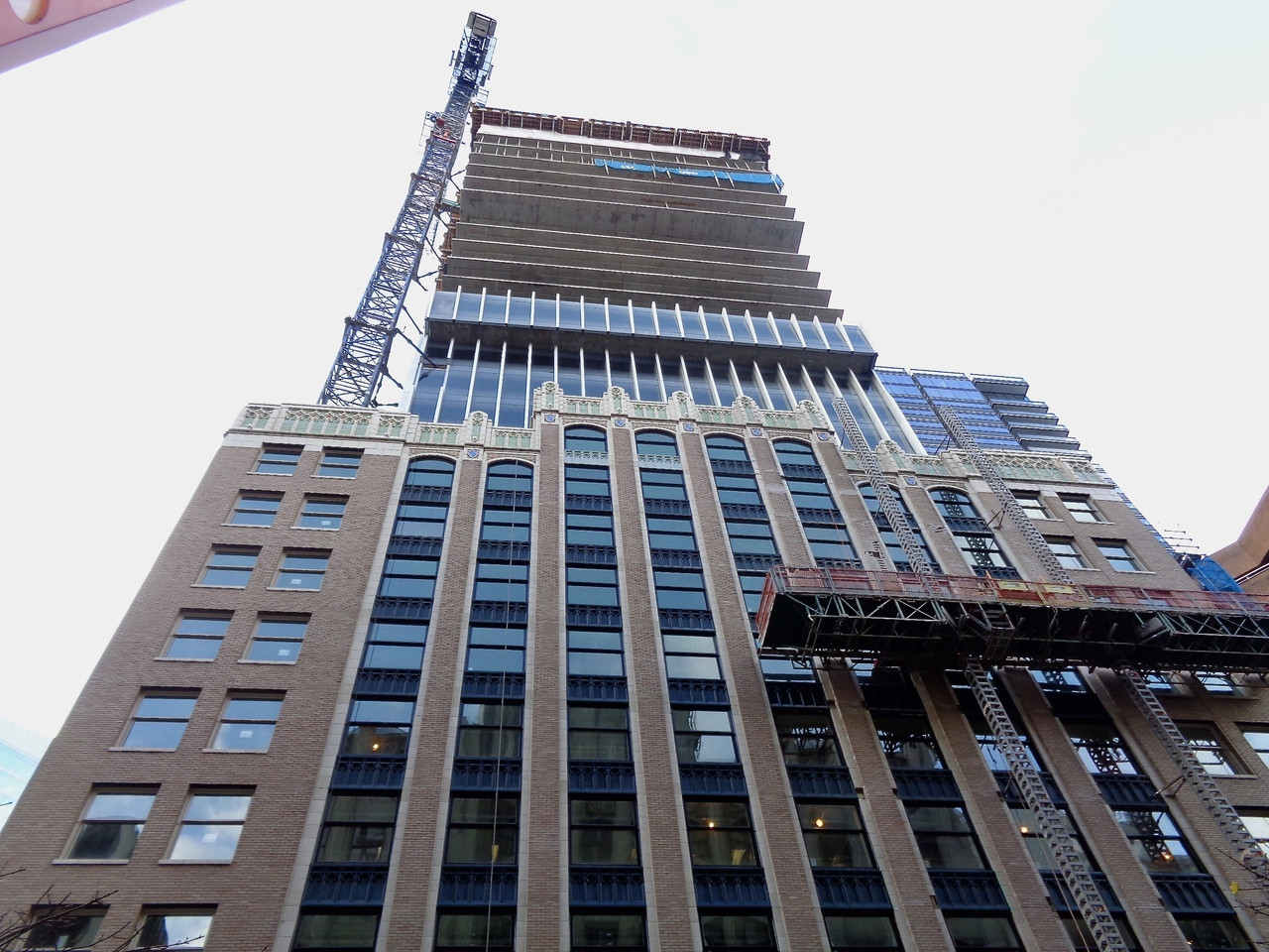
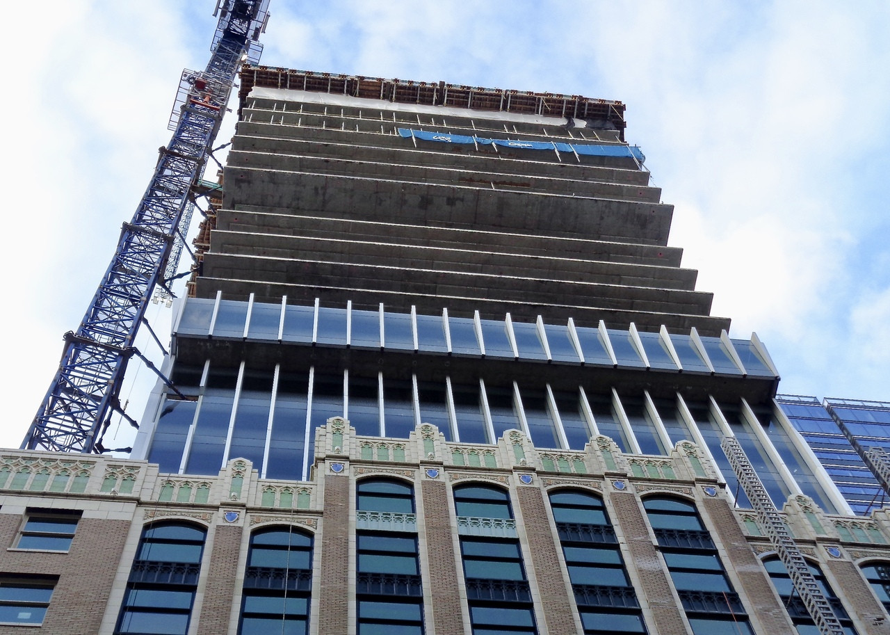
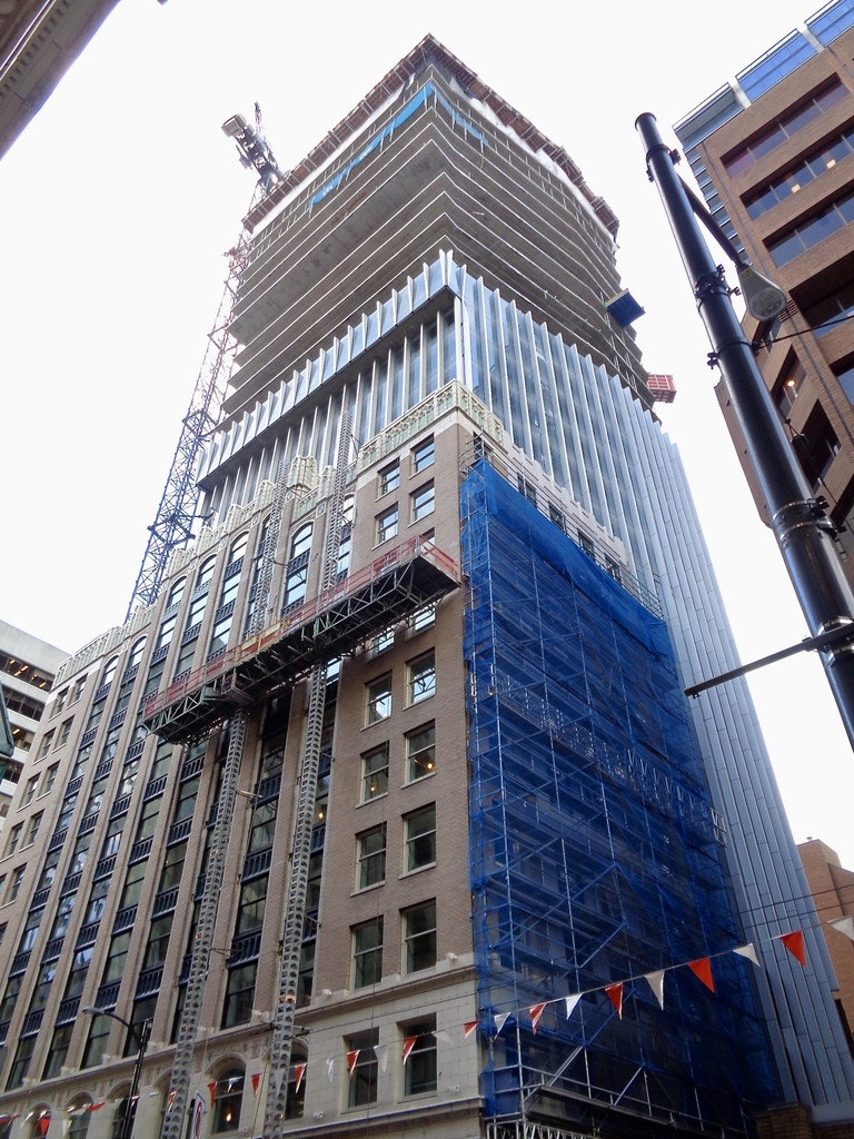
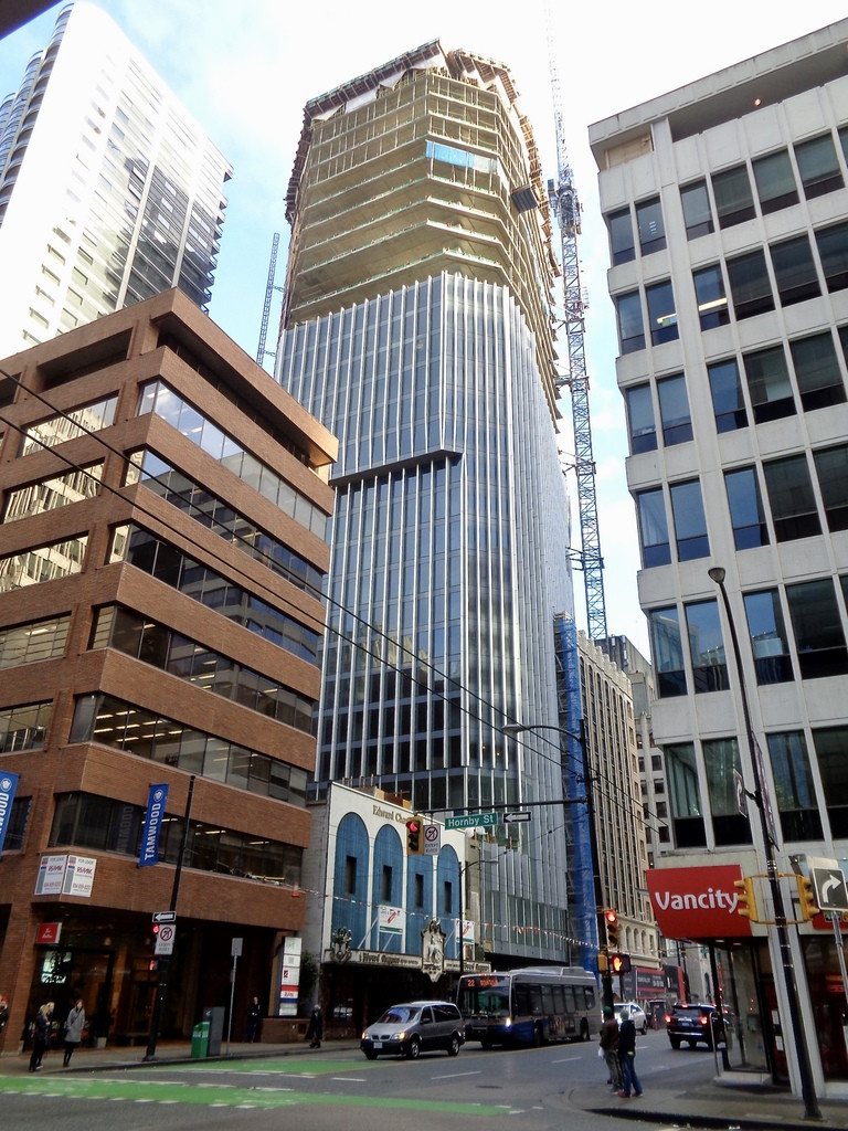
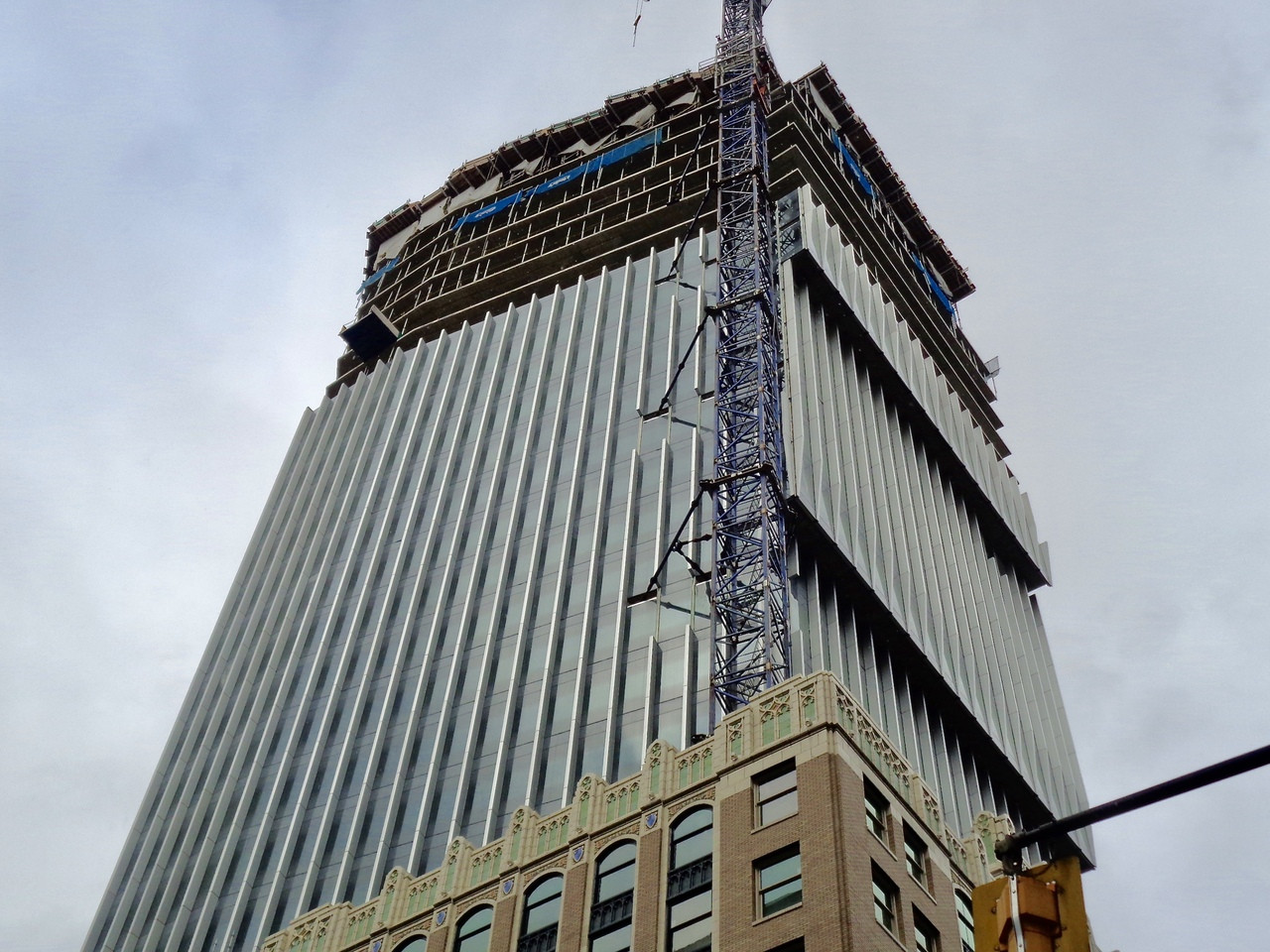
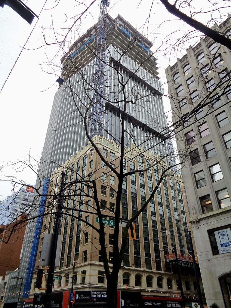
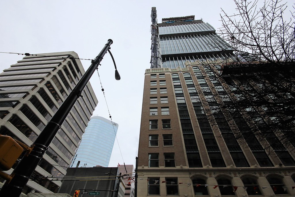
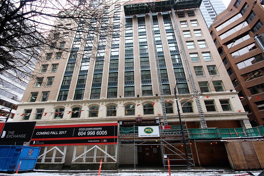
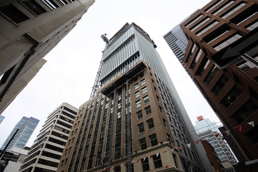
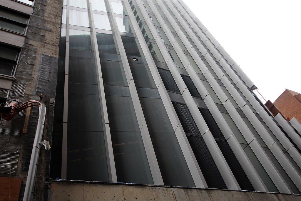
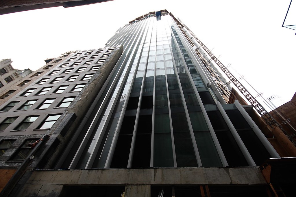
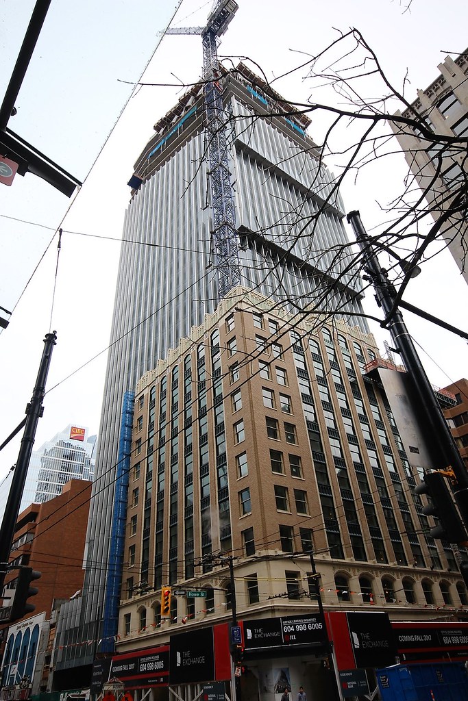
This project reminds me of EY Tower in Toronto. From the fins to the restored heritage facade.
http://skyrisecities.com/database/projects/ey-tower-richmond-adelaide-iii
http://skyrisecities.com/database/projects/ey-tower-richmond-adelaide-iii
mcminsen
Active Member
mcminsen
Active Member
Roundabout
Senior Member
Good looking project.
Roundabout
Senior Member
mcminsen
Active Member
City Of Rain
Senior Member
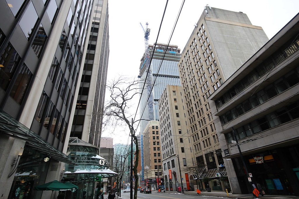
Thanks for the pics, its a very good looking office tower although its a little bit short imo.
LUVIT!
Senior Member
Vancouver is still afaid of heights somewhat. View guidelines? I was under the impression that Vancouver has a shortage of land for office space? If so this could have been taller. Otherwise I do like the tower. I prefer buildings that taper in rather than ones that jut out like this one. It makes it feel top heavy and somewhat chunky.
City Of Rain
Senior Member
Vancouver has the so called view cones regulation that the downtown buildings can not block the view of the mountains and hence the height limit.
I agree that this tower looks somewhat imbalance, as you have said its top portion is bigger than the lower section.
I agree that this tower looks somewhat imbalance, as you have said its top portion is bigger than the lower section.
City Of Rain
Senior Member
CityPlaceN1
Senior Member
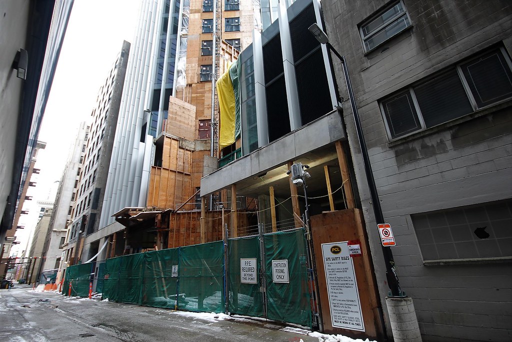
Well integrated into the heritage building.







 IMG_8748
 IMG_8746
 IMG_8744
 IMG_8742
 IMG_8740
 IMG_8738
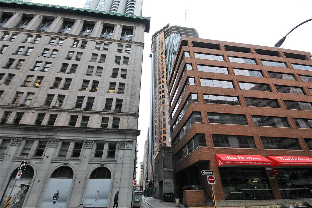 IMG_8736
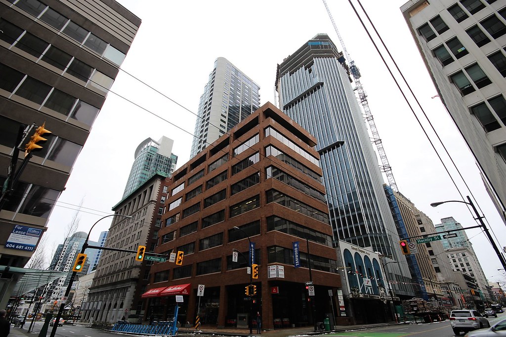 IMG_8734
 IMG_8732
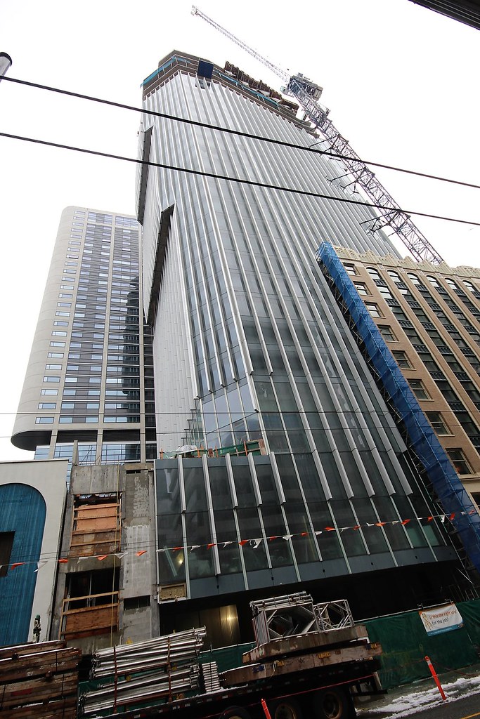 IMG_8730
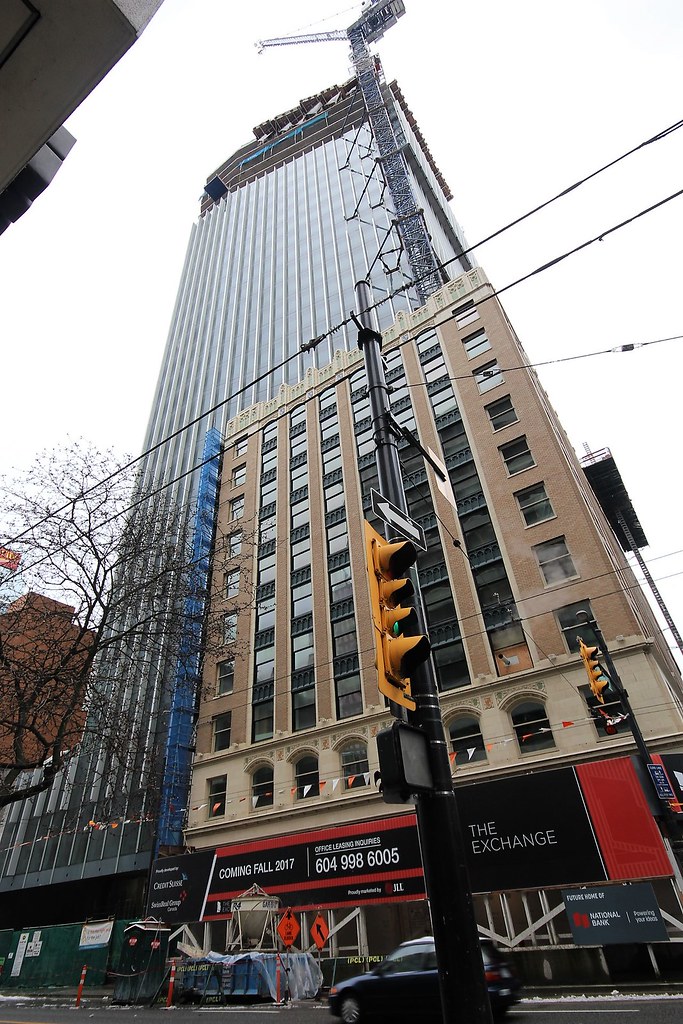 IMG_8728
 IMG_8726
 IMG_8724