News   GLOBAL  |  Apr 02, 2020
 8.5K     0 
News   GLOBAL  |  Apr 01, 2020
 39K     0 
News   GLOBAL  |  Apr 01, 2020
 4.7K     0 

It reminds me of the level of design that Borden received and is unique, interesting and colourful.

Here are the design images the city was looking at for Kinistaw Park - unfortunately these didn't really come to fruition.These images are from the city report- these I find more interesting and colorful and FUN.

Screenshot_20240227-114748_Drive.jpg

Screenshot_20240227-114555_Drive.jpg

Screenshot_20240227-114706_Drive.jpg
Screenshot_20240227-114647_Drive.jpg
Screenshot_20240227-114624_Drive.jpg


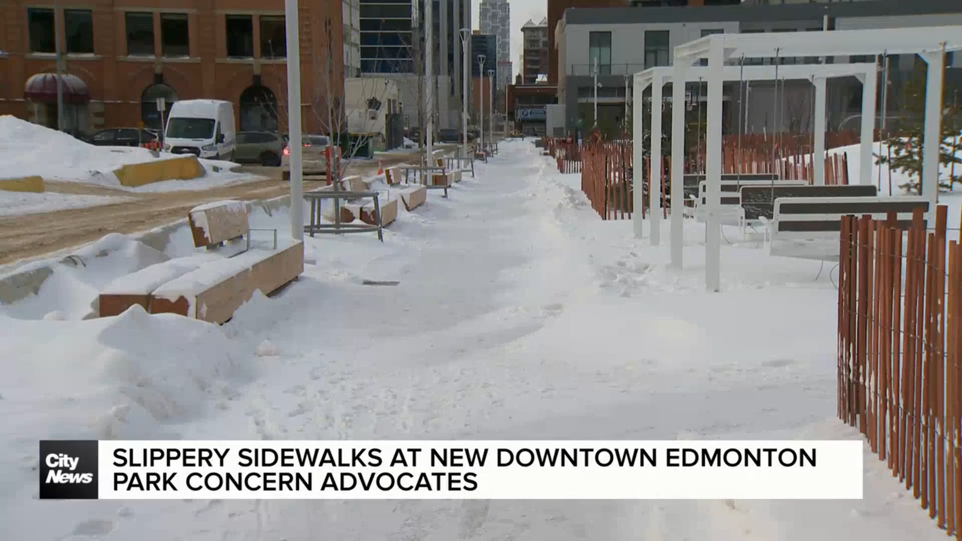
Here is park.
Screenshot_20240227-123045_Samsung Internet.jpg
 
I don't necessarily have strong feelings on this design either way, but I notice that your preferred colors appear to be the most neutral/drab/boring options available. I wonder if a pop of color would be more interesting?
Most likely you are correct. I would say in general, especially for a city like Edmonton which turns monochrome for 5 or more months of the year, adding colour where you can is probably a good thing. My main objection is the particular colour used ie, a dull red/pink, and how it looks on that specific structure. I feel that a more "drab" colour would be better on this particular structure, but not structures in general.

The examples above are examples of a great use of colour, especially red.
Yes, I like the red examples better too.
 
I remember when I used to deal with Ritch Ezra when Arista Records was still a thing and he was VP West Coast A&R, he used to say when reviewing music demos that landed in his office unsolicited that they were often accompanied with a note that said something to the effect that "this demo is better than half the crap that gets airplay on the radio". It was a huge turn-off for him -- they just compared their demo to crap -- what a commendation! Same here -- it diminishes the design result of the building proposal when you compare it to something that is less than. No need to compare it to something else; it is just bad design -- there is no sense of entry, the repetitive hoops are boring and unrelated to the landscape (much less anything to do with the Cityscape around it), and it doesn't define a purpose or a sense of goal -- it is so poor that it could almost be anything else and succeed to a greater degree.
 

Back
Top