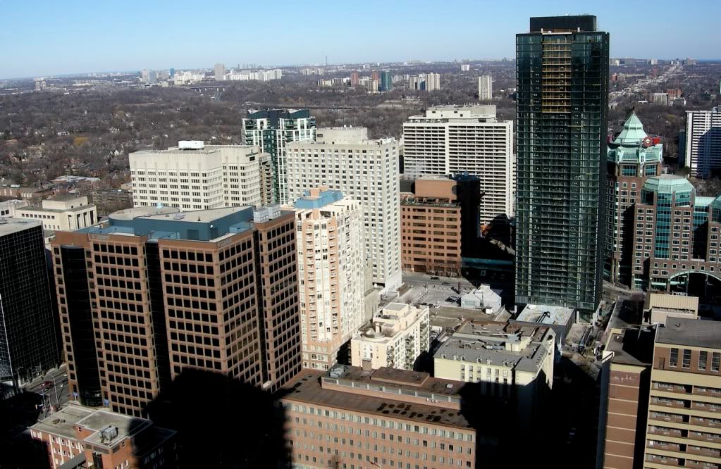
Evaluating the look of a residential building that's an homage to Mies in terms of 'Miesian sleekness' ought to take into account the fact that his residential towers had similar mechanical features on their roofs, surely?...

But that would presuppose it was an homage to one of his residential buildings, which it is clearly not. It was trying so hard to be a tip of the hat to one of his commercial designs and just missed.

Still, it is one of the most beautiful, modern condos ever constructed, yet that is faint praise when you consider the competition.

I know it is a moot point but it should have looked like this:

4384669608_80e1a37114_o.jpg

(Original courtesy Casaguy)
 
4384669608_80e1a37114_o.jpg

(Original courtesy Casaguy)

That is EXACTLY what it should have looked like. If it did it would automatically push Casa aside and become #1 sexiest building in my books.

I'm curious about the official explanation as to why they didn't go this direction.
 
Cost. That would have cost more to do, but wouldn't have added anything to the sale prices of the units, so there was no incentive for Great Gulf to do it.
 
I find the building looks better from grade with the setback mechanical penthouse. You don't see a spandrel covered wall and the vertical lines of the balconies go right to the top.

It's more than just the cost of construction. An integrated mechanical floor would raise the height of the tower above the approved allowable height. Floors of residential would need to be cut as the city was quite a stickler on the height of this tower.
 
the rooftop mechanical treatment that Traynor mocked up is exactly what Concord Adex did on their Cityplace buildings, that's why the top 2 floors of many CP buildings are unoccupied and are lit up at the top... if Concord can do it, it makes me question why Great Gulf cheaped out on this detail at X Condominiums ~

cost can not be justified as an 'explaination' here ~ considering X wasn't inteded to be a cheap product while CP was clearly affordable/targetted for investors

1_building373Front

CityPlace1.jpg
 
Last edited:
Maybe it wasn't an oversight or cheapening, but a conscious design decision. Maybe aA thought a lantern would look silly here, given the building's minimalist Miesian parallels.
 
But that would presuppose it was an homage to one of his residential buildings, which it is clearly not. It was trying so hard to be a tip of the hat to one of his commercial designs and just missed.

But his commercial towers - the TD Centre being the local example - have neither balconies nor coloured panels, so if you're basing your idea of "authenticity" on some sort of check list then the building is actually more of a tip of the hat to his residential towers with their rooftop mechanical elements.

I think it's a nod to both, though the office towers are what come most easily to mind.
 
if Concord can do it, it makes me question why Great Gulf cheaped out on this detail at X Condominiums ~

cost can not be justified as an 'explaination' here ~ considering X wasn't inteded to be a cheap product while CP was clearly affordable/targetted for investors

If I'm not mistaken the "warm by night" thing is part of Concord's public art contribution. If so, it's money that they had to spend
 
Maybe it wasn't an oversight or cheapening, but a conscious design decision. Maybe aA thought a lantern would look silly here, given the building's minimalist Miesian parallels.

Nobody said it had to be a lantern. Just that the mechanical penthouse could have been covered in a way which was more pleasing to the eye. Spire managed this and it does not have a lantern. I am sure there are many other examples throughout the city.
 
Sorry, Traynor. I mistook your mockup for the finished product and couldn't figure out why everyone had a problem with the roof. You're absolutely right; it sucks.
 
Looks good! Why not even have fake windows all the way to the top?

I did use the glass from a few floors below the penthouse to clone for the facade at top. It is glass ,but dark on the inside. Admittedly, it is only a quick render.

If they used the same clear glass to surround the mechanical penthouse and was open to the sky above, it would be weird to see clear fins up there in my opinion. If it were covered as I depicted it, then it would be dark because there would be no light behind.
 
Sorry, Traynor. I mistook your mockup for the finished product and couldn't figure out why everyone had a problem with the roof. You're absolutely right; it sucks.

That is actually a very flattering compliment to my 'Shop' job. To be mistaken for the real deal! It's not that good but thanks grey!
 
I did use the glass from a few floors below the penthouse to clone for the facade at top. It is glass ,but dark on the inside. Admittedly, it is only a quick render.

If they used the same clear glass to surround the mechanical penthouse and was open to the sky above, it would be weird to see clear fins up there in my opinion. If it were covered as I depicted it, then it would be dark because there would be no light behind.

Had they have continued with one level above the roofline with the same glass/spandrels and installed a series of LED fixtures on the roof to shine a soft white through the windows it would have rocked. As is, it's the only disappointment with X so far. It's too bad that the mechanical room is so high because it really sticks out from a distance. If I recall it was originally shorter but Great Gulf applied for an extra 3 metres (basically, one additional storey) of height for this room.
 
Great render job Traynor ... really helps to illustrate the potential that X Condo had ~ (thanks to Casaguy also for the photo)

What is now ...
DSCN5561_2.jpg

vs What could have
4384669608_80e1a37114_o.jpg


(Original courtesy Casaguy)
 

Back
Top