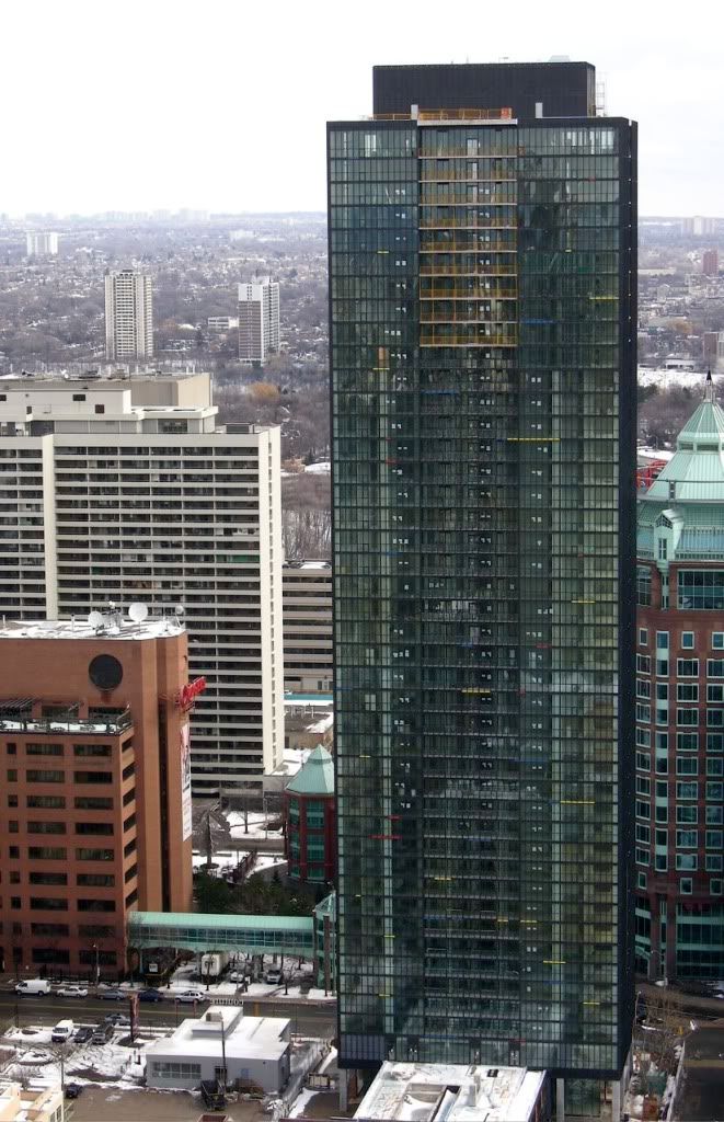
Hm. Try as I might, I just can't convince myself that I like the glass surround of the box. I think the mechanical box adds some symmetry somehow-- gives the building "shoulders" in a way. Granted, they could make it look a little nicer, but I still prefer what they've done.
But his commercial towers - the TD Centre being the local example - have neither balconies nor coloured panels, so if you're basing your idea of "authenticity" on some sort of check list then the building is actually more of a tip of the hat to his residential towers with their rooftop mechanical elements.
I think it's a nod to both, though the office towers are what come most easily to mind.
Not all his residential towers have their rooftop mechanical elements so visible. But maybe we can also find fault with his residential towers for that. The classic high-rise aesthetic North Americans think of when it comes to Mies van der Rohe is his commercial tower aesthetic, like the T-D Centre. Those are his masterpieces that everyone loves, the 10/10. The others are truly exceptional Modernist projects as well, but perhaps not the pinnacle of his achievement.
With a defined mechanical floor, the tower would look more elegant from an abstract minimalist view. It would be closer to a pure rectangular prism.
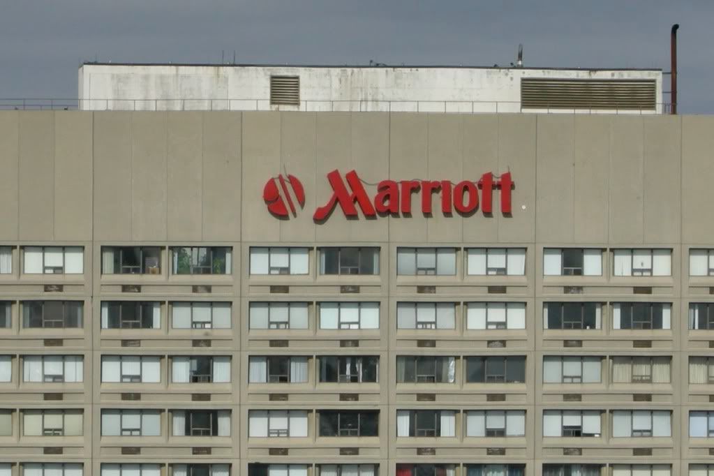
I lived in the Plaza II apartments (above the Marriott hotel) through the 80's & 90's. I talked my way up to the roof one day with an employee there to see what it was like and it's not what I expected. There are one or two floors of mechanical above the top floor of apartments (the 38th floor) and if I recall the edge of the roof comes up to a little below my shoulders (I'm 5' 8") so as you suggest the mechanical room is not nearly as high as X's, however the Plaza II has 1 or 2 full floor mechanical rooms below the roof. It's still a shame that they didn't approach X's mechanical room properly, but at least it matches the building... bah, I've gone on enough about this.
I don't find the rooftop element to be disproportionate to the general heft of the tower, cladding it in black further ties it in, and it expresses a service core that actually exists - which is perfectly in line with the Modernist principles that Mies espoused.
I don't find the rooftop element to be disproportionate to the general heft of the tower, cladding it in black further ties it in, and it expresses a service core that actually exists - which is perfectly in line with the Modernist principles that Mies espoused.
I rarely disagree with you US but I take exception to what you state about the height of the rooftop element. I don't think it's proportionate to the size of the building, I really think it's too high. I wouldn't argue with you on your other points.
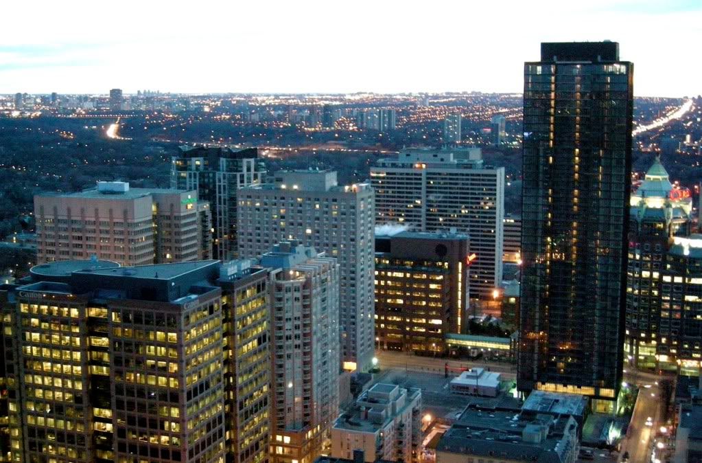
Anyway, back to some shots yesterday, from above.
Click on the thumbnail to enlarge, then click again on the image for full size.
Imagine the effect of driving in on the Gardiner and seeing a wall of twenty or thirty such buildings lining Lake Shore, instead of the shlockitecture we are getting in that area.
To put things into perspective (for those unfamiliar with this area) casaguy's photo (below) was taken from Casa showing the west side of X. My photos two posts above this were taken at 235 Bloor E. where the red circle is, showing the north side of X.


")
