News   GLOBAL  |  Apr 02, 2020
 8.9K     0 
News   GLOBAL  |  Apr 01, 2020
 40K     0 
News   GLOBAL  |  Apr 01, 2020
 5.1K     0 

Its a forum. People write their opinions which are then debated among the wider community.

I'm gonna have to call 3D on that last post seeing as the previous posters were simply expressing their opinions towards yet another conservative box.

Personally, I like Bay/ Adelaide; some don't. They still have all the right to post their opinion without getting a response which attacks them for 'posting outside of normal procedure.'
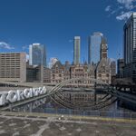
 
no doubt the building block spire of TD Can Trust Tower is attractive and unique in its design. I think the original BA proposal with its somewhat traditional sloped roof approach gave a completely different visual effect... the building was a well considered and tasteful design with top quality materials. To my eye, seeing the rendering inserted in the skyline just worked so well, unlike the current BA which does little more than fill in space (which in the end is better than nothing)

Of course, it might have been built as with a domed top, not the pyramidal that shows in the renderings. Woodbridge shopped both versions to potential tenants. Had they found a major tenant that wanted the dome, that's what they'd have built.
 
i thought.
i posted.
it's my opinion on a piece of architecture so indeed, it is about me.
me me me.
if we are discouraged from offering opinions on architecture then exactly what is the "forum" part of this forum about?
 
my opinion.. the old PoMo Bay Adelaide sucks!!!!

I like the new Bay Adelaide..it's clean.. and it's sleek.

Did I mention it's also a beast of a building??
 
yeah i have to agree on this one. that BA centre looks like a box. and not just any box. a really, really boring box. not really high, not really low, not really slender or tapered or not really anything at all. fifty storeys. yawn. but maybe i'll be pleasantly surprised. i just don't know how. will it be lit in an unusual way?

Well I think many of us share your thoughts on this building and are disappointed with what was unveiled as the design.. particularly considering it's prime location and so many years of anticipation and redesign.

Hopefully it will have an attractive sheathing that will distinguish it a bit. There is also the possibility of an attractive plaza between the buildings.
 
Anyone have any nice old rendering of BA they can post? I've seen a few angles of the pyramid scheme, but never any of the dome scheme - are there any rendering of that plan?
 
I don't think they ever published it. It was just part of their sales pitch. They'd bring in the model, take off the pyramid, and replace it with the dome.
 
No, there is a rendering of it - I have it somewhere on one of my old external hard drives. It was a water painting I believe. Unless, AndreaPalladio, you're saying that so it doesn't make an appearance in this thread? ;)
 
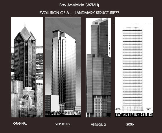
BA evolution by 3D:

baevolution.jpg
 
Oh crap, I just realized I was thinking of the very old Ritz-Carlton rendering, not the old Bay Adelaide centre rendering. My bad.
 
The boxeiest box in the boxing business! A real TKO!
 
Actually, out of 3D's four designs, I like the PoMo one the best. It would have added some much-needed variety to the skyline, although I believe that it was considerably shorter than the other versions.

The third one might have looked best, but the perspective is all wrong on the rendering, making it difficult to visualise its actual appearance.

The fourth design, which is the one being built (with minor changes), is the least interesting of the four, although attention to quality materials might make up much of the gap. If the two wings had not been dumped, I would have liked it, but the new design is a step downwards in eye appeal.

Bill
 
I think that PoMo version would be a disaster. It sure would stand out a lot more in the skyline, but for all the wrong reasons. Atlanta and Houston can happily keep their monopoly on that sort of of architecture, thank you.
 
I agree completely that the PoMo thing would have been a mistake. #2 wasn't bad and would have added that variety everyone is looking for (Trump will add more than enough,) but the current design is still my favorite.
 

Back
Top