artvandelay
Active Member
So with this project we've essentially traded the poor 1980s era urban design of the Roundup Centre for equally poor urban design and a building that looks like it's from 2009.
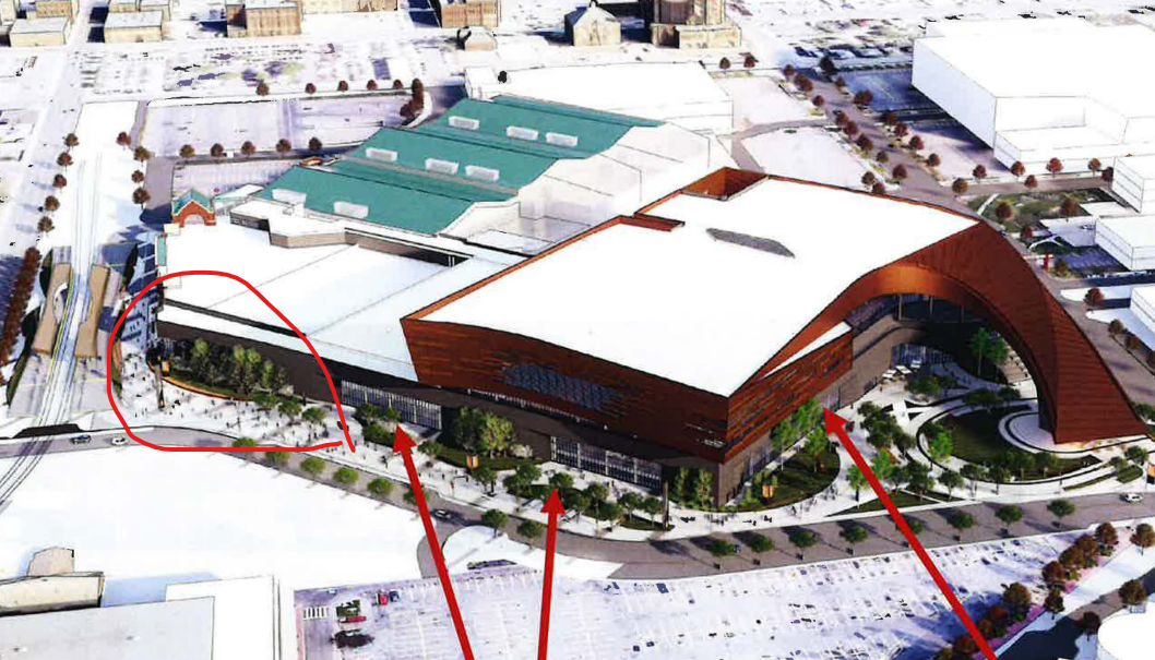
Setting aside the poor cladding material choice that requires a photo filter or favourable lighting conditions to look okay - this building does look interesting from Scotsman's hill. However, the vast majority people of are going to be looking at this thing from downtown or the Beltline where we are greeted by a flat brown wall and an expanse of monolithic brick that somehow manages to look even worse than the postmodern red-brick expansion next door.
The most important corner of the project, adjacent to where we are spending $88 million to extend 17th Avenue into Stampede Park, looks like an afterthought. A corner that should have a provision for retail/restaurant space or at least an entrance has a streetscape and landscape treatment reminiscent of a suburban rec centre.

