You are using an out of date browser. It may not display this or other websites correctly.
You should upgrade or use an alternative browser.
You should upgrade or use an alternative browser.
- Thread starter Surrealplaces
- Start date
Alex_YYC
Senior Member
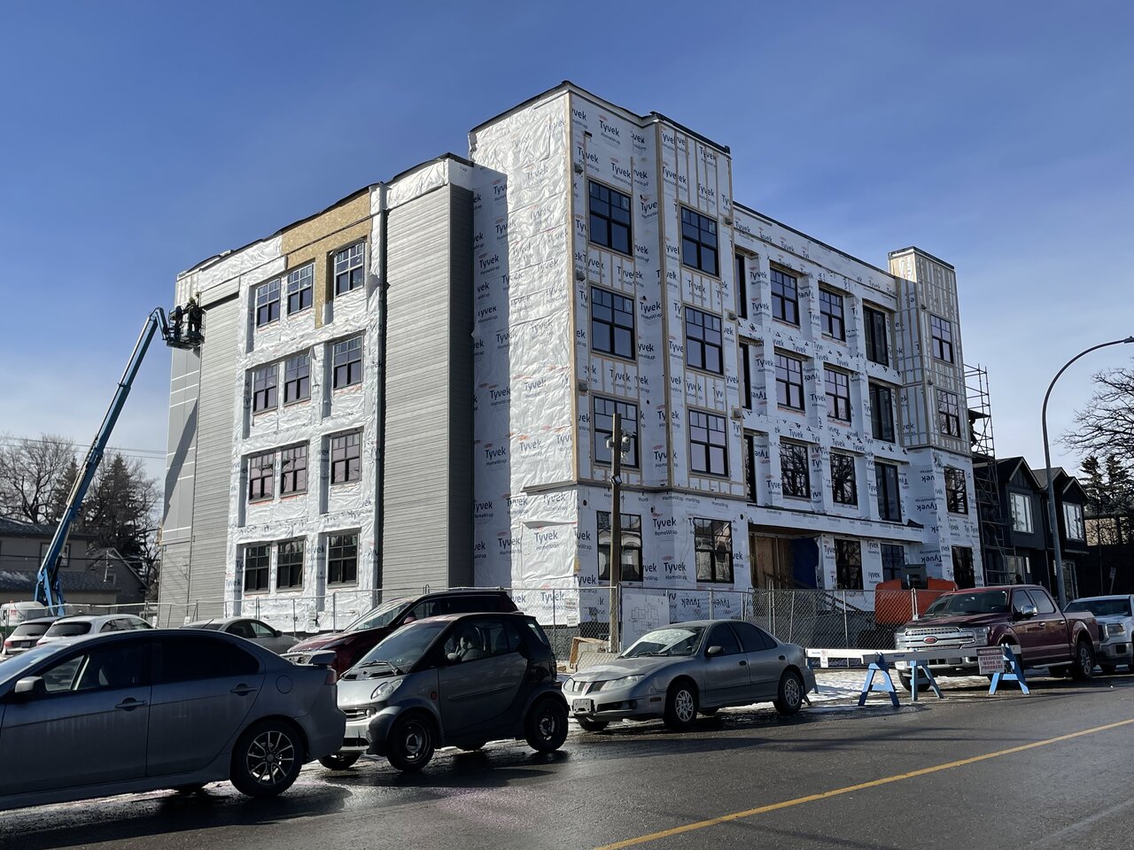
This one is flying. Amazing how fast a building can go up when you don’t need underground parking.

Albertasaurus
Active Member
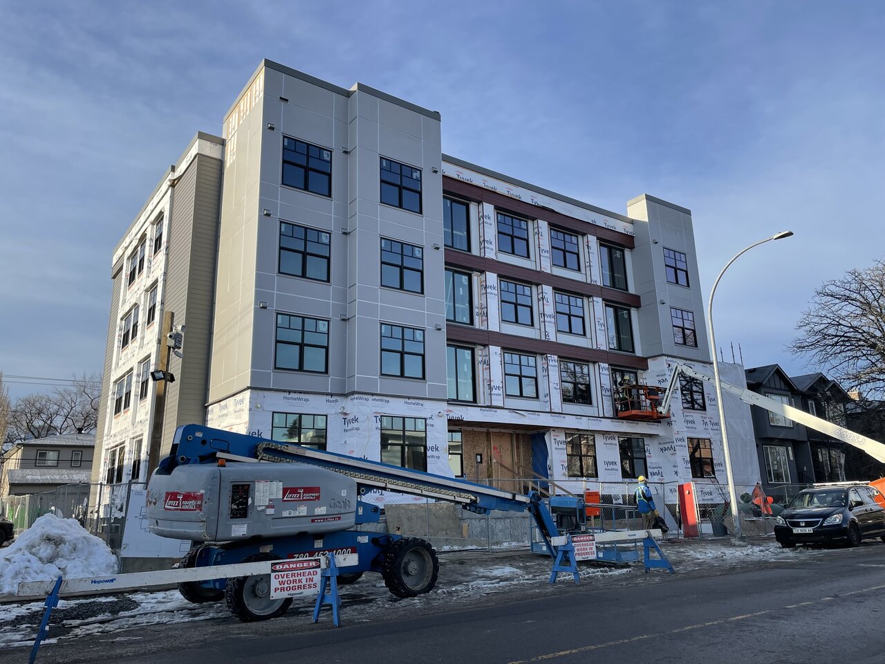
Not bad at all IMO. And assisted living at that, which is proof that you can do decent looking wood frame on a tight budget.
Alex_YYC
Senior Member
Daemon
New Member
This building under construction near my home and I t’s building quickly. I was away for a few months return and already full height!
Alex_YYC
Senior Member
Accent panels going up. Overall, for an affordable housing project it looks decent enough. What's impressed me most as how fast they’ve built this.

Tarsus
Active Member
A benefit of not having underground parking. That’s why the city needs to get off their archaic butt and either a) get rid of parking requirements or b) lower the parking minimums.What's impressed me most as how fast they’ve built this.
Alex_YYC
Senior Member
haltcatchfire
Senior Member
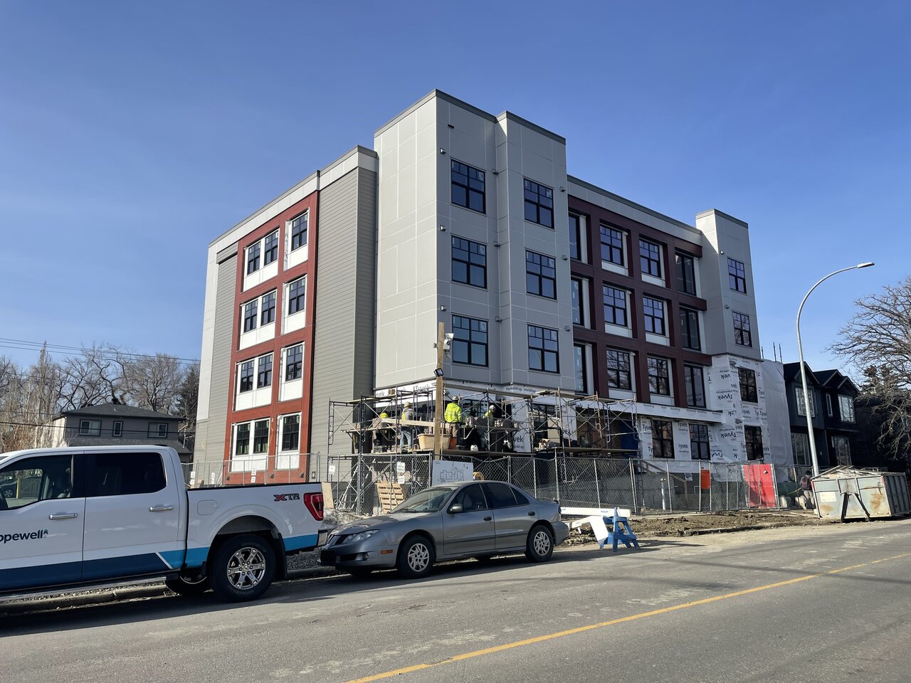
Really should have done a dark material like the window colour in those recessed areas of that brownish grid. The white sticks out and makes the whole composition a mess, where it could have simplified.
Mountain Man
Senior Member
I hate silver easy trim, colour match that shit! lol
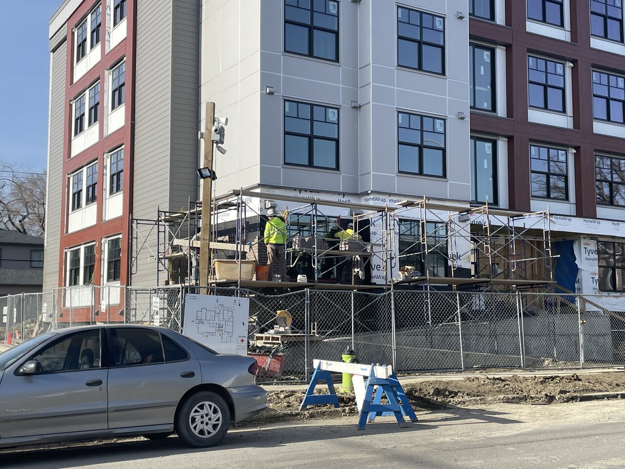
Looks decent otherwise. agree about the white, see what the brick on the main floor does for that.
Looks decent otherwise. agree about the white, see what the brick on the main floor does for that.
DiscoStu
Active Member
Ha, I drive by this one daily, and had the same thought about the recessed colors and the easy trim. Not a terrible building, considering it's use, but a bit more attention to details would've made it better for little/no cost.
Alex_YYC
Senior Member
Brick on the main level.


Alex_YYC
Senior Member
haltcatchfire
Senior Member
It's a building.
boreal96
New Member
It looks very cheap. I understand we have a housing crisis but lets keep some standards for new constructions in this city