You are using an out of date browser. It may not display this or other websites correctly.
You should upgrade or use an alternative browser.
You should upgrade or use an alternative browser.
- Thread starter Surrealplaces
- Start date
Kōsō
Active Member
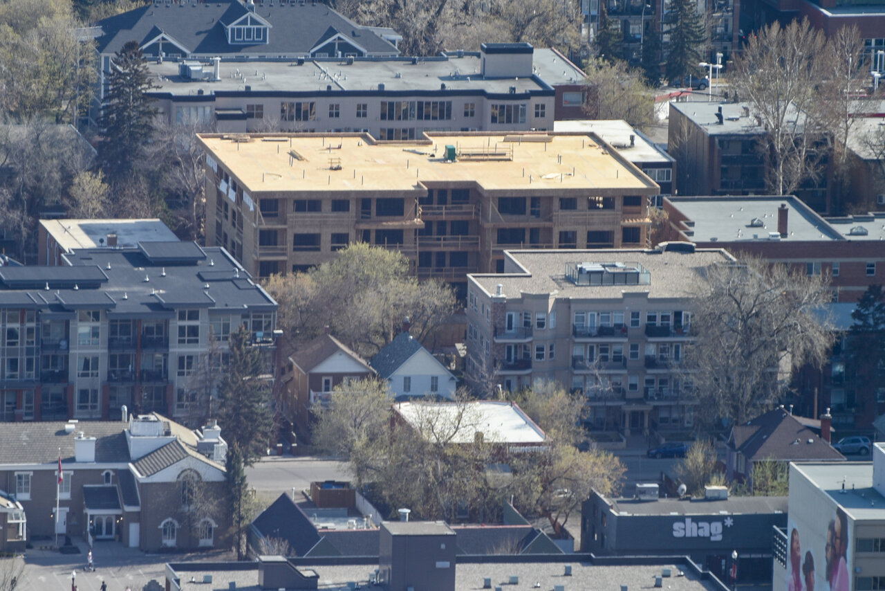
Mission Flats very far away. Taken from the 56th floor of the brookfield Tower.
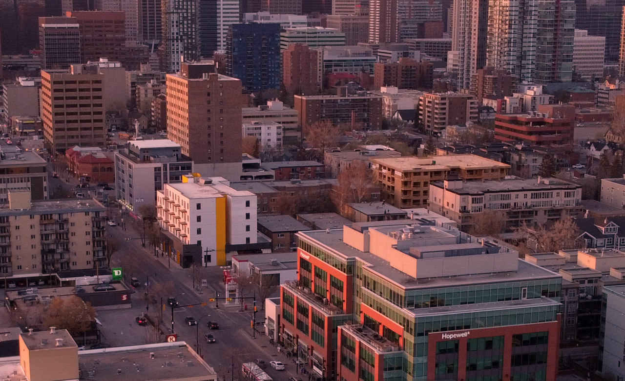
One good aerial shot deserves another!
Alex_YYC
Senior Member
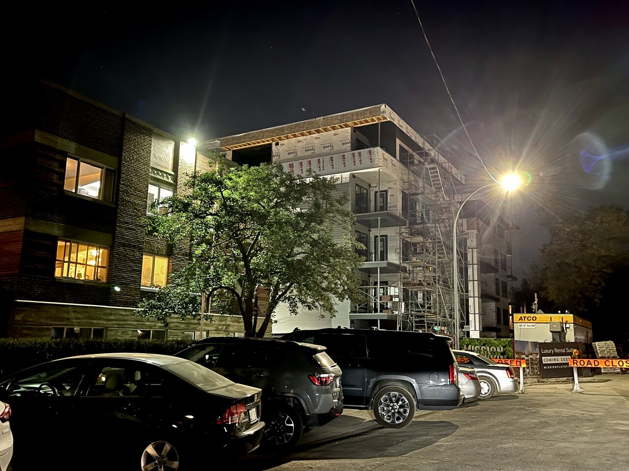
Wasn’t able to grab a good pic due to the road closure, but exterior materials are well underway.
ThujaPlicata
Active Member
1875
Senior Member
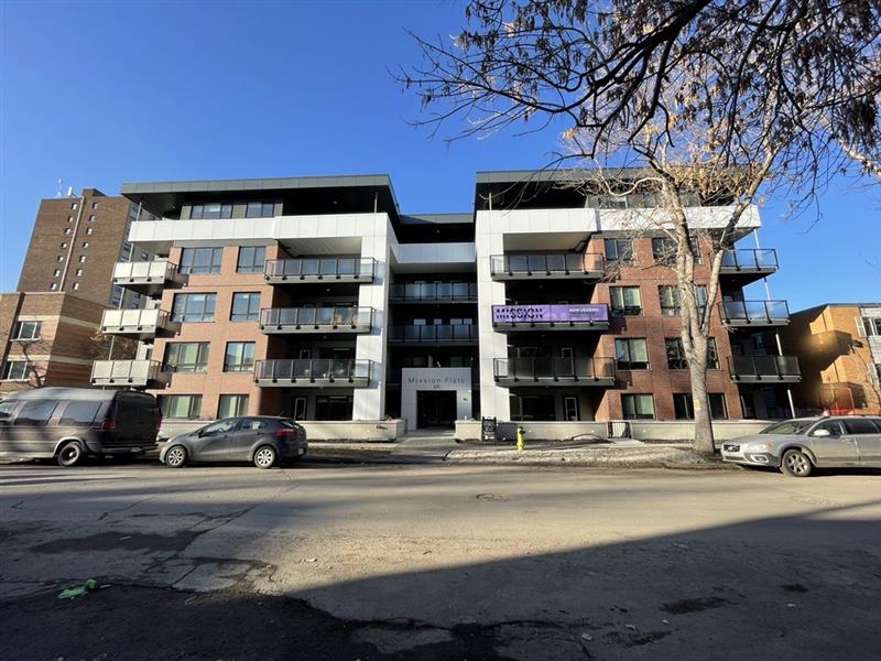
Looks good, and looks like the rendering. I think using the brick on the façade only with the other three sides as siding is fine if the siding is a decent style and color. They've also added composite composite metal trim at the top, which adds a nice touch without making it look too busy. To me this a good way to do a basic, pleasant looking but also cost effective building.
Alex_YYC
Senior Member
UrbanWarrior
Senior Member
ThujaPlicata
Active Member
Lights! (phone) camera! Action? (soon to be)
CalgaryTiger
Senior Member
Mission Flats you say, in Mission (check), Flat (check). Unspectacular, but density. Only thing is I wish the white panels were dark like the panels around the roof.View attachment 532527
Lights! (phone) camera! Action? (soon to be)
adamyyc
Active Member
For the love of god, enough with the vinyl siding. I know we’re in a housing crisis, but could we charge a few extra dollars per sq.ft. to not include vinyl siding in every 1+5?
That said, this one turned out pretty well, even with the siding.
That said, this one turned out pretty well, even with the siding.
haltcatchfire
Senior Member
Where is there vinyl on this one? I don’t see any.
ThujaPlicata
Active Member
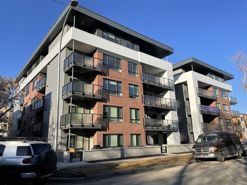
This one looks to be done - I like it.
Gullfoss
New Member
The vinyl siding is around the inset balconies. The wood slats were also removed when compared to the renderings. Very similar to the materials Wexford changed out when comparing their Elva project to their renderings.
And much like Elva, even with the changes (possibly value engineering), I think this Mission Flats project looks good. Could have been better if they stuck to the materials in the renderings.
And much like Elva, even with the changes (possibly value engineering), I think this Mission Flats project looks good. Could have been better if they stuck to the materials in the renderings.