You are using an out of date browser. It may not display this or other websites correctly.
You should upgrade or use an alternative browser.
You should upgrade or use an alternative browser.
- Thread starter Daveography
- Start date
archited
Senior Member
Maybe the centre-court has some redemption value? Talk about living in an anonymous thunderburp!
occidentalcapital
Senior Member
I love the presence. This type of streetwall is needed, especially in our cold climate.
Platinum107
Senior Member
She dummy thicc
thommyjo
Senior Member
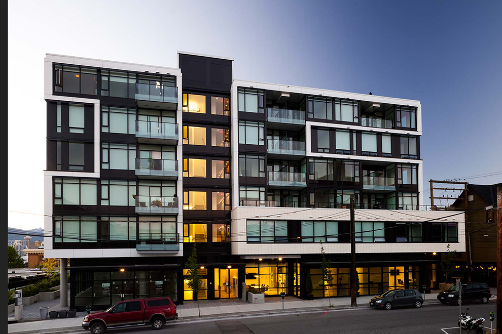
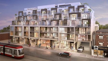
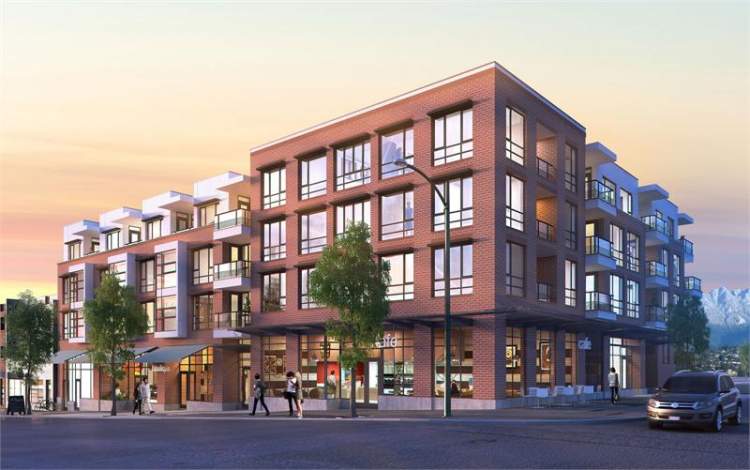
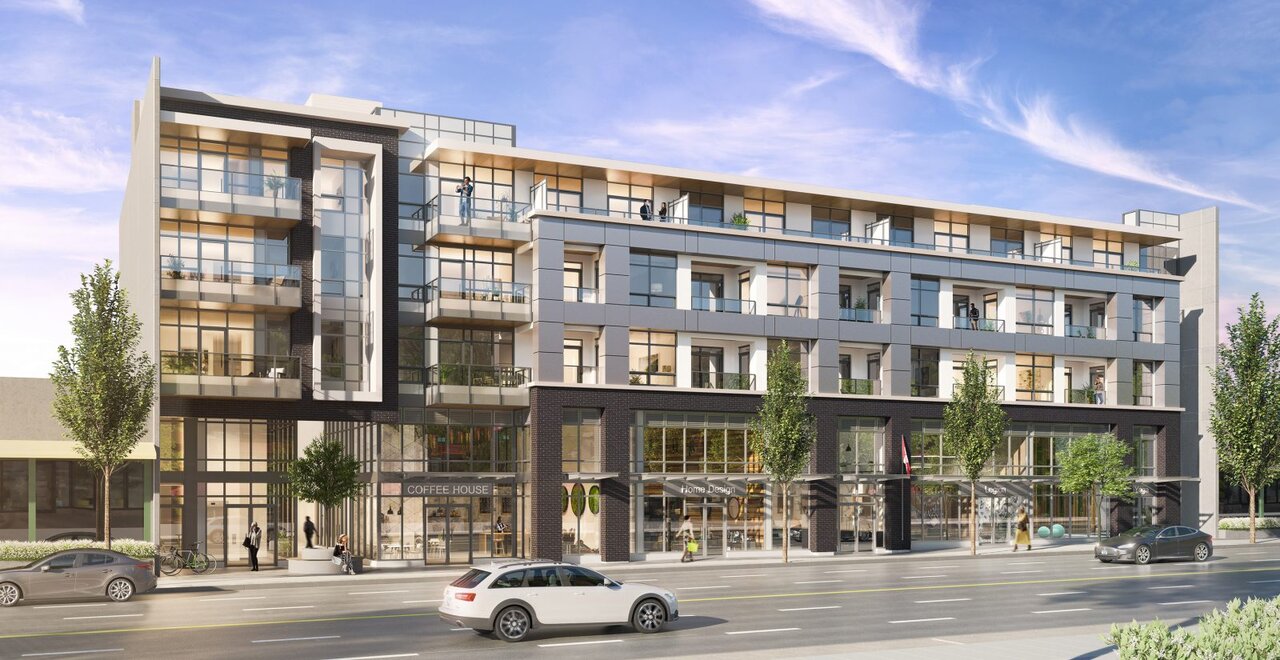
This hurts so much. This building just sucks. I guess its the economics of edmonton. Ugh. Here's vancouver and the GTA for inspiration of what we should desire more than this crap
 ...
...
roe_
Active Member
This hurts so much. This building just sucks. I guess its the economics of edmonton. Ugh. Here's vancouver and the GTA for inspiration of what we should desire more than this crap...
The design isn't great, but ditching the clown makeup would be an easy improvement. What kind of architect says, "let's go with maroon, blue and two shades of grey stucco!"?
cliffapotamus
Active Member
^^^ this. the massing isn't too bad, the balconies add interest, and the setbacks dynamic. but the grey. so, so, sooooo bad.
This trend of grey buildings needs to crawl back down the pinterest/instagram moodboard design hellhole it came from and die. We live in a place where the trees are barren 7 months of the year. we need colours.
This trend of grey buildings needs to crawl back down the pinterest/instagram moodboard design hellhole it came from and die. We live in a place where the trees are barren 7 months of the year. we need colours.
Platinum107
Senior Member
^This right here. Like, even straight up white would've looked 3x better than the moldy grey, which if you squint at this building mixes with the marron and blue and makes a very pleasant diarrhea-themed palette. I don't mind the massing either.
Clearshades
Senior Member
This is 'The Great Wall Of China'. The lower portion should have been contrasting colors to the offset higher portions with something connecting in the middle from the above picture...
I much rather they trade this for the new -'Remand Centre'. One is much friendlier aesthetics...
My goodness, I'm speechless here!
I much rather they trade this for the new -'Remand Centre'. One is much friendlier aesthetics...
My goodness, I'm speechless here!
Avenuer
Senior Member
This goes to show that Regency needs to really get away from DER as their 'go-to' architect, as all of their past projects with him have been mediocre at best.
IanO
Superstar
Density great; design not so much.
This goes to show that Regency needs to really get away from DER as their 'go-to' architect, as all of their past projects with him have been mediocre at best.
I can tell you that many people, myself included as well as their own consultants have urged Regency to do just that, particularly for Holyrood Gardens. The reaction I received at the suggestion was ...unexpected, let's just say.
Last edited:
IanO
Superstar
'You get what you pay for'
northlands
Senior Member
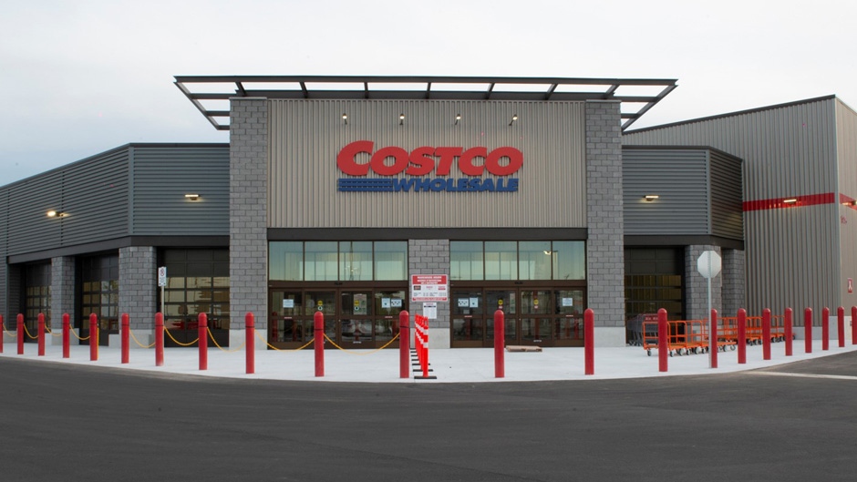
Various shades of grey complemented by red and blue with BULK sizing... where have I seen that before.... oh yeah!

itom987
Active Member
This has gotta be the most Russian looking building in Edmonton. The second photo in this thread should be called "Irony".