What do you think of this project?


  • Total voters
    62
PERMIT_DATE March 19, 2020
JOB_CATEGORY Commercial Final
ADDRESS 7 - SIR WINSTON CHURCHILL SQUARE NW
NEIGHBOURHOOD DOWNTOWN
JOB_DESCRIPTION to construct Interior Alteration to an Edmonton Public Library - Lounge & Washroom Renovation - Demolish one of the existing washrooms and wall separating the two existing rooms. Renovate existing washroom and lounge area with new finishes and fixtures including kitchen area.
BUILDING_TYPE Libraries/Museums/Art Galleries (630)
WORK_TYPE (03) Interior Alterations
FLOOR_AREA 699.65
CONSTRUCTION_VALUE 75,000
 
I've always preferred the Tank from this angle!
Screen Shot 2020-04-03 at 9.06.01 AM.png
 
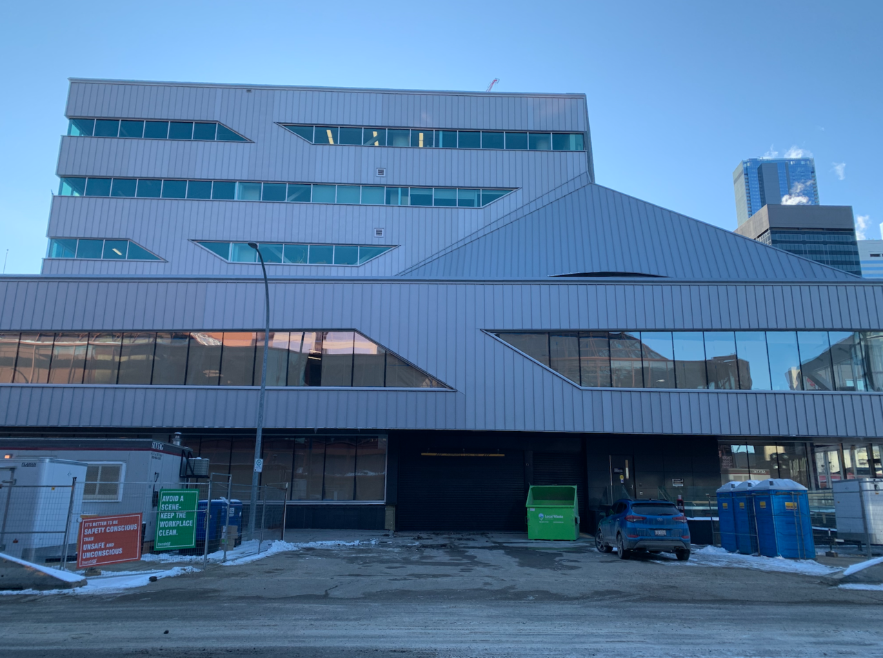
What a disaster this is. I was hopeful during construction, cause you know, sometimes renders are underwhelming, but I walked by yesterday and had to change my vote on this thread from "dislike it" to "dislike it a lot". And now we're stuck with this monstrosity for at least the next 30 years. Sheesh.
 
^ You just have to learn to approach the beast at the right angle, ie. from the East on 102 ave from a reasonable distance away, and.. that's about it. Also, never stare into it's eyes (and it's got eyes all over the place).
 
The thing with the skin, is it looks pretty decent on a sunny day. The building shines up. On an overcast day, the greyness gets magnified. They used similar siding on the Clareview and Commonwealth rec centre, and the finished product looked pretty good.
 
The skin is likely built to last given the other applications it has. From an aesthetic point of view, it isn't great, but the city is pretty broke now, so I can't see a re-skin occurring until it is absolutely necessary. I mean, as much as us design buffs would like to see it otherwise, it probably isn't realistic nor a priority unless it leaks like the police station.
 
I think it would look good painted black or black siding. I think that's the cheapest route to take. It'll make the building look smaller and make the window dseign pop out. Millwoods library is black and it looks pretty good. Curve some of those sharp edges too.
 

Back
Top