thommyjo
Senior Member
RenderingIs it meant to fully cover the balcony glass? If so, then it could make a nice accent punch. But if it's like how it is, with some panes untouched, other only half covered, that'd be weird.
RenderingIs it meant to fully cover the balcony glass? If so, then it could make a nice accent punch. But if it's like how it is, with some panes untouched, other only half covered, that'd be weird.
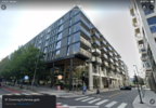
If they'd gone for panels, instead of stucco, and glass on the balconies, it would've looked absolutely incredible, but I do agree that it doesn't look nearly as good as the renders made me expect.I think that the courtyard area is very beautifully designed but I'm not gonna lie the outside walls facing the street do look quite boring. I get this is Edmonton, where buildings like the Falcon Towers and Manchester Square have fans, but it's not exactly amazing architecture from the sides that most people will see. It's really just fine, courtyard aside. Still good density and looking forward to the influx of residents and visitors as the CRUs and residences fill up.
If they'd gone for panels, instead of stucco, and glass on the balconies, it would've looked absolutely incredible, but I do agree that it doesn't look nearly as good as the renders made me expect.
yeah that’s dumb
Some are loose, missing or flapping in the windIs it meant to fully cover the balcony glass? If so, then it could make a nice accent punch. But if it's like how it is, with some panes untouched, other only half covered, that'd be weird.
Is it meant to fully cover the balcony glass? If so, then it could make a nice accent punch. But if it's like how it is, with some panes untouched, other only half covered, that'd be weird.
 maps.app.goo.gl

Yeah, it’s very ok. I’m not mad Mercury Block exists as it’s adding good density, getting rid of a parking lot, and has a cool courtyard that’ll hopefully continue the magic of Oliver Exchange. But people are acting like this development is much greater than it truly is. So there’s a cool red staircase that is clearly meant to be an Instagram focal point. What else?“No frills” building where it should have been a “loblaws”. Does the same job but finishings are very basic. A few of these elements could have made it a 10/10 rather than a 7/10.
View attachment 560412
Google Maps
Find local businesses, view maps and get driving directions in Google Maps.maps.app.goo.gl
Absolutely. It's good, human-scaled density. But it's not architectural excellence like some are suggesting, that's all.Mercury Block checks a ton of boxes for a development in this type of area. It provides good housing options for people looking to live there.
While I would have preferred brick, I don't really care. It's pretty much better than 95% of midrise buildings in the City. If they find it economical to build 10 more of these kinds of builds, I'm all for it.
We have parking lots to kill.