News   GLOBAL  |  Apr 02, 2020
 9.6K     0 
News   GLOBAL  |  Apr 01, 2020
 41K     0 
News   GLOBAL  |  Apr 01, 2020
 5.4K     0 

afransen

Senior Member
Member Bio
Joined
Apr 23, 2007
Messages
8,164
Reaction score
9,826
With so much midrise development taking place, it makes me wonder how unique the form they are taking in Toronto. Particularly the terracing required by 45 degree angular plane/shadowing. Looking at other big NA cities such as NYC and Chicago, it seems their new midrise developments don't feature nearly as much terracing. It makes me wonder if this will become a characteristic style of building to Toronto, particularly because I imagine it increases construction cost and reduces sellable sqft for a given height. Developers would tend to only use significant terracing where required by official plan.
 
As we build more midrises (hopefully), our vernacular should start becoming more visible.
 
So far, my impression was that there only high-rises and sprawls in GTA. Could we take a closer look at good examples of what named mid-rises and better plus mixed-used?
 
So far, my impression was that there only high-rises and sprawls in GTA. Could we take a closer look at good examples of what named mid-rises and better plus mixed-used?

I don't know about 'good'..........I'd have to think about that more.........

But here are some representative examples:

Toronto mid-rise, just north of Summerhill on Yonge:

1622775631765.png


Toronto mid-rise a few blocks north of the one above:

1622775690599.png


Toronto mid-rise, just a bit north of that, still on Yonge:

1622775740811.png


Mid-rise, Toronto's Beach neighbourhood, a few blocks east of Woodbine:

1622775844403.png


Midrise Toronto, Danforth at Woodbine:

1622775959006.png
 
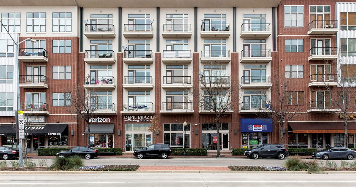
That's not bad at all. Thanks. What do you think about architecture style? Is that can be true that for a picky stroller, many of these buildings can be easily mixed up with the decks of cruise ships? How to avoid it? How to make architecture solutions more competitive, thus improving the city streets' aesthetics? Can we see more examples of modern and lively designs like that in the image below? I don't call on to copy it, but midrises of modern architecture seem to miss in Toronto like a trend. Walking along a sidewalk should be interesting for those who walk. That can be taken as one of the good rules of filling our streets and parks with people. The building on the pic. 3 of Northern Light post is depressing me.

Windows exterior and material, overusing brickwork, and common rusticity of style arise questions. The number of bulkheads and lintels nudge us to wonder whether the architect had a choice to play with forms, colors, materials? The only outstanding building is in the second pic because it a reproduction of French architecture of the time of Napoleon. And in the fourth one, if Starbucks hadn't delighted the eye there, it would have represented.....I can't pick the right definition yet, though the street number is unusual and placed out of box.

Helsinki-02-Guide.jpg
Jätkäsaaren+asuntomessut4_Antti+Pulkkinen - Copy.jpg
121007_038.jpg
 
Last edited:
Our mid-rise style is pretty unique given that it is the result of very awkwardly thought-out planning policy, and arguably leads to very unideal results. The examples that @Northern Light showed above pre-date the existing policy.

Because of the avenues and mid-rise policy, most new mid-rises are only economically feasibly to construct when they are essentially horizontal sky-scrapers, and this results in IMO an overbearing hulking mass that isn't necessarily very urban. See Bianca Condos for an example.


Further, the outcome of these policies lead to inefficient building design, lots of thermal bridging, and unnecessarily lost square footage. This recent twitter thread on the subject was worth reading:

 
Further, the outcome of these policies lead to inefficient building design, lots of thermal bridging, and unnecessarily lost square footage.
Thank you indeed. It's interesting who approved this. Was there a professional discussion on this topic?

I am reading through Policy Context following the link at the tweet and see this: "..to intensify along the Avenues in a way that is compatible with the adjacent neighbourhoods through appropriately scaled and designed mid-rise buildings."

Who takes solutions is lead by intensifying ideas and thought about "appropriately scaling and designing" which are just nice facade words. But were there technical limitations such as maximum heat loss per square or volume unit for new construction? Bianca Condos at the first glance makes me think that the designer tried to expose to the atmosphere as much exterior surface of the building as possible. In that extension, the new building is really compatible with single-family dwellings around.

What do you think about the idea to prohibit new individual home construction or full renovation within the limits of Toronto in 5 or 10 years? So people have to switch to mid-rise dwellings or flee to the suburbs. In this way, the city would widen options for design criteria, land use, and development of all things: parks, urban transit, create new centers of urban life, save on maintaining roads that are less in use, take a chance to renovate infrastructure such as sewers, power lines?

Of course, it should work in a different way, not prohibition, but the general idea is somehow to change rules so that white monsters like Bianca Condos become the exceptions.

I might be wrong but from my standpoint, the dense matrix of the side street corridors of the private properties stays as fortified walls on the way of the wind of changes and slow down the development.

I see also a problem here in so-called zoning. The new development flow allowed along the arterials orthogonally and doesn't touch in the depth of the neighborhood. That constrains and narrows down creative space for designers, land architects significantly.

I have just watched this and found myself getting choked up:


I am pondering: Guys, are you serious?.... Is that the solution that you, guys, had been working hard on being in the loop of local issues and it was awarded?
 
Last edited:
I always had a bit of a soft spot for our Streamline Moderne style curvy, cruise liner themed midrises. Better than pointy boxes.

I don't know about 'good'..........I'd have to think about that more.........

But here are some representative examples:

Toronto mid-rise, just north of Summerhill on Yonge:

View attachment 324959

Toronto mid-rise a few blocks north of the one above:

View attachment 324960

Toronto mid-rise, just a bit north of that, still on Yonge:

View attachment 324976
 

Back
Top