News   GLOBAL  |  Apr 02, 2020
 9.5K     0 
News   GLOBAL  |  Apr 01, 2020
 40K     0 
News   GLOBAL  |  Apr 01, 2020
 5.3K     0 

While I agree with much that you state, it is not the 'style' which gives a building life, but the interplay between functionality and form.

Indeed, and nowhere did I use the word 'style' to describe the practical system of problem-solving that is Modernism. As for the magic ingredient that creates aesthetic beauty, well, if that could be defined then it could be reproduced endlessly - which, alas, it can't ... and isn't. When it's present it makes life better, and designers who produce it crop up now and then, but there's nothing wrong with someone who doesn't see it either - though not seeing something can sometimes lead Philistines to claim that it can't possibly exist. And the humble collective, the repitition of basic forms, can also create beauty - when I think of Greece I'm as likely to be inspired by images of an island with dozens of small, almost identical white-painted barrel-vaulted houses as I am to see the Parthenon.

I actually like the Crystal a lot - it's as legible as any Modernist building in that the exterior form you see from the street translates directly through to the interior spaces, the interior structure is expressed in the exterior form, and at heart it's a simple solution to the ROM's need to display their collections and make it easy for visitors to circulate. It strikes me as quite 'pure' in a way that the AGO, for instance, isn't: that spectacular billowing Dundas facade hinting at further spaces that aren't delivered - instead Gehry gives us handsome rectilinear Modernist white-walled galleries throughout. Diamond talked about this Gehry "carapace" effect in his talk, of his combination of artistry and computer software and the idea that you can now "do anything" - as well as the idea of novelty architecture as a smart career move.

I have no idea what scribble you're talking about. I missed Diamond's first half hour.
 
Canada Life is a pretty hard case to argue one way or the other, but the Royal York?? It addresses the waterfront in a way that no New York City building of the period does, is beautifully massed, strikes a lovely balance between the French Gothic of the Plaza and the Waldorf-Astoria’s Art Deco and was the largest hotel in the commonwealth and one of the largest in the world when completed. I see no point upon which it is inferior, and for my own personal taste I prefer it to its slightly frou-frou NYC contemporaries.

CCN is one of the most beautifully composed skyscrapers in the world, and more than a match for the rather ungainly monoliths on Wall Street. It is stirringly grand, yet serene, and without the overbearing quality that turns downtown NYC into a Batman movie after the sun goes down.
 
... and it was even lovelier before Eb Zeidler junked up the pure, Modernist geometry of the exterior plaza with his faux-Calitrava excrescences and monkeyed with the interiors.
 
CCN is one of Canada's best skyscrapers, and the best of the pre-war period. Montreal's Aldred building is perhaps purer deco, but it is paltry and undersized -- and hence lacks presence.

as nice as it is, though, it's anachronistic compared to something like 500 5th ave.,

(it actually resembles this building's left "shoulder," which is to say that 500 5th is a far more elaborate and involved meditation on the theme.)

500_fifth.jpg


clunky and midwestern compared to something like 500 lexington

3789355705_72f14cf4e5_b.jpg


and rather joyless when compared to 70 pine.

i am dragging this on, i know -- it's just that this argument is fascinating. i have never encountered such an (in my view) overestimation of toronto's architectural wealth (i would say the same, as an aside, were someone to say montreal could compare to nyc). CCN is a good period skyscraper -- on the level of detroit's penobscot building or chicago's palmolive building. that's it.
 
Last edited:
555 Fifth is handsomely massed but disturbingly narrow when viewed from the avenue; and the lobby is a grim grey tomb rather than CNN’s lovely weightless space. If by “left shoulder†you mean the building directly adjacent, that may be because that building’s architects were York & Sawyer, who I believe were consultants on CNN.

500 Lexington is very disturbing, with an ugly naked side to the south. The proportions have always seemed too thin for the overly elaborate crown and the structure turns St. Bartholomew’s into an ungainly pseudo pod (the two structures are the same color, an early stab at contextualism that went awry).
 
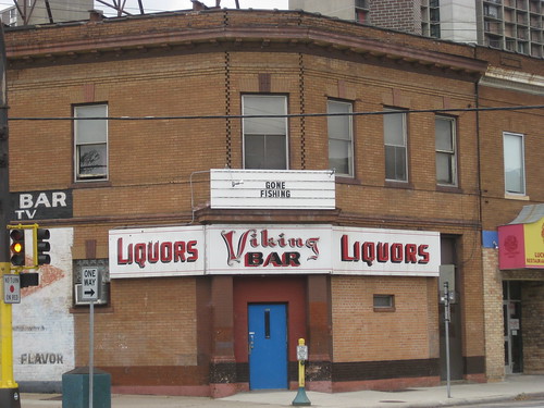
Just like the blue-collar workers who left the Cedar-Riverside neighbourhood in Minneapolis leaving places like the Viking Bar empty,

3980062217_1caa24e18a.jpg


this thread has gone fishing. In a good way though, I might add.
 
I actually like the Crystal a lot - it's as legible as any Modernist building in that the exterior form you see from the street translates directly through to the interior spaces, the interior structure is expressed in the exterior form, and at heart it's a simple solution to the ROM's need to display their collections and make it easy for visitors to circulate. It strikes me as quite 'pure' in a way that the AGO, for instance, isn't: that spectacular billowing Dundas facade hinting at further spaces that aren't delivered - instead Gehry gives us handsome rectilinear Modernist white-walled galleries throughout. Diamond talked about this Gehry "carapace" effect in his talk, of his combination of artistry and computer software and the idea that you can now "do anything" - as well as the idea of novelty architecture as a smart career move.

... and yet one of the criticisms of the Crystal is its lack of practicality/functionality as a museum space? I like the Crystal but I'm surprised to see you say you like it too. The most obvious, or practical, solution for the addition would have been a D&S box, surely. Libeskind's shards are essentially frivolous pippy-poos, a more recent version of Victorian turrets in terms of functionality. They are designed for presence, which is not a bad thing, whether Diamond dismisses this as novelty or not.
 
Oh, I've spoken up for the Crystal on several occasions, Tewder, just as I've pointed out that Modernist buildings - both the early pre-WW2 European examples, and our local and more recent "comfy Modernism" variety - can successfully incorporate curves, and that shapes and colours have no inherent moral value. Some silly boys hereabouts have me pegged solely as the "austere minimalism" guy for some unknown reason.

Did D+S submit a design for the ROM addition? I have no idea. The report that presaged the design competition identified a need to pull the ROM out of their trough of despond through the building of an iconic structure ( your "presence"... ) to get the tour buses to screech to a halt outside and lure the masses through the new entrance on Bloor. The shortlisted designs were certainly more Big Hair than what D+S do, but there's no reason to suppose one of our good local firms couldn't have done a bang-up job too.

My main beef with the Crystal is the enormous amount of steel required to build it, in an age of LEED and green issues - it seems quite wasteful. But I think Libeskind understood the functional requirements very well.

And I think we're in the territory of beauty and magic with the expressive spatial arrangements of the Crystal. The structure of intersecting forms, like something thrown up by tectonic forces, is vast - it's well worth spending half an hour just walking around inside that great sculpture and connecting to the energy of the place. Stand at the north end on the second floor facing Bloor Street, for instance, and trace the huge planes that soar up from the basement and intersect just above your head on their way up to the tips of those "shards", for instance. They're just behind you, expressed in the great angled walls too, and they leapfrog upwards across voids to the Costume and textile gallery, and they're incorporated in the Spirit House at the core of the thing. There's an extravagant visual delight there that probably only a large cultural institution with well-heeled supporters could produce.

None of this has much to do with Minneapolis, of course ...
 
Though Minneapolis does have its share of 'Big Hair' architecture so the same arguments here probably apply...

The Walker
792px-WalkerArtCenter.jpg


The Guthrie
795px-Guthrie_Theater-night-2007-03-12.jpg


Pictures from Wikipedia.
 
As the risk of sounding like a broken record, that blue thing is the scariest building I've ever seen. And I think Nouvel is very talented.
 
Oh, I've spoken up for the Crystal on several occasions, Tewder, just as I've pointed out that Modernist buildings - both the early pre-WW2 European examples, and our local and more recent "comfy Modernism" variety - can successfully incorporate curves, and that shapes and colours have no inherent moral value. Some silly boys hereabouts have me pegged solely as the "austere minimalism" guy for some unknown reason.

Because you usually (the Crystal being the one glaring exception I can ever remember) dismiss anything other than bare-bones, stripped back, budget-minimalism (4SC), as a cry for "hollow Spectacle". Oddly you give the Crystal a pass, even though (more than any other building in Toronto save the CN Tower), it is trading solely ON spectacle :p (edit: And on second thought, the CN Tower gets a pass because it was built as an functioning antenna!)

I actually like the Crystal a lot - it's as legible as any Modernist building in that the exterior form you see from the street translates directly through to the interior spaces, the interior structure is expressed in the exterior form, and at heart it's a simple solution to the ROM's need to display their collections and make it easy for visitors to circulate. It strikes me as quite 'pure' in a way that the AGO, for instance, isn't

The above is pants-wettingly-funny! The Crystal obscures its use through finicky window placements, a purposeful masking of stories. It's completely illegible; as a building, a museum, whatever. That a fractured sense of volume is expressed inside can hardly be helped - though the impression I always get is that the interior of the building is actively fighting against that; railings to stop people from walking up walls, special cases needing to be designed because the old ones couldn't fit, a dinosaur vying for attention in a fun house room without right angles. The addition chatters on at full-volume even while you're trying to focus on what it contains.

That you think the Crystal 'is a simple solution to the ROM's need to display their collections and make it easy for visitors to circulate' is amazing. Truly, amazing :)
 
Last edited:
The COC and the ROM got very different buildings because they're different institutions with different requirements. The Crystal is clearly a contemporary addition, and its use is obvious when seen from the street - everyone knows it's part of the ROM. The connection it makes with the heritage wings on both sides and on both the cultural and natural history floors is perfectly clear to visitors. The building can be enjoyed independently of what goes in it, just as the rectilinear City Room can be enjoyed for all its Piranesian splendour on opera nights. The system of custom glass display cases used in the Crystal matches the system used in the heritage wings, and the same exhibition display firm worked with ROM curators to install both. The heritage wings, opened in 1914 and 1933, aren't FSC "bare-bones, stripped back, budget-minimalism " any more than the Crystal is, and I enjoy them too. So the silly little thesis you're trying to assemble falls apart at all levels, with or without Depends.
 
The COC and the ROM got very different buildings because they're different institutions with different requirements. The Crystal is clearly a contemporary addition, and its use is obvious when seen from the street - everyone knows it's part of the ROM. The connection it makes with the heritage wings on both sides and on both the cultural and natural history floors is perfectly clear to visitors. The building can be enjoyed independently of what goes in it, just as the rectilinear City Room can be enjoyed for all its Piranesian splendour on opera nights. The system of custom glass display cases used in the Crystal matches the system used in the heritage wings, and the same exhibition display firm worked with ROM curators to install both. The heritage wings, opened in 1914 and 1933, aren't FSC "bare-bones, stripped back, budget-minimalism " any more than the Crystal is, and I enjoy them too. So the silly little thesis you're trying to assemble falls apart at all levels, with or without Depends.

I love the crystal but I think you doth protest too much.
 

Back
Top