News   GLOBAL  |  Apr 02, 2020
 9.8K     0 
News   GLOBAL  |  Apr 01, 2020
 41K     0 
News   GLOBAL  |  Apr 01, 2020
 5.6K     0 

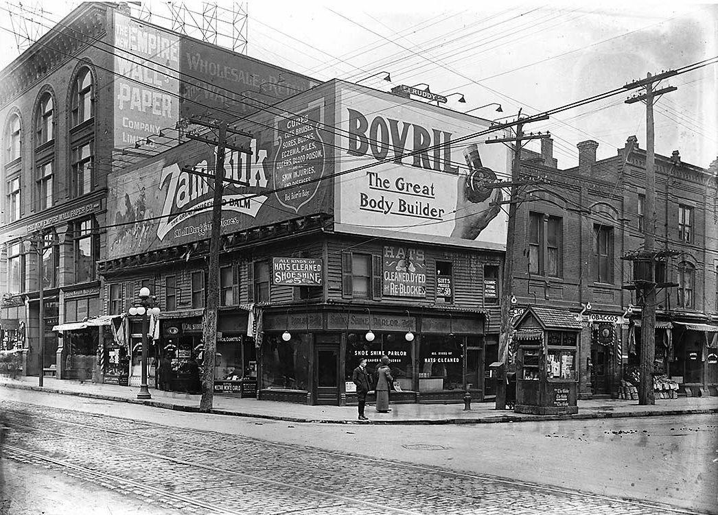
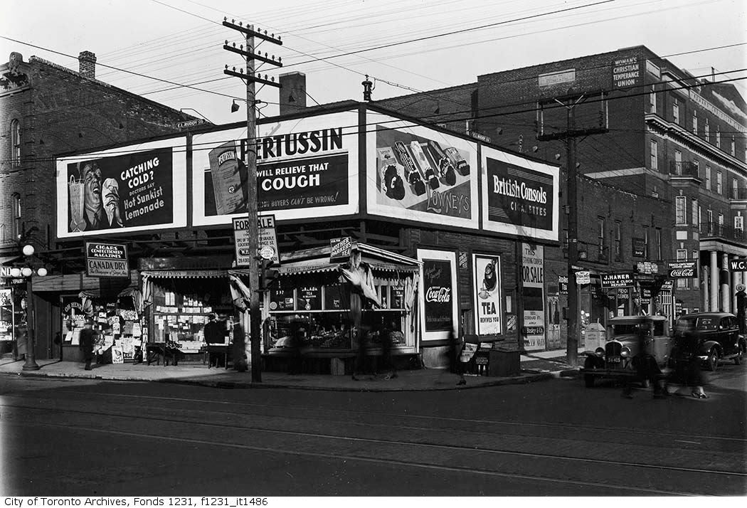
All this recent talk about taxing billboard companies would almost lead one to believe that signage and advertising is a relatively recent phenomenon, and that there once existed a pristine ad-free city. At least in the 20th century, from store signage, to billboards, to horse-drawn ads to vehicular ads, Toronto has embraced the varying delights of the visual come-on.

NE corner of Yonge and Shuter 1912:
Northeast_corner_of_Yonge_Street-1.jpg

Seeing these images is a great reminder as to how important the visual language of marketing has always been to urban life. And how much it has always animated and excited our sense of what city living is.

Incredibly of course many of these late 19th/early 20th century signs were actually hand painted, and almost functioned as a kind of indigenous commercial folk art. Even as printing technologies allowed for posters to be mass produced, there was a great deal of genuine aesthetic impact to be found there.

Today the problem is not so much the presence or glut of commercial signage, but the utter lack of any visual interest or sense of aesthetics in so much of it. As with so much of what ails the public realm in Toronto, the problem mainly lies in appallingly bad design and execution.

To me, nothing has done more damage to the look of the city street than the ubiquitous cheap backlit sign boxes with vinyl lettering. Many of them don't even pretend to be 'designed’, and are an offence to anyone with even a scintilla of taste.

IMG_3932-1.jpg


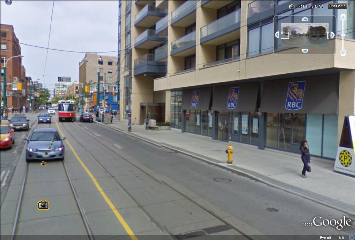
This problem has dovetailed in a disastrous way with the complete failure of so many commercial and condo developers to figure out how to incorporate the signage of the ground floor retail into their developments. Giving rise to monstrously ugly and mean views like these:

IMG_3930.jpg


IMG_3912.jpg


IMG_3913-1.jpg


IMG_3915.jpg


IMG_3922.jpg


IMG_3927.jpg


IMG_3928.jpg
 
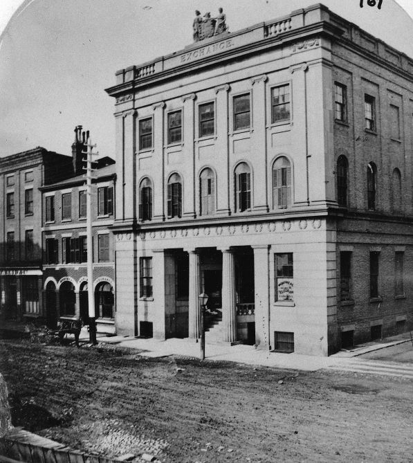
According to my 1874 FISHER & TAYLOR'S Toronto Directory, Leader Lane was at that

time named Exchange Alley, running north from Wellington to Colborne St, ending there.

It was laterly extended to what is now the east/west back lane behind The Albany Club

et al. During the former time (1874) The (Corn) Exchange Building housed many offices

including those of Gooderham & Worts, (non executive?) they also being involved with

corn. This property was at the N/W corner of Wellington & Exchange Lane/Leader Lane,

presently occupied by a condo, c/w an Italian restaurant on the main. (30 Wellington E)

At some point in time this mid eighteenth century "pile", (with affection) became

The Imperial Bank; it burned March 20/41.


Regards,
J T

Thanks for this info, JT. I had thought that the Exchange building was lost in the blitzkreig of the 50's and 60's. I think it was one of the finest Georgian buildings ever built in Toronto, worthy of John Nash or the Adams brothers. What a loss...

1856:
04wellingtonexchange1856jy5.jpg


1878:
Toronto_Stock_Exchange_in_1878.jpg
 
This problem has dovetailed in a disastrous way with the complete failure of so many commercial and condo developers to figure out how to incorporate the signage of the ground floor retail into their developments. Giving rise to monstrously ugly and mean views like these:

IMG_3930.jpg

I've noticed that many businesses that locate in condo ground floor retail locations tend to fold more quickly than those that don't. I've no data to support this, just a personal opinion based on what I think I've seen.


December 4 addition.


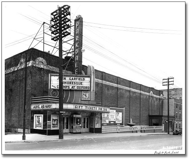
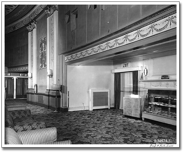
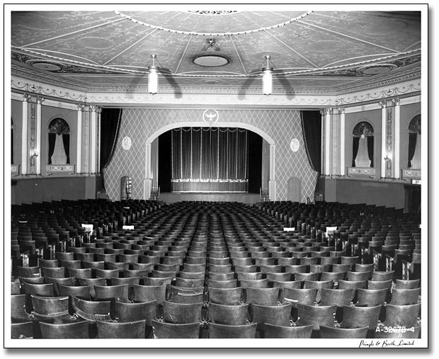
Parkdale Theatre. Saw 'Bambi' here. Still can't shake it the horror of her mom's death.:eek:

rg_56_11_0_312_1_620.jpg


CSC_0034.jpg


rg_56_11_0_312_2_620.jpg


CSC_0036.jpg


rg_56_11_0_312_3_620.jpg


CSC_0035.jpg


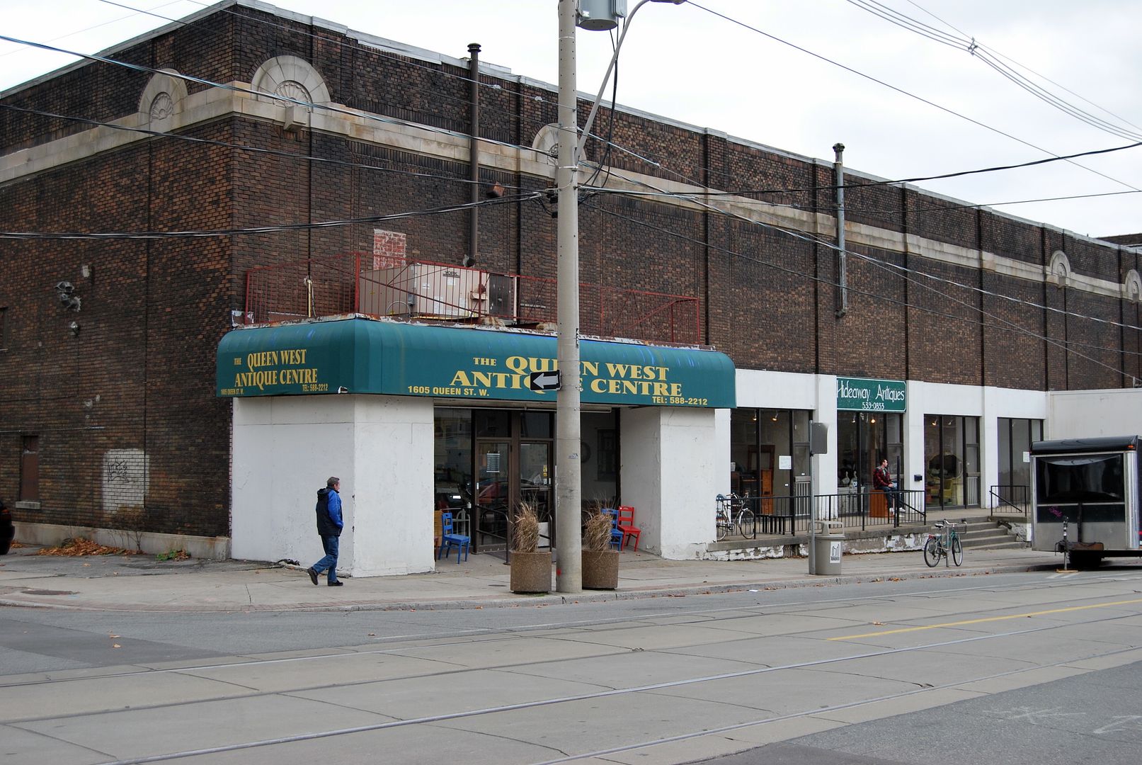
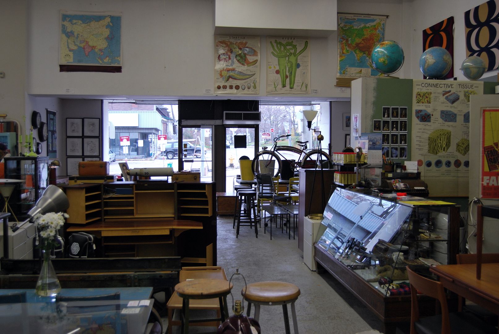
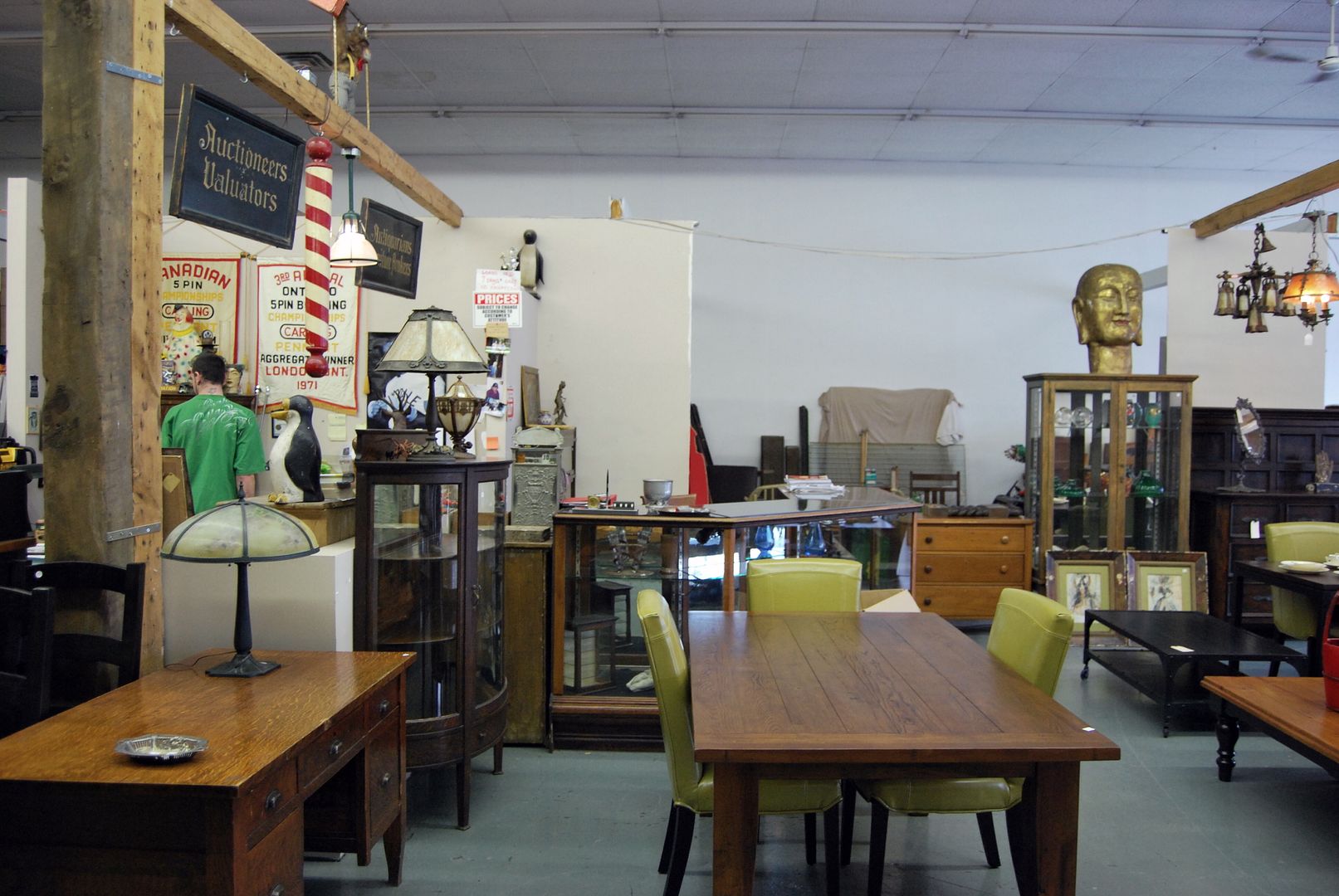
There are two separate antique businesses here now, although it looks like one. Many thanks to their owners for letting me take pictures. Quality stuff in their shops. Wish I hadn't thrown out my parents mid century stuff...


.
 
Seeing these images is a great reminder as to how important the visual language of marketing has always been to urban life. And how much it has always animated and excited our sense of what city living is.

Incredibly of course many of these late 19th/early 20th century signs were actually hand painted, and almost functioned as a kind of indigenous commercial folk art. Even as printing technologies allowed for posters to be mass produced, there was a great deal of genuine aesthetic impact to be found there.

Today the problem is not so much the presence or glut of commercial signage, but the utter lack of any visual interest or sense of aesthetics in so much of it. As with so much of what ails the public realm in Toronto, the problem mainly lies in appallingly bad design and execution.

To me, nothing has done more damage to the look of the city street than the ubiquitous cheap backlit sign boxes with vinyl lettering. Many of them don't even pretend to be 'designed’, and are an offence to anyone with even a scintilla of taste.

This problem has dovetailed in a disastrous way with the complete failure of so many commercial and condo developers to figure out how to incorporate the signage of the ground floor retail into their developments.

Your point is well taken, deepend, and I believe the problem derives from many residential developers having no regard for the retail component and not integrating signage (or thinking about it at all) while the building is being designed. Issues such as materials, colours, lettering, etc. are completely ignored until it's too late. Combined with this is (how shall I put it?) a general lack of taste and a reluctance to spend any "additional" money on upgraded materials or a designer.

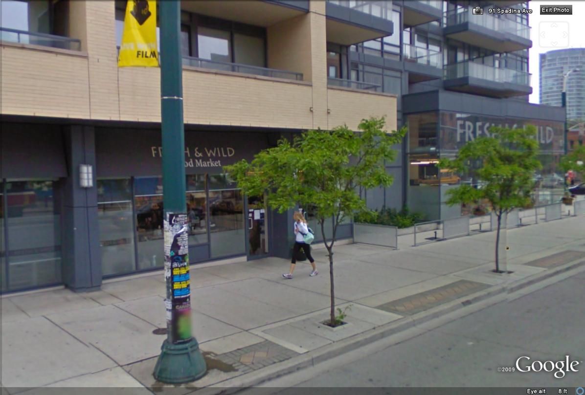
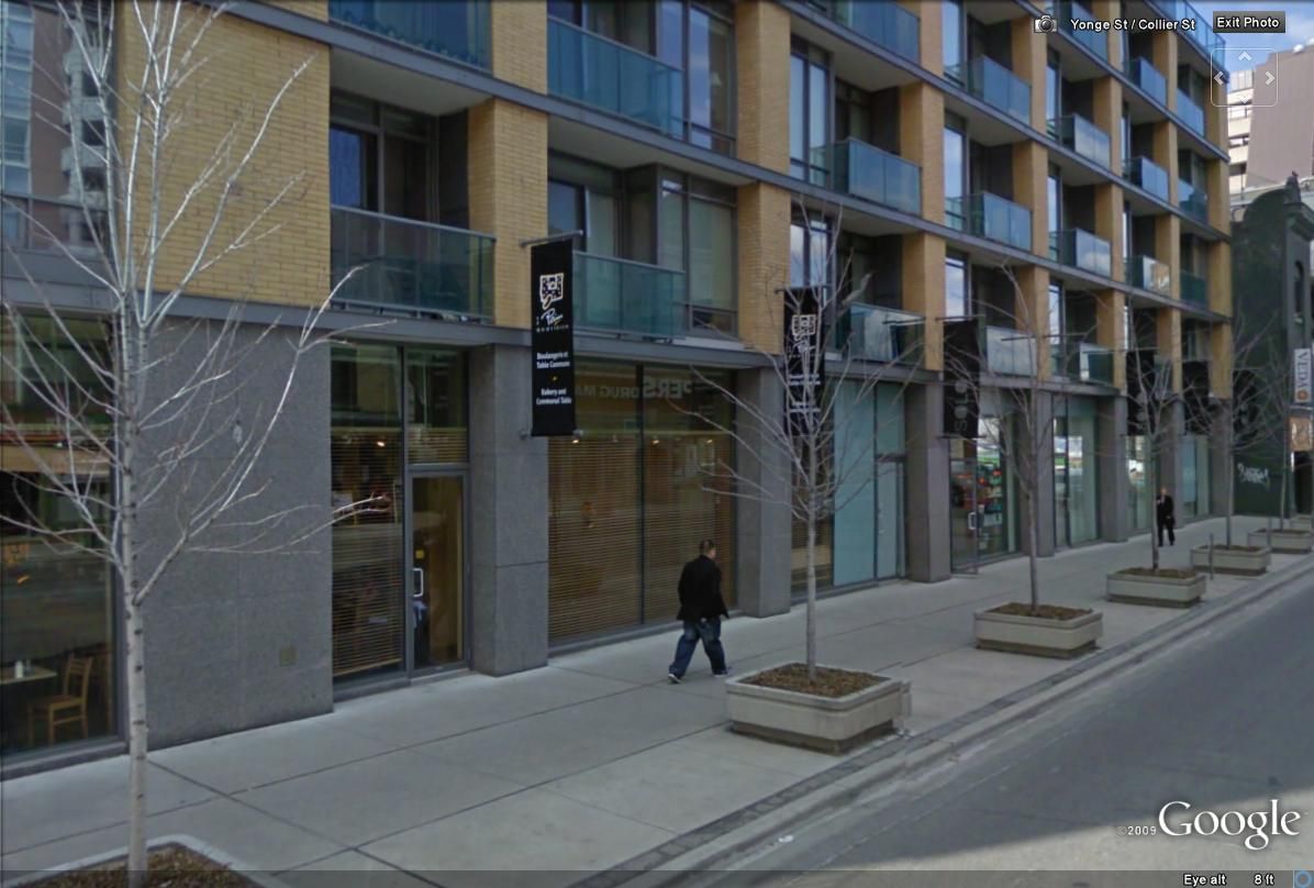
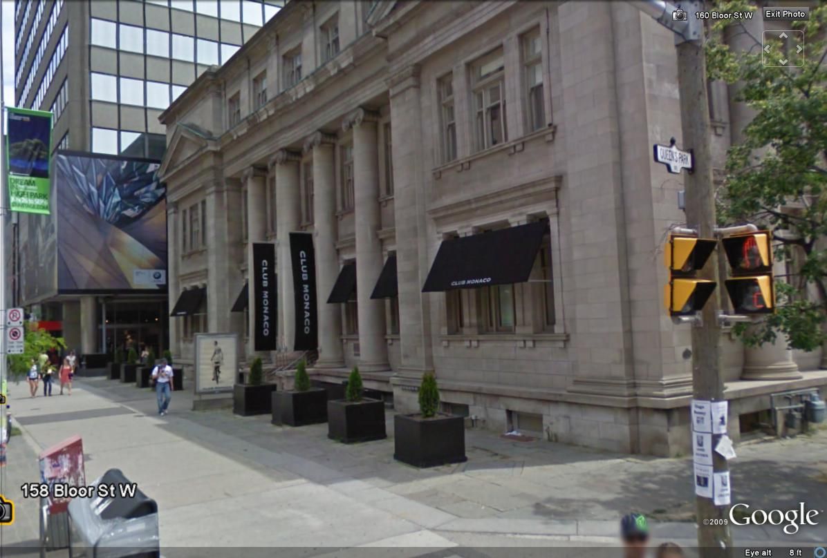
Some buildings do it quite well. I think the Hudson (at King & Spadina) integrates the signage quite subtly, matches the colours to the building palette and varies the design by putting the "Fresh and Wild" signage on the inside of the glass box. Another good example is 18 Yorkville, though it could be argued that the banners are almost too subtle and black canvas awnings should have been added as well. My favourite use of awnings is the Club Monaco at Bloor and Avenue Road: elegant, minimalist and complementary to the architecture (and the brand).

Hudson:
hudsongoogle.jpg


hudsongoogle2.jpg


18 Yorkville:
18yorkvillegoogle.jpg


Club Monaco:
clubmonaco.jpg
 
Two more "signage" pics:

NE corner of Yonge and Gerrard 1937:
1937necorneryongeandgerrardpj6.jpg


I think that the City holds some responsibility for the decline in quality signage by prohibiting projecting signage over City streets (even a canvas awning now requires an encroachment agreement; forget about Manhattan-style canopies to the curb). Though some may argue that it eliminates visual "clutter", it also eliminated the vitality of so many storefronts as well.

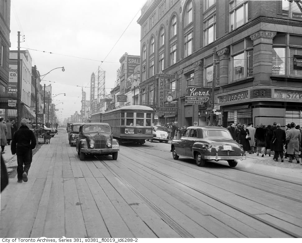
Yonge and Shuter 1949:
1949yongestreettrafficxr8.jpg
 
Parkdale

Wow I passed this on the streetcar a couple weeks ago. I actually made note of the bldg as it seemed interesting, but figured it was just another old warehouse (especially for that area).

CSC_0034.jpg


I had NO clue it looked anything like it did! Wow!! Very impressive / Sad :(

Thanks
 
I've noticed that many businesses that locate in condo ground floor retail locations tend to fold more quickly than those that don't. I've no data to support this, just a personal opinion based on what I think I've seen.

Ground floor retail rarely works long term. Main reasons I see are;

1) The ground floor of a multi-story tower has lots of columns, mechanical rooms, lobbies, parking ramps, etc. Therefore it is very difficult for national retailers to fit into the spaces with prototypical stores (i.e. Shoppers or banks) who tend to last longer than independents

2) The condo development community for the most part do not have retail as part of the long-term strategy of the development, its often an after-thought or requirement. These developers do not have retail leasing departments or a retail division that maintains the vision and management of this component of the building. The retail components are sold off to investors or the condo itself. Without the long-term vision the retail component goes to the highest payer, not the strongest tenant or best mix.

There are exceptions, and in these cases the retail seems to work as the developers have teamed with retail developers so the needs of a retailer are factored into the design/leasing (Lanterra, First Gulf, Tribute-RioCan, Cadillac Fairview, etc).
 
Wow I passed this on the streetcar a couple weeks ago. I actually made note of the bldg as it seemed interesting, but figured it was just another old warehouse (especially for that area).
I had NO clue it looked anything like it did! Wow!! Very impressive / Sad :(
Thanks

You're welcome; :) in addition to the re-use of this old theatre as an antique store, there are a number of others on both sides of Queen in these couple of blocks. Kind of an 'antique row' - like Royal Street in New Orleans or Bond Street in London, but not quite. Yet. But we can hope. An under appreciated stretch of Queen IMHO.


QUOTE=Earlscourt_Lad;348349]There's an identical building at St. Clair & Dufferin.

f1231_it0222.jpg
[/QUOTE]


Amazing that you could commission a movie house for no small investment and even - back in those days - re-use a set of plans to create a cookie cutter building.


thecharioteer, those old signs seem to confirm that consumer aspirations were simpler. Nothing like the advertising proclaiming 'mass-tige' - prestige goods mass produced for the masses - today. Then: Lowney chocolates. Today:? I suppose it could be Godiva chocolates.


December 5 addition.


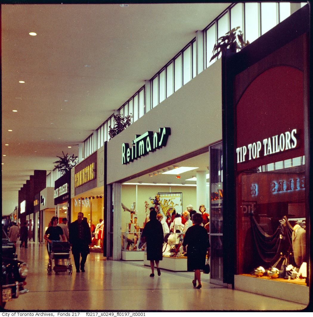
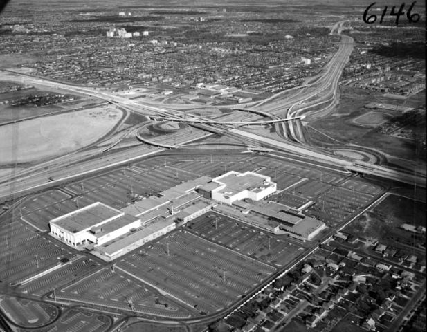
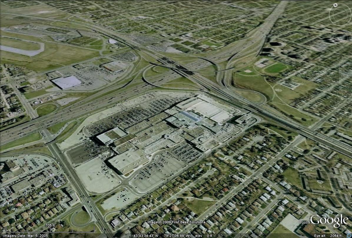
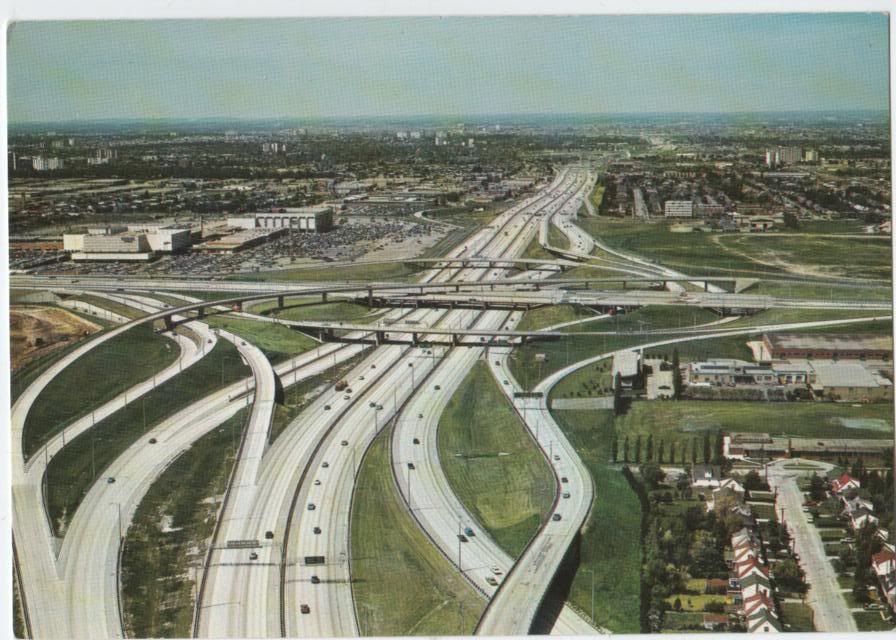
Then: 1960s Yorkdale mall.

That's a Karmann Ghia poking into the picture isn't it? stumack? LIMike?

fo0217_ser0249_f0217_s0249_fl0197_i.jpg


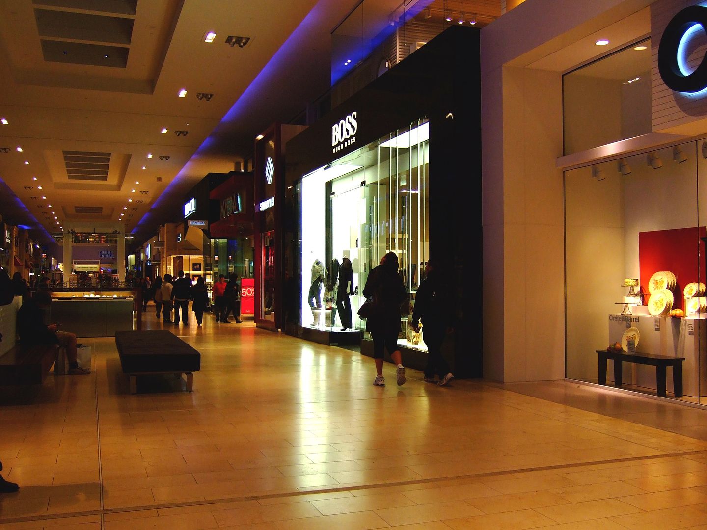
Now: September 2009.

DSCF2075.jpg
 

Back
Top