|
|
|
You are using an out of date browser. It may not display this or other websites correctly.
You should upgrade or use an alternative browser.
You should upgrade or use an alternative browser.
- Thread starter Mustapha
- Start date
Armour
Senior Member
The funny thing is that the center ice faceoff circle in hockey is blue, not red. If that red dot in the aisle is to represent where the center ice circle was on the ice surface (which I believe it is), then it is technically incorrect in its appearance.View attachment 65187 View attachment 65188
yep, it works good. no more messing with photobucket. then: Maple Leaf Gardens centre ice. Now: red spot in aisle 25 at the Loblaws in the former Gardens.
Goldie
Senior Member
Goldie
Senior Member
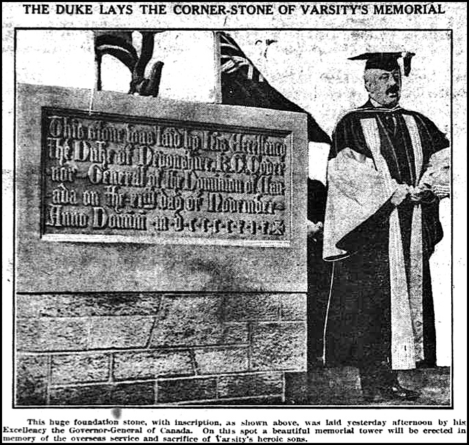
And here's a challenge ---- can someone provide a "Now" image (featuring the stone) to accompany this 1919 image of a U. of T. event?
Cornerstone of the "Soldiers' Tower" being laid by Governor General, the Duke of Devonshire.

Cornerstone of the "Soldiers' Tower" being laid by Governor General, the Duke of Devonshire.
Attachments
RadioTech
New Member
Goldie
Senior Member
Excellent, Radio Tech.
I particularly appreciate your very accurate view-point.
I particularly appreciate your very accurate view-point.
RadioTech
New Member
Thanks, Goldie:
When I first encountered this forum, I was impressed and inspired by the shots taken by yourself and Mustapha.
Though my interest is more historic than photographic, it seems the most relevant way to make a comparison, whenever and wherever possible.
I hope to find the time to do more of them in the future.
Joe
Goldie
Senior Member
The Scarborough Bluffs Refreshment Room was constructed in 1903. The business was opened by Albert Stinson to attract customers disembarking from the streetcar and continuing southward toward Lake Ontario where, by 1911, Scarborough Township had established Scarborough Bluffs Park.


Attachments
Koolgreen
Active Member
Koolgreen
Active Member
Armour
Senior Member
Although I haven't cared about the Leafs for a decade, I'm so glad they finally changed that clunky, inelegant logo. The new one is quite attractive and it actually looks more like a maple leaf. The current one doesn't even resemble one.
Mustapha
Senior Member
The funny thing is that the center ice faceoff circle in hockey is blue, not red. If that red dot in the aisle is to represent where the center ice circle was on the ice surface (which I believe it is), then it is technically incorrect in its appearance.
Funny that they got the colour wrong. And there is not even a plaque nearby to commemorate. It's like Loblaws wanted to keep it a secret just for those in the know...
Mustapha
Senior Member
I've probably posted too many Harbour Commission Building items.
However, this one is meant to keep the string active and thriving:
View attachment 65601
There will be some Googling to see why a German U Boat is in Lake Ontario but the answer isn't difficult to find.
Armour
Senior Member
That's an understandable mistake. All other faceoff circles in hockey are red. And there was a history of the space written on the back of a jar of pickles; but someone bought it.Funny that they got the colour wrong. And there is not even a plaque nearby to commemorate. It's like Loblaws wanted to keep it a secret just for those in the know...
the lemur
Senior Member
I think there might be an opportunity for a 3-part Then & Now when the York St offramp comes down.


