H
Hydrogen
Guest
Just think of how cheesy one could get with St. Patrick Station? 
Just think of how cheesy one could get with St. Patrick Station?
Does anyone think that shelling out $1.25 million for Jack Diamond to indulge his interior decorating fantasies at Museum station guarantees "outrageous success"?
And by what yardstick will this "outrageous success" be measured? By twice the number of people entering the station? By nice write-ups in glossy magazines? By the OAA giving Diamond+Schmitt an award for best tacky and cheesy reno of the year? What?
If you're a twelve year old, perhaps.
Perhaps TKTKTK could convince the TTC to hide snipers in the St.Clair station? They could take potshots at commuters and create another edgy "outrageous success" - in honour of the 1837 Rebellion that paused near there on their march down Yonge Street.
I'm not saying that we have to change the entire thing. But if there's some design that does work – I don't see any need to preserve the bathroom-tile feature of every station. [...] I just don't think there is any value in preserving the current features and colours for the sake of simply preserving in them.
But that doesn't mean that the station fonts can't be preserved in the new scheme. Museum has done that,
And I don't think the tiles have lasted.
Honestly, at Harvard, with all its illustrious architecture and atmosphere, all Walter Gropius could come up with is this?


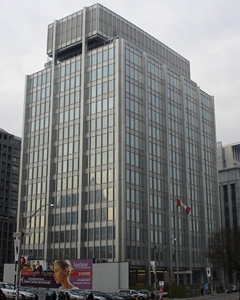
You know, and I know, that that photo shows an architectural triumph that brings architecture to a new level.
On the otherhand, I bet most people find it depressingly drab. Those philistines!

...would you find this to be cold, grey, and expressionless, and needing a little jazzing-up through colour, etc?
Because that's the sensibility you're bringing here.


