News   GLOBAL  |  Apr 02, 2020
 9.7K     0 
News   GLOBAL  |  Apr 01, 2020
 41K     0 
News   GLOBAL  |  Apr 01, 2020
 5.5K     0 

I'm going to guess that's where the ads will be reinstalled.

No, the ads are installed further down on the track in black frames.

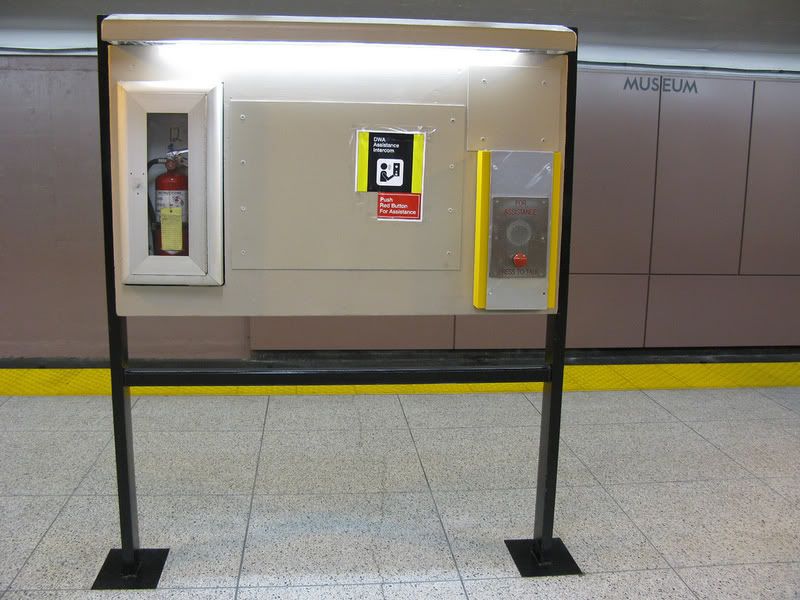
Those spots are for workers (and potentially fallen passengers) to back up against the wall should they be on the track when a train is coming.

Looks horrible... but so does the rest of the station. It fits right in.
 
thanks metroman for the pic post.


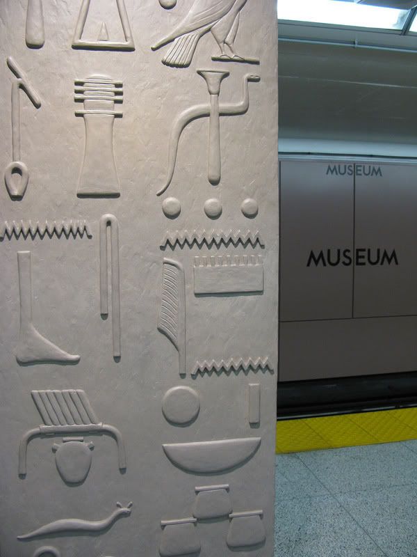
p.s, i wonder if the unfinished ceiling could be a reference to the unfinished pyramid?

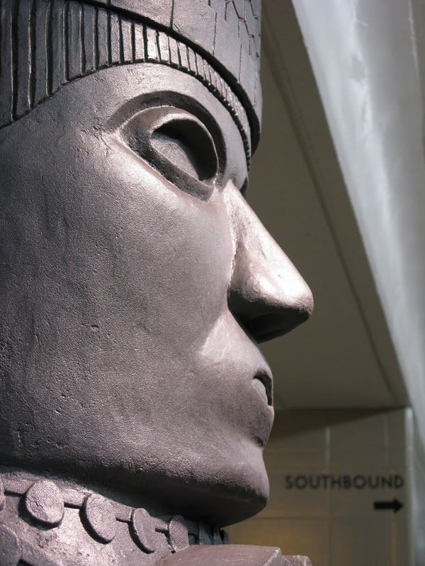
Eye.jpg


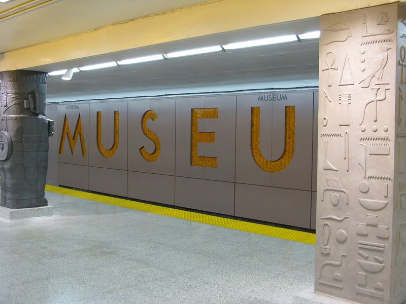
another thing, why is osiris brown? he's supposed to be green. and where's isis?


.
 
Notice how other stations don't have conspicuous sections of concrete wall, like St. George. It's another questionable aspect of the panels.
 
^ Because they didn't bother removing the tiles on the track. They just built on top of them. Had they removed the tiles first, there would be more space and that section of concrete wall wouldn't be there.
 
My photos...

2401668317_3faa68908a_b.jpg


2401674785_b5707a4a84_b.jpg


2401675685_abb2abc402_b.jpg


2401677647_1e9ff939dd_b.jpg


2401679021_2b6f17282d_b.jpg


2401681921_012eb1efb4_b.jpg


2401687537_80e4bed38a_b.jpg


2401690299_b67d32e2d6_b.jpg


2401694741_dd029068e1_b.jpg

(a little piece of the Moscow Metro in Toronto?)

2401696971_494d32e618_b.jpg


2402507000_c01e400381_b.jpg


2402521668_4ebc40dc1e_b.jpg


... and videos.

http://ca.youtube.com/watch?v=sgWqQF6xD2c

http://ca.youtube.com/watch?v=I4fl03Py0zs

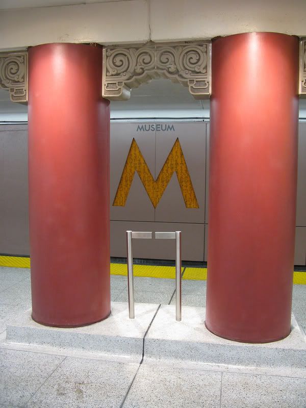
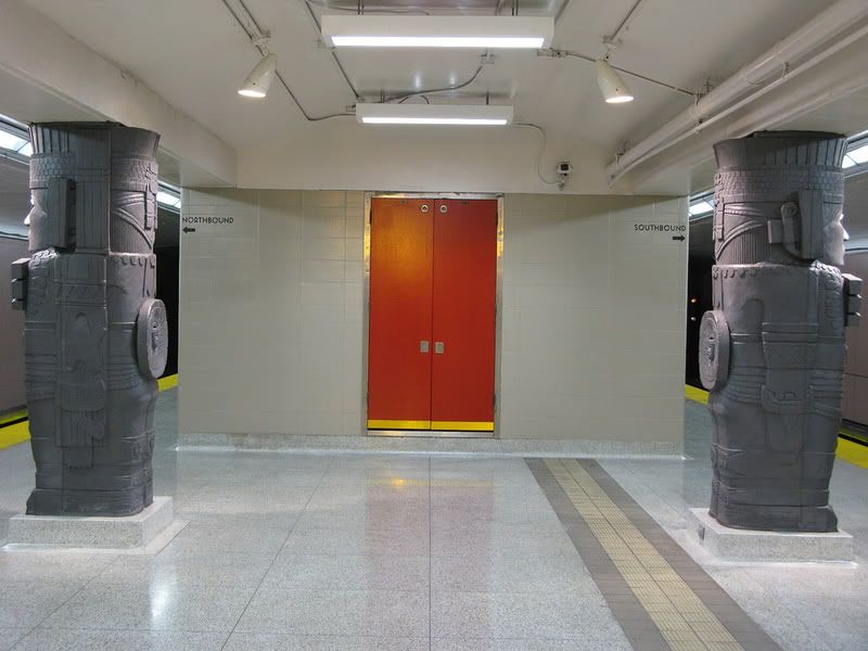
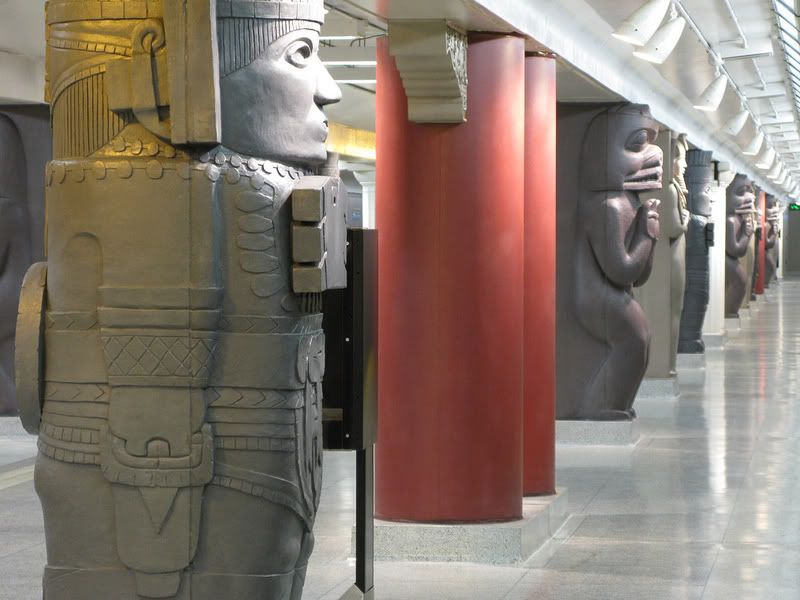
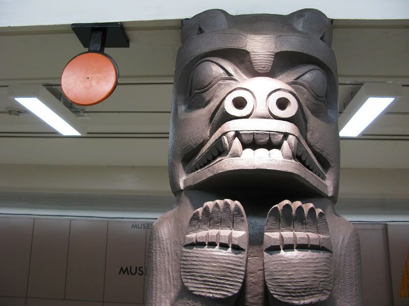
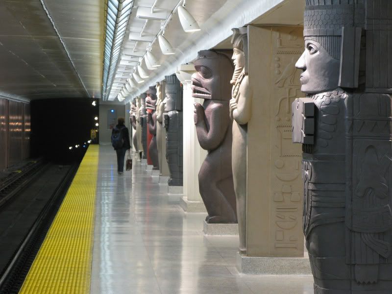
I noticed that people at Museum Station (mostly U of T students) were wowed at first by the new columns, but they were more interested in touching them rather than looking at them. I'm rather impressed by the column artwork, but my comments about the rest of the station remain the same as before. (go back a few pages to read them!)
 
Somehow, I still can't hyperbolize this as an aesthetic catastrophe the way some have, even if I'm fundamentally anti- such makeovers. But my point remains: this is a splendid, witty rework of a nondescript subway station. If it were 1988.

Hey, I guess it's consistent with TTC modus operandi: after all, their HQ is a grandiose 1938-style Fascist-Classicist cube which just happened to be built in 1958...
 
yeesh, is it just me or does it feel like some ppl are really negative on this forum...

i dunno but as a marketing executive, i think this does a lot more for ttc's branding purposes than anything that "feels like Toronto". If anything, this project speaks louder for TTC communicating that it is improving itself than some clean up of a ttc station or two that is done in in a "sophisticated" way that apparently 'matches' with the rest of the city.

I think for those who didn't see the rendering (or, unlike us on the forum, the non-UTers that didn't see the rendering to such detail to notice the ceiling and other shortcomings in comparison) will appreciate the renovations to this station and find the station design's novelty of interest. And let's just call that a good thing...
 
The bottom one's easy:

To cure skinny leg, Mix three jars of slugs with one urn of rib run-off, strain through combs, drink with bendy straw.
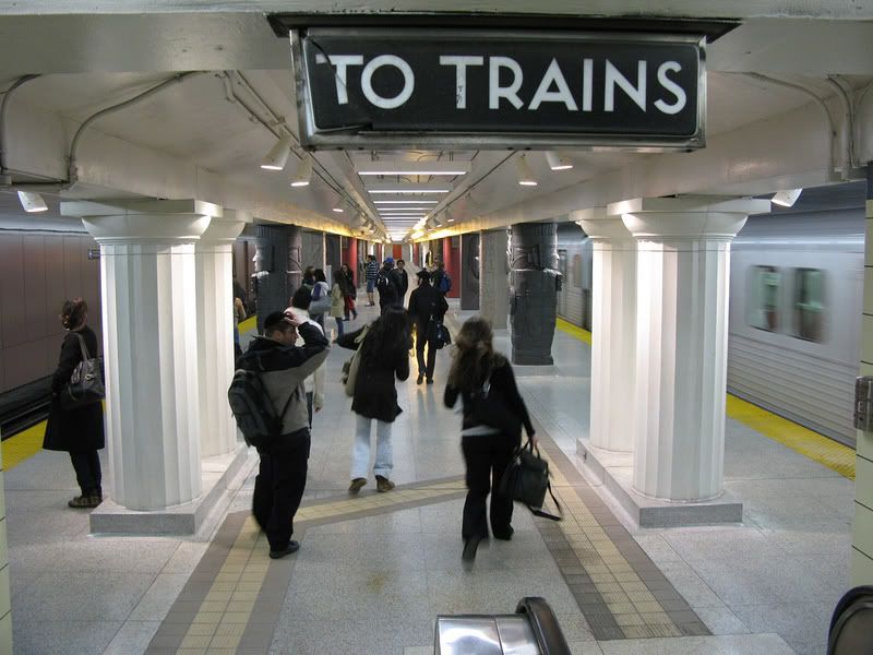


LOL!
 
This image shows exactly what is wrong with the TTC. While they create these new tacky scenes and 1980s vegas touches, the completely ignore these beautiful little touches of design that are just left to rot.

2401668317_3faa68908a_b.jpg
 
That unfinished ceiling is killing me... my eye is drawn to it.

Since this is essentially a theatrical execution, I'd slap some dark paint on it to exaggerate the contrast and draw the eye to columns... might as well create some real drama by "eliminating" the ceiling and featuring the set pieces even more.
museum.jpg
 

Back
Top