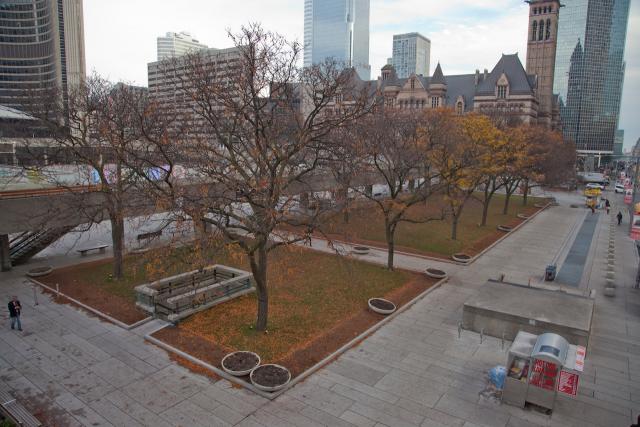
We've been putting some of those questions to City Hall staff and will have a story soon on what's next for Nathan Phillips Square.

42
 
More work coming...

bnr-constserv2.jpg

Tender
ecblank.gif
Call number: 109-2016
Commodity:
Construction Services, Mechanical Services
Description:
Replacement Of Refrigeration Plant, Pool Piping & Upgrades At Nathan Phillips Square, Toronto.
Bids Are Invited For The Replacement Of Refrigeration Plant, Pool Piping & Upgrades At Nathan Phillips Square Located At 100 Queen Street West,

Issue date: July 19, 2016
ecblank.gif
Closing date: August 8, 2016
at 12:00 Noon
 
Last edited:
We've taken a pretty exhaustive look at the Nathan Phillips Square Revitalization, and put it all into a new front page story of you. Take a look!

42
 
Great story on the revitalization. I'd lost track of the status of many of the elements, so it was excellent to have a recap/status update.
 
Great article!

The cigarette butts littering Osgoode Lane and in the new Peace Garden raised planters are atrocious. I'm assuming from office workers at Osgoode. People should be ashamed of themselves. It's one thing that we don't have enough parks and rec people to keep up with maintenance of parks in general and it's another thing that people have so little regard for littering their crap in public spaces. Who raised these types of people?
 
Great summary of what was done and what was missed. You did forget to mention the garage entrances. These were supposed to be rebuilt with glass and wood railing matching the skating pavilion. The Queen Street entrance was also meant to be rebuilt facing into the square.

The concrete benches were in fact made but they're ugly precast squares. They were placed in the space between the stage and skating pavilion instead of around the fountains. The concrete benches around the reflecting pool were also replaced with newer ones, also made of precast concrete. Furniture was not harmonized like it was supposed to be. There's a mishmash of styles, most notably the 3 or 4 styles of benches and garbage cans.

It's also worth mentioning that whoever is in charge of the square is a hoarder. They haven't thrown out the old benches and planters. You can see them scattered around the square, like in this picture:

18632-62919.jpg


Why the heck would they keep them there? Just throw them out and clean up the square a little.

I had heard that the ceremonial ramp was going to be done as part of a separate project. The plan was (is?) to make it more inviting to pedestrians. As it is now, the green roof is almost always empty. Replacing the ramp's surface with steps would help fix this. I can't think of any reason why they'd need cars driving up that ramp any more. It wouldn't get much farther than the entrance gate.

My hope for the remaining elements is that they'll be done as upcoming individual projects, smaller in scope and easier to get by penny pinchers on council.

- The walkways will have to be repaired within the next 5 years. Perhaps when they figure out what to do with the Sheraton bridge, they'll redo all of the walkways. Maybe we'll end up with something better. Full frosted glass walls would look better and create a glowing perimeter around the square at night. It would also be cheaper than trying to keep up the maintenance of the concrete walls. Add paving or wood decking and it's done.

- The Queen Street forecourt can be improved again in the near future. Landscape the remaining grass to encourage park like activities like picnics and laying in the grass. Topography like HTO Park with its hills and trees would be best. Create more pathways through that grassed area to improve porosity.

- Bay Street might see work done as part of the City Hall precinct plan. Old City Hall is slated for improvements to its front yard and sidewalks on Bay Street. There's room to widen the sidewalk and lower it to street level while maintaining the same 4 lanes of traffic. It just needs to be reconfigured. NPS's side could be done at the same time.

Overall, I'm happy that we got the improvements we did but it's upsetting that this went over budget and years late, yet so much of the core of the project was dropped.
 
As it is now, the green roof is almost always empty. Replacing the ramp's surface with steps would help fix this. I can't think of any reason why they'd need cars driving up that ramp any more.
What the? They used to have cars park up there? When was this stopped, surely long before the greenroof?
 
What the? They used to have cars park up there? When was this stopped, surely long before the greenroof?

It's always been a ceremonial ramp. I would love to see it "greened" with steps as well, and do it in a way that raises the floor a little so that users can actually see into the square without having to remove the concrete panels and alter the external appearance.

AoD
 
Last edited:
Yeah, the ramp and the elevated walkways are the two spots in the most dire need of some love, in my eyes (though I like some of @MetroMan's notes about the Queen forecourt and, relatedly, the southeast corner mentioned in the article).

My worry, though, which I'm sure is founded, is that both the ramp and walkways will be treated with timidity and frugalness above all else. I think these sites present a great opportunity, and I'd love to see some outside-the-box thinking dedicated to making these special places - mini-destinations in and of themselves rather than just conduits for viewing other items.

Instead of just following the most likely formula: 1) Replace floor concrete with pavers or wood planking; 2) Repair concrete that's not being replaced with another material; 3) Remove some concrete and/or replace with glass to improve sightlines/transparency; 4) Add some plantings, why not aim for something grander (and, no, the only alternative isn't a $30M boondoggle)? This is one of the most civically/urbanistic spots in the entire country and the best we can do is some new pavers and some shrubbery?

I don't have that better suggestion in mind, but there's a world of minds more creative than mine that could come up with some options. Alas, they'd be DOA with this particular Council.
 
The new Peace Garden also didn't turn out quite as "peaceful" as the renderings made it out to be. It's too exposed to the world around it. It needs to be more intimate. Trees planted around the amphitheatre seating might help but it'll take a decade or more before anything resembling a canopy emerges.

18632-62906.jpg

image by Jack Landau

Here's the original plan:

npspai_peacegarden_6.jpg


While I don't mind the new one because it preserves the Hiroshima and Nagasaki memorial, the original concept was for a place where you could sit in peace and be left with your thoughts.

As with many other things about the square, the original concept was watered down by design by committee to the point where it lost most of its overall intention.

Another example of this was how the main theme of PLANT Architect's proposal was to make NPS an "Agora Theatre", an open space in the middle of an urban forest. Trees were to be planted more densely around the square, creating a noticeable perimeter of trees on all 4 sides, enclosing the square. The watering down of the Queen Street forecourt, cancelling Bay Street and planting so few trees in the Peace Garden ruined that concept. It was the reason why PLANT's proposal was selected in the first place!


npspai_overview-day-note.jpg
 
Last edited by a moderator:
I am very dissappointed with this project. I attended the charets that were held more than ten years ago to gather suggestions for the revitalization. I was underwhelmed with the winning design but figured it was better than nothing. The results look like the work of a commitee cherry picking and, ultimately, ruining the intent of the winning design. The walkways, Bay street entrance, ramp, Queen street frontage, removal of the Sheraton bridge, and restaurant have all been axed. Basically all that has happened was a cleanup of the mess the city created over the past forty years. I hold little hope that the vague promises to address some of the omited elements of the revitalization will ever happen. It irks me that our only grand civic square has been compromised. Another watered down half assed city job. Ugh!
 
Yeah, the ramp and the elevated walkways are the two spots in the most dire need of some love, in my eyes (though I like some of @MetroMan's notes about the Queen forecourt and, relatedly, the southeast corner mentioned in the article).

My worry, though, which I'm sure is founded, is that both the ramp and walkways will be treated with timidity and frugalness above all else. I think these sites present a great opportunity, and I'd love to see some outside-the-box thinking dedicated to making these special places - mini-destinations in and of themselves rather than just conduits for viewing other items.

Instead of just following the most likely formula: 1) Replace floor concrete with pavers or wood planking; 2) Repair concrete that's not being replaced with another material; 3) Remove some concrete and/or replace with glass to improve sightlines/transparency; 4) Add some plantings, why not aim for something grander (and, no, the only alternative isn't a $30M boondoggle)? This is one of the most civically/urbanistic spots in the entire country and the best we can do is some new pavers and some shrubbery?

I don't have that better suggestion in mind, but there's a world of minds more creative than mine that could come up with some options. Alas, they'd be DOA with this particular Council.

I think the key is "less concrete, more something else".
Does Toronto only consider concrete when it comes to building materials? The square is still a sea of drab concrete, the pavement, the walkway, the ramp, the arch, the benches, all the same. Is it because concrete is cheap and easy? And every time we put some grass and trees, as if that will save everything.

Honestly, when you put a bench, do you want people to WANT to sit on them, not because they need a rest, but because they look fun? What about some permanent art collections? Sculpture? A great fountain that is beautiful, not those sprinkling thing Toronto loves so much that it installs at both NPS and YDS? I am afraid this square intends to convey some architectural philosophy (how concrete creates the world, for example?) but just ends up looking drab and uninviting. For Christ's sake, add some colour to it.
 
Initially, I also resented so much use of concrete, specially because all of it in the same colour makes the square so monotone. But I realize why they do it now. They're keeping with the style of the architect and the era that City Hall and Nathan Phillips Square were built in. It may not be my favourite style but I do believe in remaining faithful to an artist's work. I would be furious if a future generation were to come by and add splashes of colour to TD Centre towers. "It's too black and monotone" would not convince me at all of the need for any change from Mies Van Der Rohe's masterpiece.
 

Back
Top