B
BuildTO
Guest
New Freedom Tower design unveiled
Wed Jun 28, 2006 1:39 PM ET
By Mark Egan and Joan Gralla
NEW YORK (Reuters) - The redesigned Freedom Tower at Ground Zero in Lower Manhattan, planned to become America's tallest building, will be a monolithic glass structure reflecting the sky and topped by a sculpted antenna, the architects said on Wednesday.
Symbolic of the Declaration of Independence, the reworked 1,776-foot centerpiece of the World Trade Center site unveiled by architect David Childs will have a base sheathed with rolled, heat-treated glass over concrete.
The tower is planned as a symbol of New York's revitalization after the September 11 attacks in 2001, which claimed more than 2,700 lives at the World Trade Center.
Rebuilding has been dogged by almost five years of acrimony over designs, security, insurance and control of the 16-acre site at Ground Zero.
The new design uses a high-tech laminated safety glass, which if attacked by a truck bomb would shatter into falling pebbles, not break into flying shards.
The previous design featured a 200-foot metal and concrete base, added after New York police said the building would be vulnerable to truck bombing. The design was also criticized for looking too bunker-like.
The new plan for the building -- construction began in April and is hoped to be completed by 2010 -- was made after consulting New York police counterterrorism experts as well as state and city officials.
The exterior glass to be used is rolled with molten metal and the design features a vertical triangular rib motif, echoed throughout the building and on the antenna.
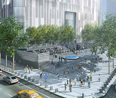
The tower will be surrounded by groups of steps leading to the entrance, serving as a public plaza and security buffer zone. A series of thigh-high rectangular slabs on the site's perimeter -- resembling tombstones in an artist's rendering -- will guard against truck bombs.
The antenna, to be used by radio and television broadcasters, has been given a more sculptural feel by Kenneth Snelson, a sculptor best-known for his Needle Tower, installed in New York's Bryant Park in 1968.
The antenna raises the building from 1,338 feet -- the height of the original World Trade Center's 110-story twin towers -- to the full 1,776 feet.
Unlike most other glass-clad office buildings, the Freedom Tower will appear clear because they will remove the iron, which tints glass green, Kenneth Lewis of architects Skidmore, Owings & Merrill told reporters at a preview.
"We've tried to make it more monolithic," he said. "It's reflecting the sky and the changing light's character as the day goes on."
The architects have drastically rethought Daniel Libeskind's original twisting design for the Freedom Tower because it would have been too hard to build and too vulnerable to attack.


