jahvon09
Active Member
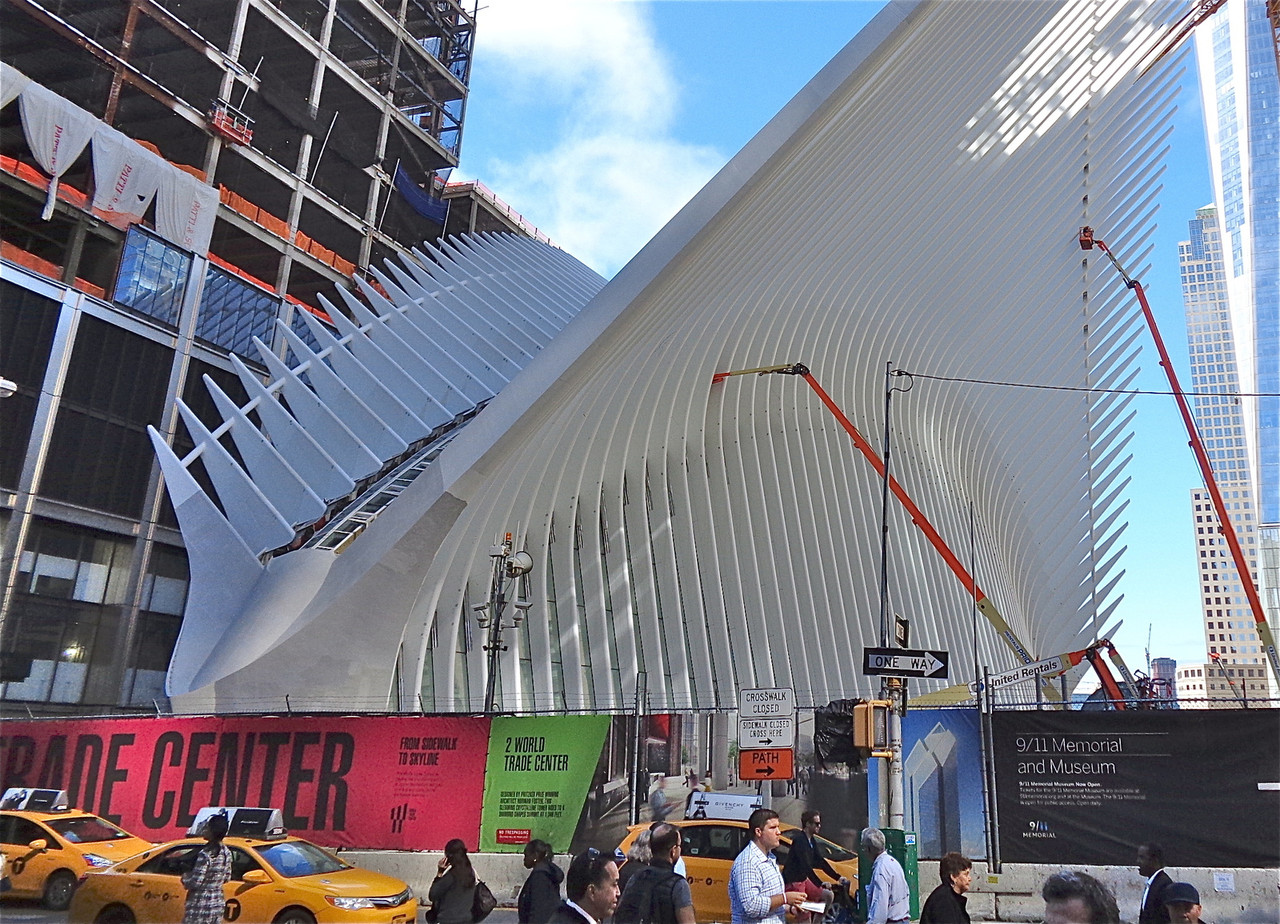
The station looks impressive, except for that mistake in putting a train signal in front of the art piece. That shouldn't have happened. Either the signal should have been located somewhere else, or the artwork should have been conceived with the signal in mind.
In most cities, I've seen that at the extreme end of the platform where the first car stops. That makes the wall look very tacky!!
Last edited:


