News   GLOBAL  |  Apr 02, 2020
 9.4K     0 
News   GLOBAL  |  Apr 01, 2020
 40K     0 
News   GLOBAL  |  Apr 01, 2020
 5.3K     0 

mastershake

New Member
Member Bio
Joined
May 26, 2007
Messages
44
Reaction score
0
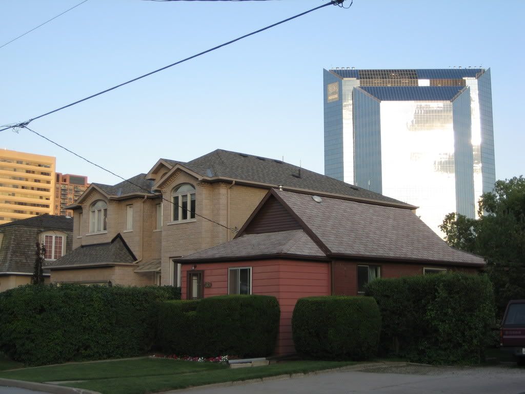
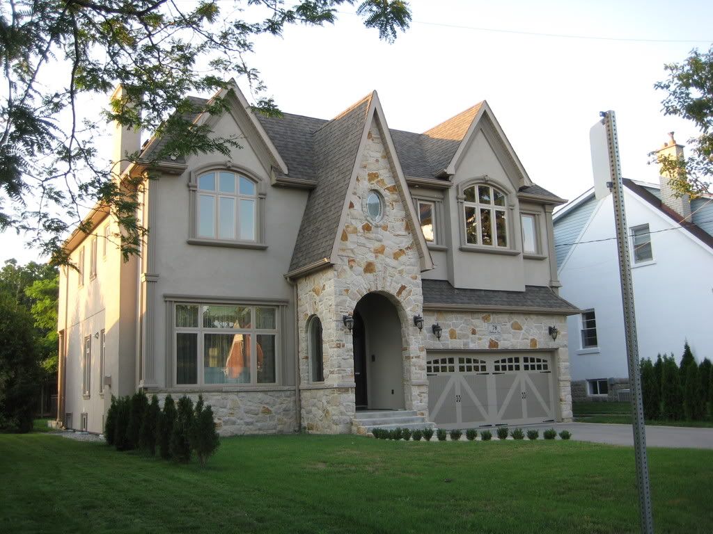
1. My Neighbourhood. Some of the houses are very tacky in my opinion
IMG_1553.jpg

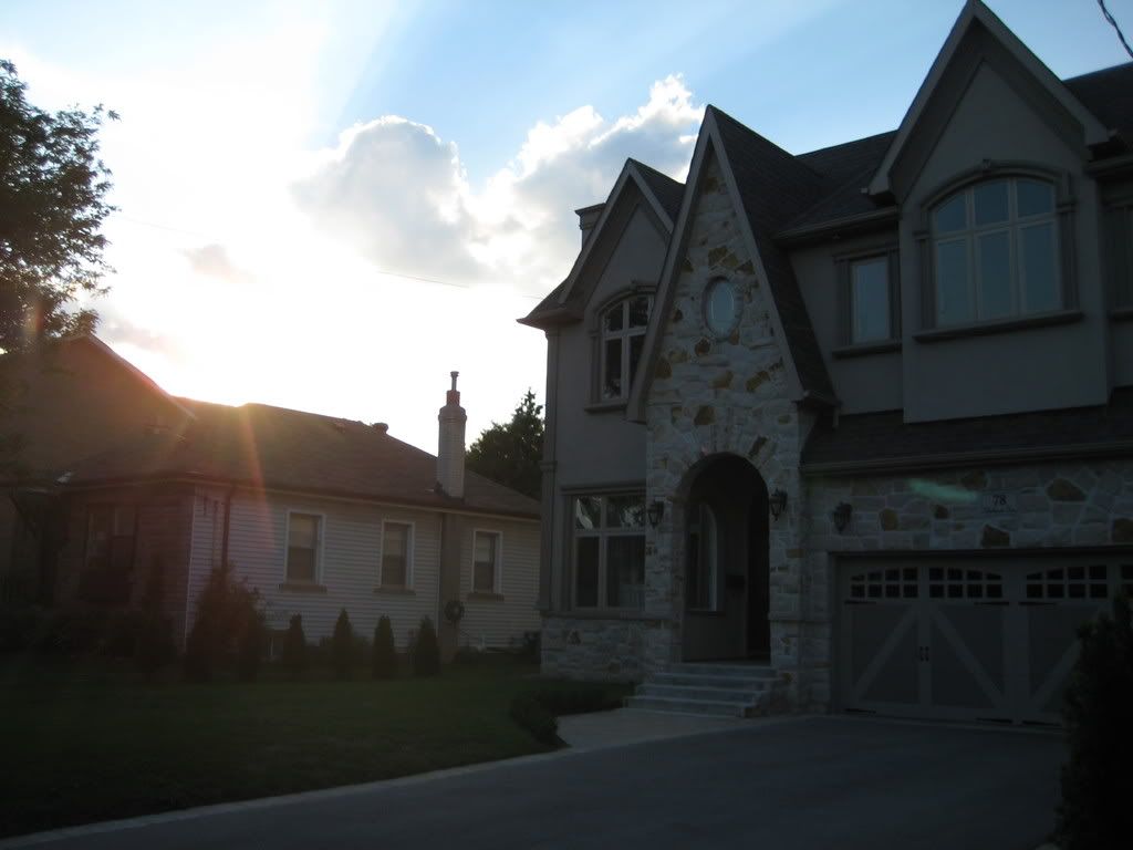
2. This was taken into the sun, but it's an attempt to show the difference in scale between the new McMansions and the original houses
IMG_1554.jpg

3.
IMG_1555.jpg

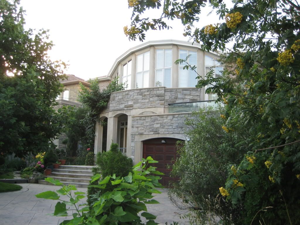
4. I actually don't mind this new one so much:
IMG_1556.jpg

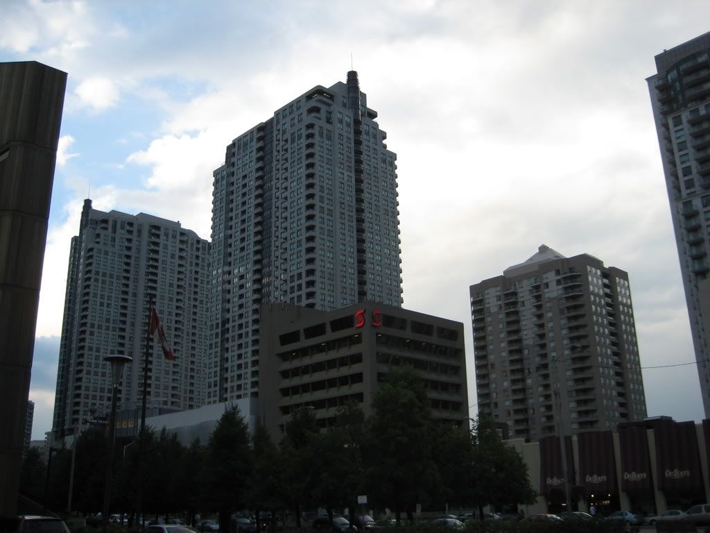
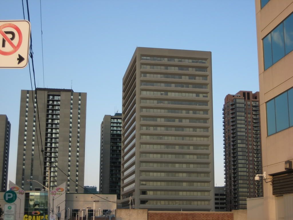
5. The Sheppard Centre is ugly, but it's still better than what's on the other three corners of Yonge/Sheppard
IMG_1558.jpg

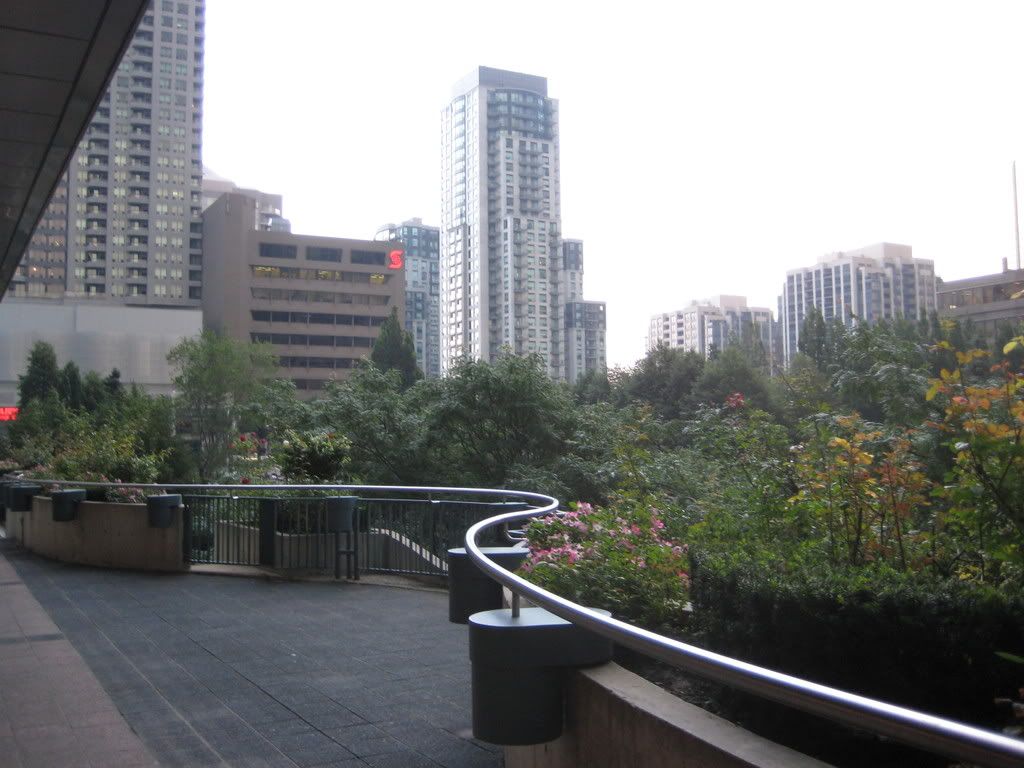
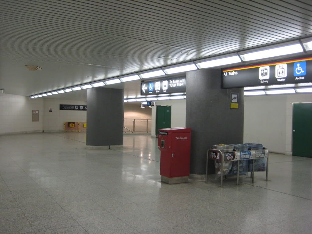
6. Huge underused space in Sheppard Station
IMG_1559.jpg

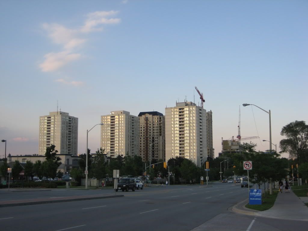
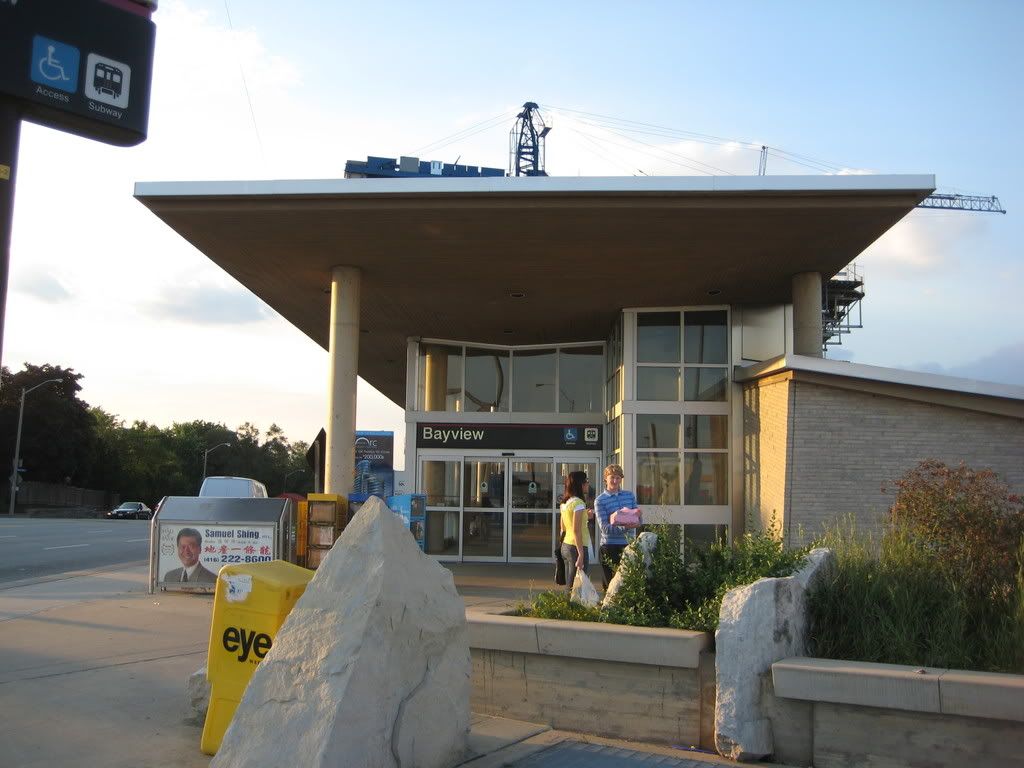
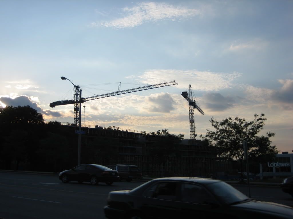
7. Over at Bayview & Sheppard on my way to the YMCA
IMG_1560.jpg

8.
IMG_1561.jpg

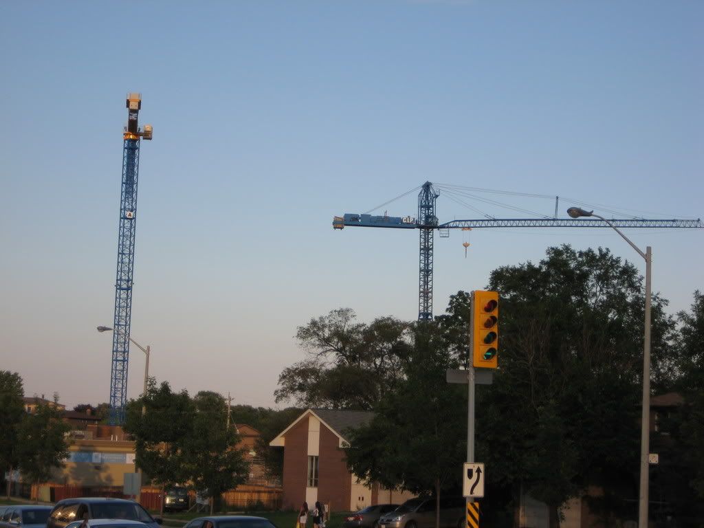
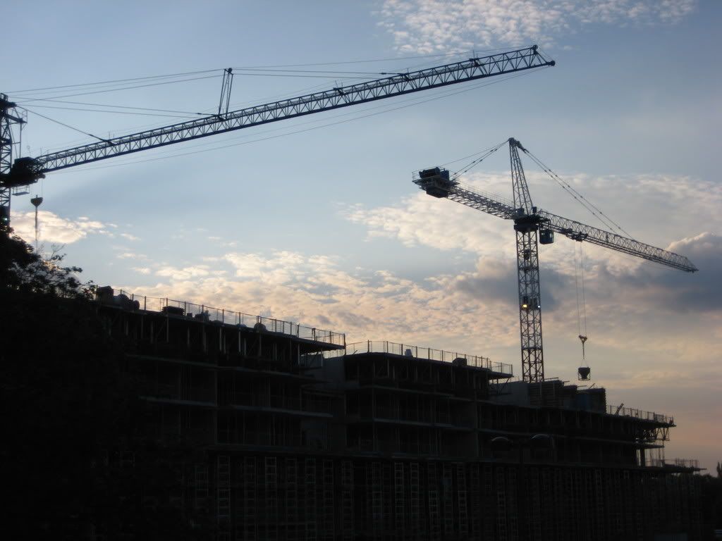
9. What are these cranes for?
IMG_1564.jpg

10.
IMG_1568.jpg

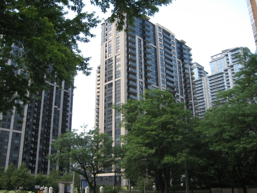
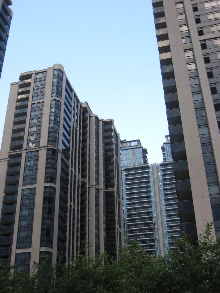
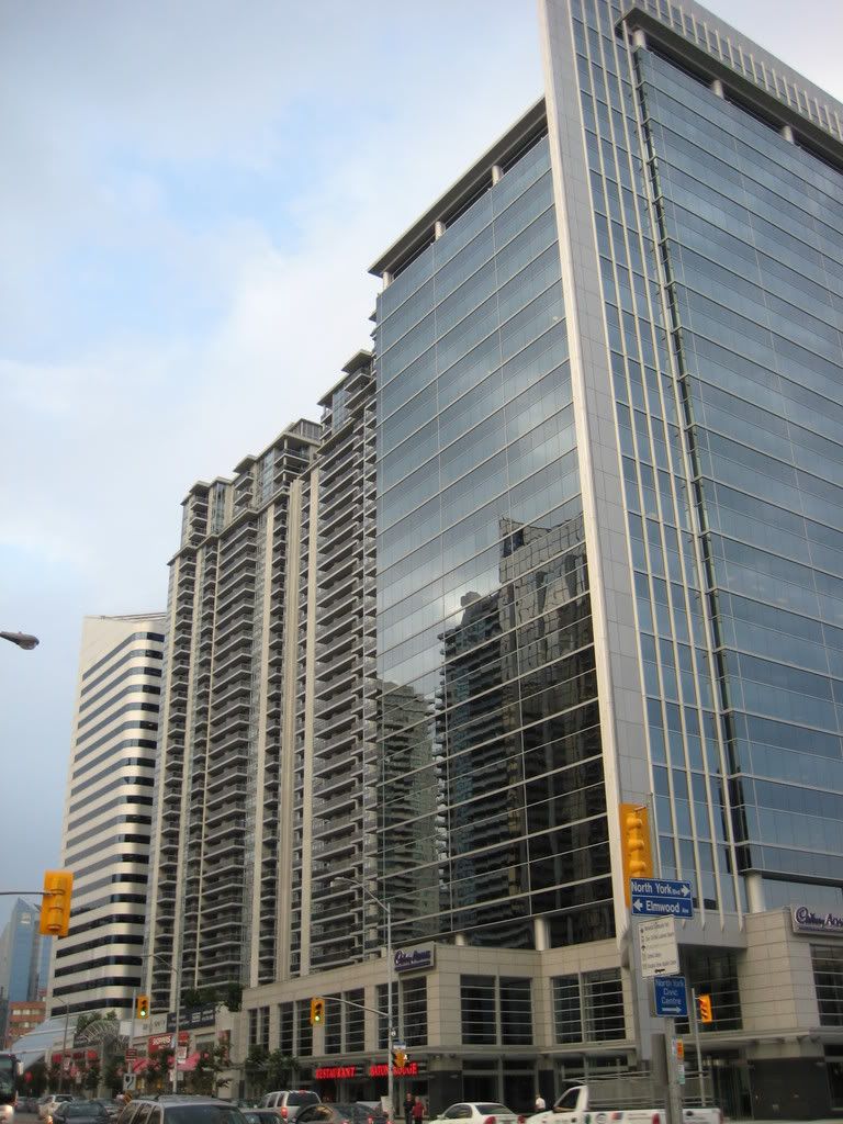
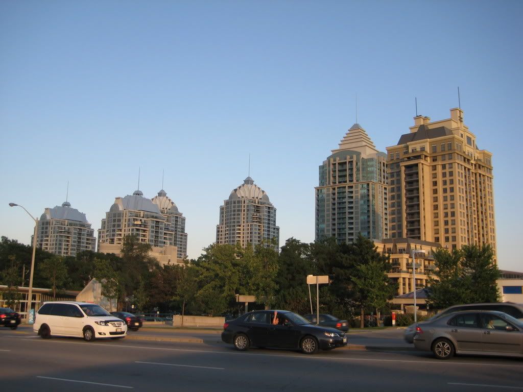
11. These buildings look ridiculous, especially the shorter ones
IMG_1570.jpg

12.
IMG_1571.jpg

13.
IMG_1574.jpg

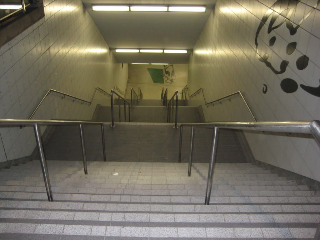
14. Bayview station seems so deep, I think there are around 90 stairs down to the trains. Sometimes these can be a challenge right after working out my legs at the Y
IMG_1577.jpg

15.
IMG_1581.jpg

16.
IMG_1585.jpg

17.
IMG_1592.jpg

18.
IMG_1596.jpg

19.
IMG_1602.jpg

20.
IMG_1603.jpg

21
IMG_1605.jpg

22.
IMG_1608.jpg

23.
IMG_1618.jpg

24.
IMG_1621.jpg

25.
IMG_1624.jpg

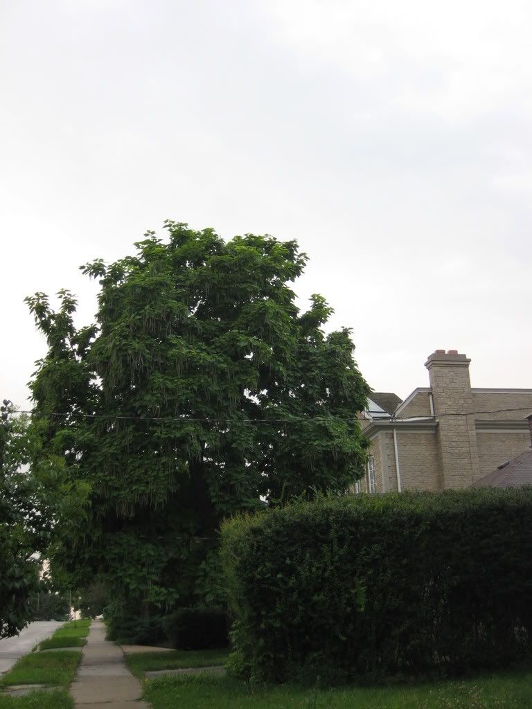
26. I like this tree
IMG_1632.jpg

27.
IMG_1633.jpg

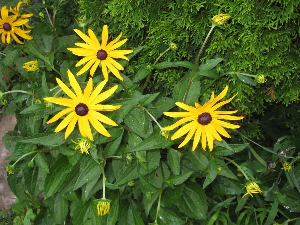
28. Back home, these are in my garden
IMG_1637.jpg
 
Thanks for sharing!

Those cranes look to be for Daniel's "The Bayview".

You live on a nice looking street. I too like that house.

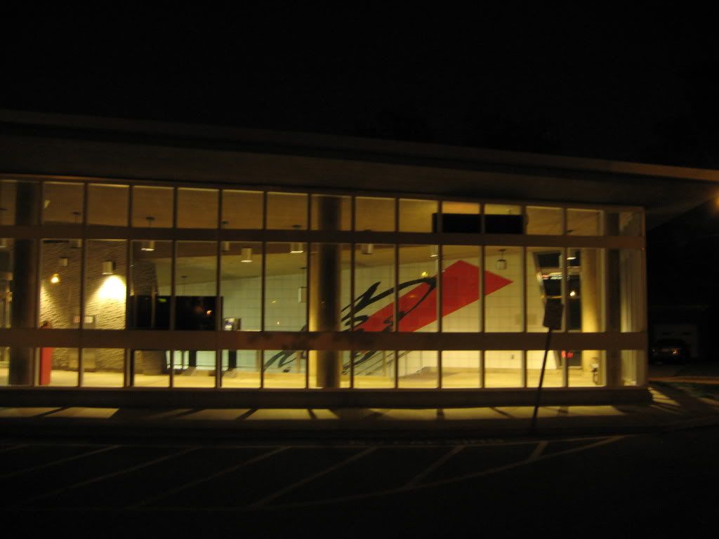
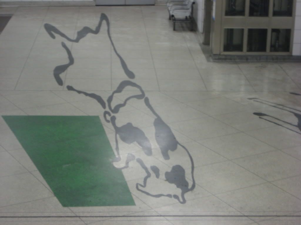
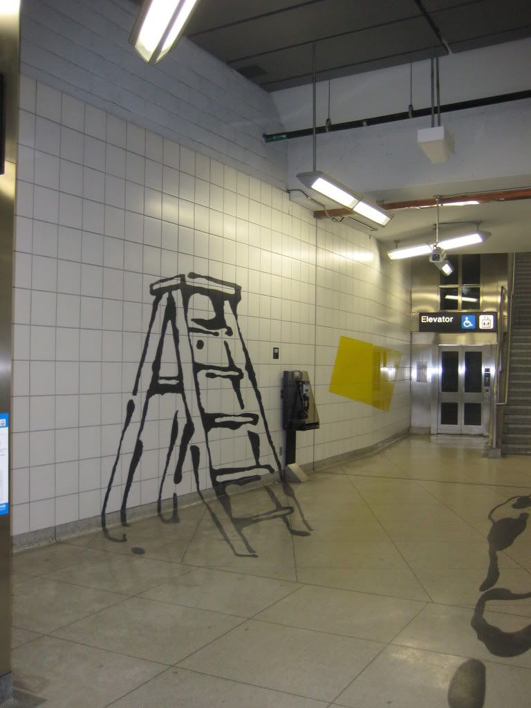
The fido graphic in the subway was pretty interesting.

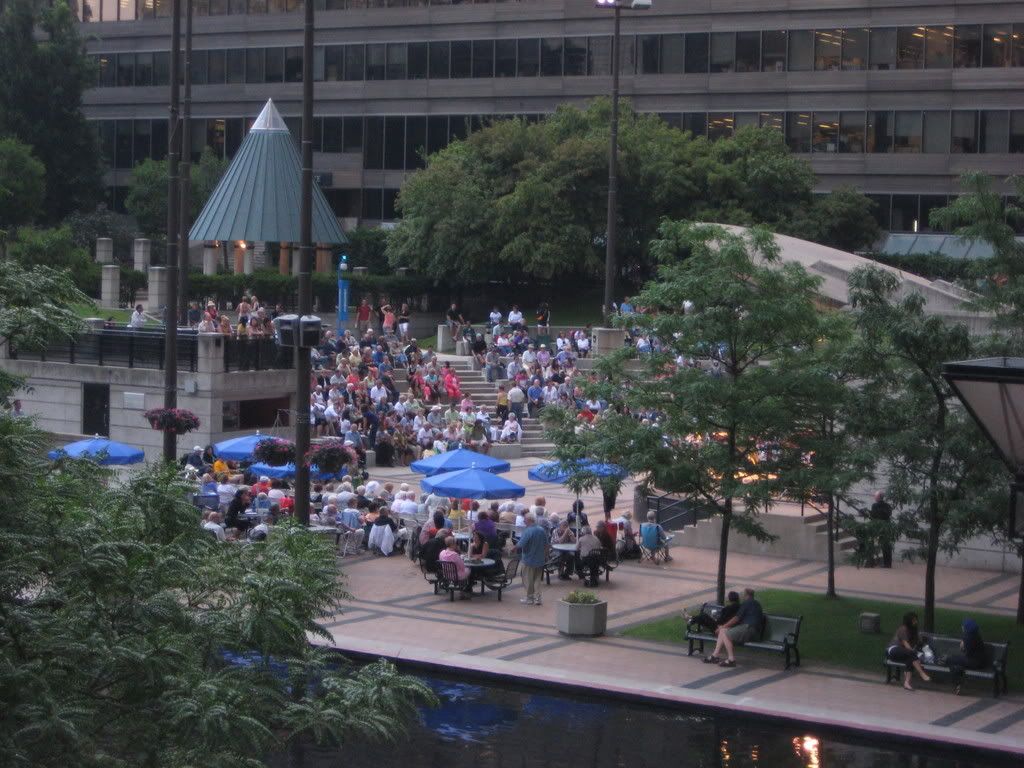
Mel Lastman Square sure kicks Nathan Phillips ass.
 
yep, thanks for the tour! youve actually made the area look pretty good. lots of new development continues to happen up there...
 
The area from a little north of sheppard (and hopefully soon a little bith south of sheppard after the tridel and basiz development) up to NYCC station station is actually quite nice and only getting better. The area from NYCC station up to finch is nice in some area's but has a ways to go. Directely south of NYCC station the Gibson house proposal may do wonders as well (hopefully it'll have an office compontent).

The point is this area is only getting better and better. NYCC to Finch is good but it's a little less culturally diverse with most of the shops being korean with a few persian ones as well.
 
That one McMansion you liked is one of perhaps 4 new houses in North York north of the 401 that aren't offensive. The latest trend is to build cartoonishly quaint 4000sq.ft "cottages" (or small castle keeps, if they have faux stone...fauxite?) with multiple steep roofs and mini copper mansard things above the first floor windows and those lead-lined Tudor windows...like cartoons their walls almost look amusingly/toddlerishly tilted, and they're missing only the thatching. It's like living in a Hanna Barbera Land smurf playhouse.

Every single person I've spoken to about NY Towers outside the forum is either fond of them or indifferent. Love those crazy roofs!

The area from a little north of sheppard (and hopefully soon a little bith south of sheppard after the tridel and basiz development) up to NYCC station station is actually quite nice and only getting better. The area from NYCC station up to finch is nice in some area's but has a ways to go. Directely south of NYCC station the Gibson house proposal may do wonders as well (hopefully it'll have an office compontent).

The point is this area is only getting better and better. NYCC to Finch is good but it's a little less culturally diverse with most of the shops being korean with a few persian ones as well.

'Downtown' North York (Empress to the 401) is more fleshed out and finished, but it's also more polished, with more money and attention being put into the public spaces and retail because of the government buildings and the office towers and the subway concourses (compare Empress Walk or Sheppard Centre with the mysteriously weird North American Life complex at Finch).

'Uptown' (Empress to Cummer) is definitely a work in progress, littered with about a dozen construction sites, half of them on Yonge itself. 'Uptown' doesn't yet have the chain retail (not necessarily a bad thing) or the landscaped median (a very bad thing) that 'Downtown' does, but it is the residential half of North York Centre. The Gibson project may actually get built with no street retail, which would be disastrous and wuold permanently insulate North York Centre's two retail halves. It's actually not as mostly Korean as it seems...it's a raw, spontaneous ethnic zone, though, with many Korean stores at street level having Persian businesses on the 2nd floor. It's not a Disneyfied ethnic retail "Little Korea" ghetto with Korean flags flying from the light standards (or Little Persia a bit farther north), so the area has not been embraced by the experience-seeking public other than the Korean kids and local residents that use it. 'Downtown' is only diverse because ten different demographic/ethnic groups are all being catered to simultaneously, so a strange genericness has won out...perhaps in the next 10 years or so, some aspect will win out over the others, like if Yuppies overwhelm the condos, or if the local Korean or Persian population rises above 5% of the total, or whatever.
 
mastershake: That tree with the long seed pods that you like is a Catalpa - there's another one outside 2810 Bayview, across from the Y. There are two varieties and the southern one is hardy enough to survive in southern Ontario - along with the northern variety, of course.
 
Interesting to know UrbanShocker. There are a couple Catalpa trees on my street.

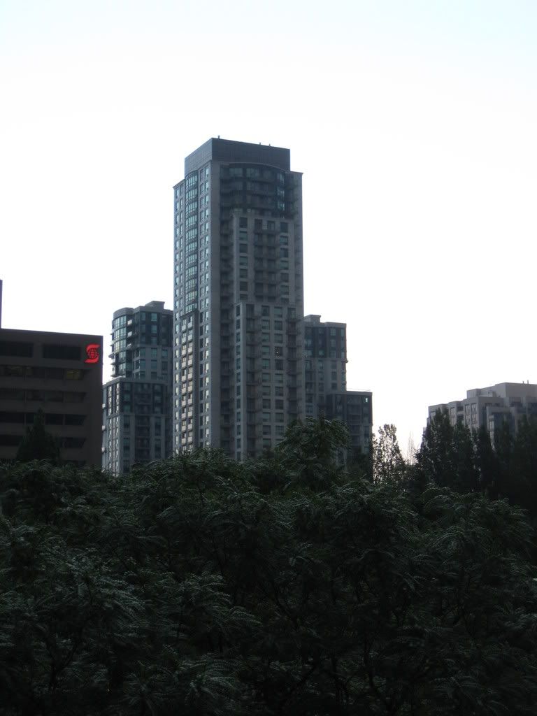
I used to live in one of the apartments near peanut plaza on Don Mills facing South-West, and thought that the NY towers looked "ok" poking through all of the trees. But from the ground I think they look silly, their "hats" are much too tall for their stature.

I just moved to the area this month, but Yonge Street around Mel Lastman square is pretty nice. The nicer sidewalks, median on yonge street and more restrained signage make this part of the street look nice. But i find the areas farther north, towards finch, or south towards the 401 to be shabby and unfinished with cracked sidewalks, shabby businesses with too many advertising signs, and construction sites.

It is hard to believe that there are parking lots still on two corners of yonge and sheppard, and an empty lot on another. I would have thought this would have been one of the first areas to be developed due to being on two subway lines.

My initial impression of my neighbourhood is that most of the original (45? year old) houses are owned by older people, who have lived there for decades and have let their yards become a bit overgrown interspersed with the McMansions Scarberian describes. I think the fake stone exteriors look horrible and even cartoonish as well. There are worse examples than my picture number 1.
 
Perhaps Catalpa's were the designer greenery of the '60s, in North York. It would be interesting to know how the landscaping varied in different subdivisions, as the city rapidly expanded after the war - a sort of Concrete Toronto for shrubbery.

Though it's a grotesque thought, shouldn't we at least consider the possibility that the hideous fake stone on those McMansions may actually be a hugely debased version of Toronto Style? After all, the rustic look was used widely as an element in those '50s and '60s ranch-style bungalows that were thoroughly "of their time" when hipsters moved out from downtown to Don Mills and Bayview and Leslie and the shiny new suburbs, in those days.
 
Great pictures. You got my brother's house in one of them.

I hate those towers going up beside the mall at Bayview and Sheppard (whose name I can't recall). Who designed this garbage?
 
^ Do you mean the Shame Baghai condos? Or the Shane Bag-o-crap condos?

Shane Baghai's website opens with a strings version of Air on the G String...with harpsichord accompaniment. The harpsichord helps it redefine luxury. I'm assuming Baghai picked up one of those classical sampler CDs from Starbucks or whatever and had a hard time choosing between Air and Eine Kleine Nachtmusik, which is not as classy but, given its brisk tempo and bouncy lightness, might make purchasers more excited about spending their money.
 
Great pictures. You got my brother's house in one of them.

Thanks Chris, I hope I didn't criticize his house. There are some really cute houses in the area, I just prefer the older ones. I was looking on MLS at houses in the area, and they are pretty pricey. I saw one with a headline like "renovate or rebuild - your choice" listed for $550k, and a lot of the bigger houses were in the 850 range. I saw one on senlac listed for 1.1 million. As someone just out of university it makes me think I'll never be able to afford a house. I think I lucked out finding a fully self-contained (not basement) apartment in this area.

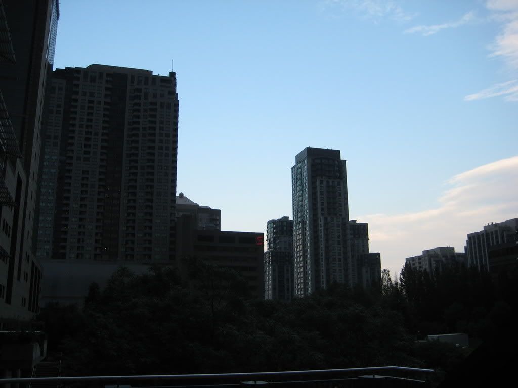
I just snapped these photos going about my daily business, going to the YMCA one evening, and the Grocery store another. I'll try to add to this thread if I take more. It's too bad it was so grey and rainy when I was taking some of these. I think the pictures above Mel Lastman square would have looked a lot better with some blue sky.
 
Welcome to the neighborhood! I live a few houses down from one of your pics in a post-war bungalow.

I also abhor some of the new houses. I feel that these days, stucco is the new aluminum siding. They all look tacky and cheap.

Keeping with the subject of trees, my house has a few maples, Norwegian and Manitoba. Apparently they're invasive species or big weeds.

If you want a change in scenery, you should walk west one day, past Senlac, to Wentworth Ave. At the end of the street, go down the valley and walk south to Earl Bales. You're instantly out of the city.
 
Small world, I didn't think that anyone from the forum would recognize any of the houses in the area. Thanks for the tip pipolchap, I was wondering what the best way to get down there was. I'll check it out sometime, that valley does look nice from the bridge over sheppard.

I don't like the stucco either, but I think I prefer it to the "stone" exteriors of some of the new houses. Some houses have a facade of white and orange-brown mismatched "stones", like in my picture number 1. What's wrong with plain old brick?
 
Even brick is somewhat tacky these days since it no longers serves any purpose other than ornamentation. It's often noticeable on a closer look that the bricks aren't lined up properly, or there are gaps without any mortar.
 

Back
Top