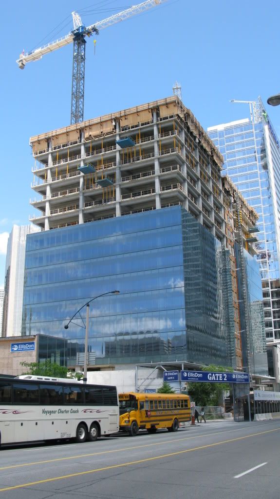
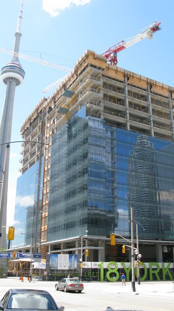
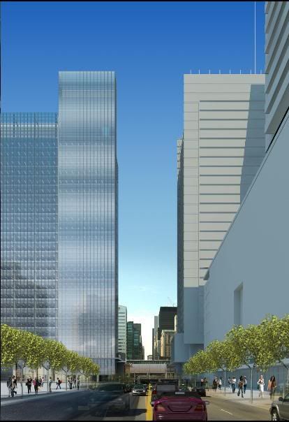
18 York is looking sweet! (and the streetwall that has developed there is INCREDIBLE!.. just a few years ago there was nothing... When/IF the office tower north of ICE is built, we'll have a VERY COOL intersection there with towers on each side! (Telus, 18 York, MLS, Office tower on the south-west corner whichs name i can't remember). it'll be great for photography when looking up! This intersection could become one of the coolest crossroads cause all the towers would have been built near the same time!

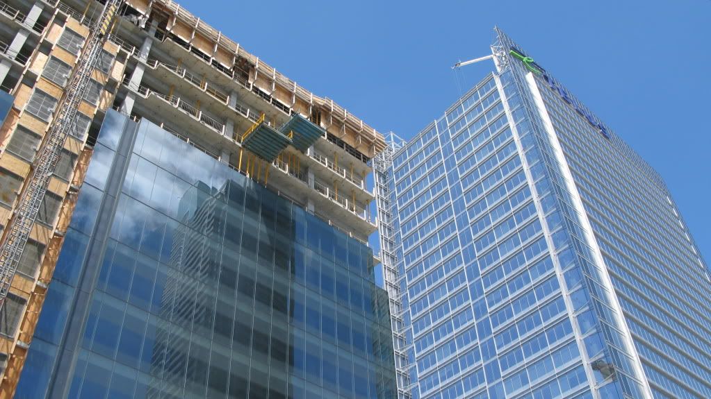
The cladding on 18 york is turning out better than i expected, too bad these towers couldn't have been taller but i guess it won't matter since MLS/ICE are right next to them :)
 
I still don't know what I think about this one. I love the reflective glass but I think it's gonna look like it should be in some commercial park in Oakville. Pics from today:

IMG_1680.jpg


IMG_1684.jpg


IMG_1690.jpg
 
I agree with the other posters. The glass is beautiful but this is still just a boring box. But at least those office jobs aren't going the suburbs.
 
I'm a little disappointed that the glass on the vertical fin is the same as the glass on the rest of the building. The rendering indicated otherwise:

18york_1.jpg

18york_2.jpg


Given that the fin is the signature design element of the tower, it's a shame that it will not really stand out now. Does this qualify as the 'Cheapening'?
 
Ramako, I was just about to make the exact same post.

The buildng has lost much of its limited asthetic appeal and I too am disappointed. I quite liked the contrasts in cladding.
 
You are missing my point.

Some posters are disappointed by the evident shape of the building. There are claims that it is boring. Regardless, the building is going up, and it will never by a jagged crystal or architectural dildo. It will be what is being built. Even if it were something other than a rectangular structure, some people would find fault.

In the end, to each his own, but I agree that it represents jobs and business downtown. I like the clean lines and glass. Call me boring.

Of course the tower is still a very welcome addition to the neighbourhood and the city's economy, but that doesn't mean it's beyond criticism. Overall, I quite like the tower, but I'm still dissapointed by the change to the glass.
 
I wonder if they are planning some sort of metal fin treatment to be placed over the glass for that featured vertical element. It could be coming later.
 
concerning architectural flare, i generally don't expect too much from financial buildings. i think this is the case for most contemporary designs, both locally and internationally. these buildings serve a very simple function and, symbolically, represent the economic climate of their time. i think 18 york is satisfactory. i am more excited about how it will change the streetscape of bremner/york and add to the public sphere.

that said, i would certainly welcome a return to aesthetic brilliance a la mies, the empire state building and the sears tower.
 
I'm a little disappointed that the glass on the vertical fin is the same as the glass on the rest of the building. The rendering indicated otherwise:

I had noticed the same thing and was thinking likewise. However, before I posed that thought here, I took another look at the renderings (inlcuding the large billboard renderings on the site) and felt a bit better that that may still be sticking to the original design. From what I gather the same glass is used all around the tower, and vertical fin will be added on at a later point once all the glass is up. If you take a close look at the southwest elevation rendering (first one posted by Ramako, which is still not as clear as the one on site), you will notice that the vertical fin guts out a bit from the glass cladding. Whether that is the case or not I do not know, just a hunch. I did not notice any sort of supports on the building to mount the vertical fin when I last walked by but until I see that the building is occupied and it has not been added, I will wait and see the final outcome.
 
You are missing my point.

Some posters are disappointed by the evident shape of the building. There are claims that it is boring. Regardless, the building is going up, and it will never by a jagged crystal or architectural dildo. It will be what is being built. Even if it were something other than a rectangular structure, some people would find fault.

In the end, to each his own, but I agree that it represents jobs and business downtown. I like the clean lines and glass. Call me boring.

It doesn't have to be starchitecture but should have something to give it some identity at the neighbourhood level like a pronounced change in cladding or some setbacks. Any commercial building can represent jobs and business downtown.
 

Back
Top