Earlscourt_Lad
Active Member
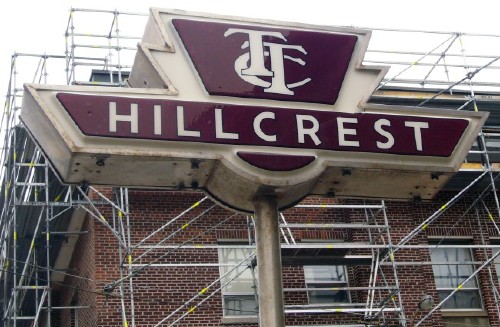
I like the new design. I think it has the potential to become an iconic sign, and capitalizes on the TTC's great design heritage.
Am I alone in thinking the new versions are a bit of a mish-mash, and somewhat reminiscent of the MTA's signage (but not in a good way)?
Am I alone in thinking the new versions are a bit of a mish-mash, and somewhat reminiscent of the MTA's signage (but not in a good way)?
")