


barrytron3030
Active Member
this was a waste of time and resources on the council's part. arguing about new street signs is so unnecessary. the new ones are not attractive.
|
|
|
I really don't understand the city sometimes. Those old street signs had charm and were distinctive. An updated version of that design would be perfect. These new signs are pretty forgettable.
The city (and the TTC) really need to do a better job in this area.
I agree Syn. If you think of London or Paris, as examples, street signs and street infrastructure in general become identifiable little symbols of the city over time. Updating them a little is okay but changing them drastically seems like an idiotic erasing of decades and generations of 'branding' that already exists and that you just can't get back again over night.


But the loss of the quality street signs of the old City of Toronto, which were elegant, sturdy, and timeless, and had the distinctive Toronto Acorn on them......is beyond contemptible!
I agree Syn. If you think of London or Paris, as examples, street signs and street infrastructure in general become identifiable little symbols of the city over time. Updating them a little is okay but changing them drastically seems like an idiotic erasing of decades and generations of 'branding' that already exists and that you just can't get back again over night.
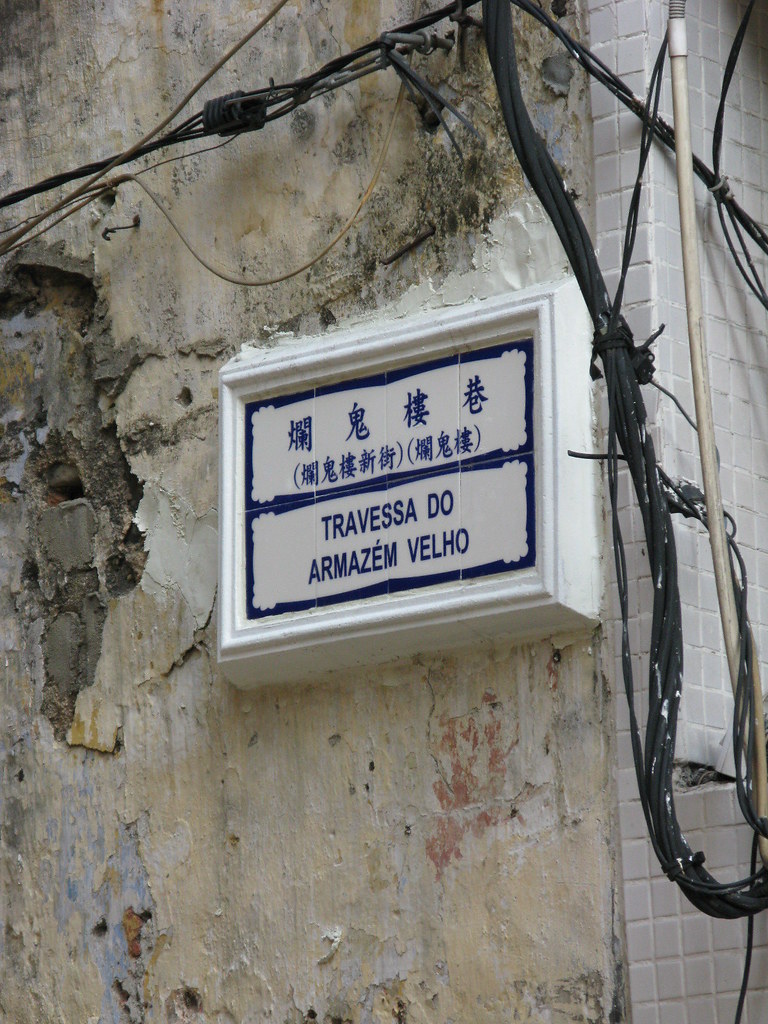
Wow, Azulejo-esque. Just what you'd expect from a former Portuguese colony.