News   GLOBAL  |  Apr 02, 2020
 9.7K     0 
News   GLOBAL  |  Apr 01, 2020
 41K     0 
News   GLOBAL  |  Apr 01, 2020
 5.5K     0 

I'm fond of Toronto's distinctive street light with the curved bracket. They're the ones that emit white light, but are limited to the old city of Toronto. Better design is possible and preferable in prominent places, but as a "generic" design to install on ordinary streets, it's quite elegant. In fact, these street lights have even been used in prominent streetscape overhauls like St. George Street through the U of T campus. They look fine, but I would still advocate for a more sophisticated design for such ambitious projects.

New LED lighting units have been installed on these distinctive brackets as an experiment on a few streets, but don't seem to suit the curved bracket design as well as the round metal halide unit presently used. It should be a round lighting unit. Windsor has the distinctive brackets as well, but they installed sodium-vapour lights on them. Like our experimental LED lights, they don't seem to compliment the curved look of the bracket very well.

Windsor certainly has a lot of those old brackets retrofitted with cobra-heads. There's still a few in Brampton in the B and C Sections of Bramalea, though they look a little different, actually much like the ones in Etobicoke from the late 1950s/1960s. The old Town of Brampton had a miniature version (same as the old Yonge subway poles) that disappeared except for one in an alleyway. A few retrofitted brackets remain like on Elizabeth Street.

I resurrected the month-old thought as I was biking in the Huronia region a week-and-a-half ago, I found a pure acorn-and-bracket in Midland.
 
Toronto Hydro will ruin the aesthetic of these streetlights if they start installing generic LED units on them. They should get a round design that compliments the brackets better.
 
Toronto Hydro will ruin the aesthetic of these streetlights if they start installing generic LED units on them. They should get a round design that compliments the brackets better.

I agree. The ALAMP pilot on Delaware Avenue south of Bloor illustrates this. Toronto Hydro has fallen in the classic Toronto trap of running pilot projects without follow-through. I'd like to see LED lights where there's the simple arms and cobra-heads (especially in the old City of Toronto where in the 1970s and 1980s many streets were converted from the old arc/incandescent lights to then-modern high-pressure sodium lamps with cobra-heads). That should last them a long enough time before having to figure out how to replace the white-burning metal halide lamps in the modern arc-style lamp housings. Hydro already replaced arc-style lamps on the Spadina fixtures from the 1997 project with the grey flat luminaries.
 
Last edited:
Some answers, at last, with regards to the origins of the famous acorn signs.
A little while ago I was contacted by one Dylan Robertson who was writing an article about fonts on various city signs, wondering if I had any info on the history of the acorns. I didn't - but it looks like someone in the comments section did:

http://www.thegridto.com/city/places/graphic-content-a-field-guide-to-wayfinding

collations

Toronto’s “acorn” street signs, otherwise known as “Roscos,” were a result of the City of Toronto’s Special Committee on Improved Street Lighting, Traffic Control Signals and Street Name Signs of 1947. Among the Committee’s tasks was a rationalization of street signage in use around the city, which ranged from wooden signs on wooden poles in the ‘suburban’ areas to those blue enamel street signs, many of which are still affixed to the sides of buildings throughout Toronto. The “Rosco” design was the winner amongst several options. It was manufactured by Rosco Metal & Roofing Products Ltd, whose Toronto facilities were located on Dupont Street, at Shaw Street, where the Sobeys is now. This company had operations across Canada and went on to become Westeel-Rosco Ltd. The “acorn” signs, their Standard Series of street name sign assemblies, and a variant, their Economy Series, were at one time in use in several municipalities in Canada. Toronto’s “acorn” signs have seen three generations, the first being the 3-D acorn with raised lettering, the second being the 3-D acorn with flat lettering, a product of the 1980s, often incorporating neighbourhood names, as seen in the photo above, and the third and final version being the over-sized flat acorn with flat lettering that saw brief life before the introduction of the current street name signage.
 
Some answers, at last, with regards to the origins of the famous acorn signs.
A little while ago I was contacted by one Dylan Robertson who was writing an article about fonts on various city signs, wondering if I had any info on the history of the acorns. I didn't - but it looks like someone in the comments section did:

http://www.thegridto.com/city/places/graphic-content-a-field-guide-to-wayfinding

That 'someone' is likely Patrick Cummins
http://urbantoronto.ca/forum/showthread.php/13197-a-little-variety-please
http://www.flickr.com/people/32175940@N06/
 
That comment solves the mystery of the origins of those iconic street signs. Of course it's Patrick Cummins, who knows the city well and whose collations photo project is a fascinating historical resource. He's a city archivist--part of the group at the City of Toronto Archives who do great work helping people discover the city's history.
 
At Queen & Pape.

papesign.jpg
 

Attachments

  • papesign.jpg
    papesign.jpg
    84.3 KB · Views: 1,059
Is it me or a lot of the new blue signs don't have a street number on it. I don't like it when I am on a big commercial street and the storefronts don't have their address number easily visible and I have no idea where how far away I am of the address I am looking for (if I don't have an e-map with me)
 
Is it me or a lot of the new blue signs don't have a street number on it. I don't like it when I am on a big commercial street and the storefronts don't have their address number easily visible and I have no idea where how far away I am of the address I am looking for (if I don't have an e-map with me)
There are Cities where it is obligatory to put the building number at ALL entrances - for fire service I think. Not a bad idea. I also think it would be great if stores in Malls were numbered (the same number as used on the store maps).
 
Is it me or a lot of the new blue signs don't have a street number on it. I don't like it when I am on a big commercial street and the storefronts don't have their address number easily visible and I have no idea where how far away I am of the address I am looking for (if I don't have an e-map with me)

Most have a street number on them. There are a few without, but not many.
 
There are Cities where it is obligatory to put the building number at ALL entrances - for fire service I think. Not a bad idea. I also think it would be great if stores in Malls were numbered (the same number as used on the store maps).
Very sensible. Especially since they all have existing unit numbers for internal purposes anyway, why not show them externally as well?
 
Haven't checked in here for a while. Just a quick update...

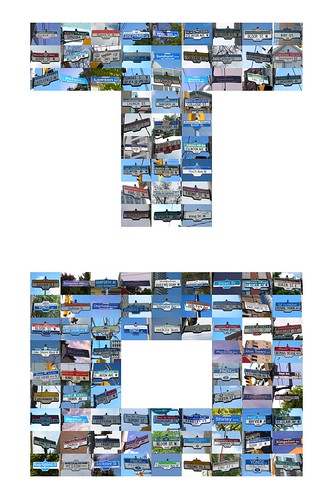
14547853927_03a66da985.jpg


Many people over the years have been asking for hard copy versions of the street sign photos/collages I've done (such as those featured at the beginning of this thread). I would occasionally have prints done for certain persons, but have basically been sitting on them all this while. I had actually intended on writing a book on Toronto's street signs and was going to use the photos for that...but, eventually, I realized that would involve writing a book! Then, of course, I got a little side-tracked with my Urban Wilderness project and sort of forgot about the street signs. But now I'm bringing them back and making them available as prints online here:

http://evictorc.imagekind.com

(I've also started adding a few of the same prints here - http://fineartamerica.com/profiles/evictor-c.html - but I'm having a little trouble getting the two sites to match up price-wise due to various format differences. So just check for whichever one's cheaper at the moment!)

If there's any interest, I might also start doing a series of Urban Wilderness collages too.
I'm still adding things on a near daily basis, so keep checking the site(s)...
 
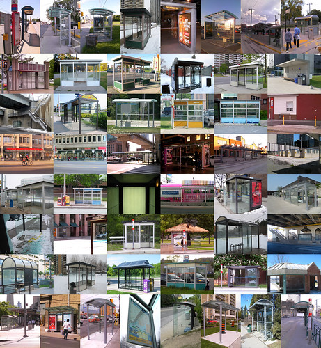
...and now the collages don't just cover street signage, but various other collections of Toronto street furniture/accoutrements, such as bus shelters:

14748382562_3f15beb342.jpg


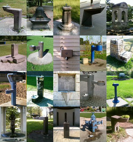
drinking fountains:

14725664956_822272087e.jpg


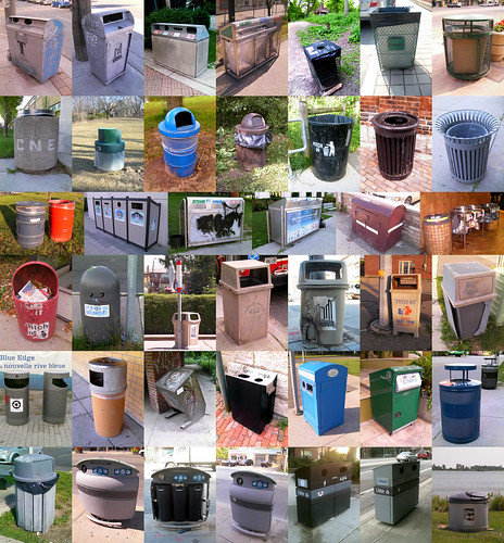
waste receptacles:

14561999848_6158c6249b.jpg


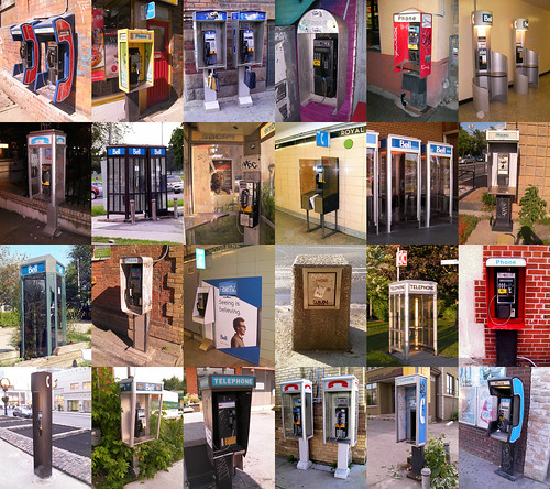
pay phones:

14748350532_a0ec59a292.jpg


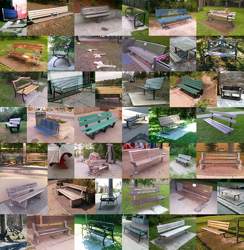
and benches, Benches, BENCHES!:

14746268084_1c18e0275d.jpg
 

Back
Top